February 26, 2010

Type Experiments

Here are some of my corrections and new versions for the weather types. I'm beginning to finish up with all of these, an begin merging them on to the billboard and bus templates. First, I'll probably make a few more cloud images. The theme that I'm trying to do for is the "worst of conditions", specifically at night. I haven't quite worked out a tagline yet. Anyway, I need to switch up some of the words in the cloudy composition now, since "fluffy" and "wooly" aren't exactly terrifying, dangerous words.

The snow composition is almost finished, I'm just going to add a few more teeny word 'flakes.' I don't want it to look like a pathetic snowfall, but I don't want it to look like a blizzard either. I want the words to be clear enough, and still look quiet.
Done with night! I think I've done all that I'm going to do to this little guy. I added more words, and made some drastic scale modifications. I also added a slant to everything in an attempt to give it a little extra depth. There's no danger in this composition, but that's because in respect to the narrative of the series, this is the beginning, where there is no danger yet.

WIND! This is my favorite weather piece, for sure. These were made in camera, and now I'm beginning to composite them into one massive, scary image. I added in the colored version of the first image, just for fun. Purdy, right? Anyway, this also shows who I've chosen as my news channel--CNN. Given the serious nature of my weather types, I don't think I want to use any of the other channels. CNN is serious business.


Icon Evolution

Mr. Curly Q. Shrimp!

Family Recipe

As usual, clicking the image gives you the larger full view. Reflection is at the bottom of this sea of icons!
So this is the final set of icons for my story, titled "Family Recipe." This was a pretty challenging project, since there are so many pieces to it, and to each piece, additional variables to consider. Creating icons that accurately represent the object you want has it's own difficulties, but personally, I had the most trouble with cohesion across the set. After I chose to go with a "curly" theme, where to place the curls on each object became quite a task. And making all of the curls optically equal was another goal in order for the icons to match. I think in the final set, I did a pretty good job of making all of the swirls a standard size.
Weight was another issue that a battled with, and in the end, I think I won. :) Some of my objects are very dense, such as the recipe box. Others, very thin, like the carrots; and placing them at optically the same size was an interesting task. If this had not been done, of course, there would still be icons that looked awkward next to each other because of the vast difference in weight.
3 of my icons that I still feel a rather weak are the recipe box, the spoiled food in the pot, and the pizza box. It's a shame too, since they're pretty important icons, as far as the narrative goes, haha. The recipe box still looks a lot like a file cabinet because of my inability to accurately portray it with no demention. Same with the pizza box, it because rather awkward once I translated it from a 3-dementional icon into a more flat version. The pot is an icon that I got particularly frustrated with, and still haven't completely resolved. I hope that by adding a line to show the rim of the pot on this new version, I hopefully clarified that it is definetely a pot (some people thought it was a cake!).
Overall though, I'm pretty proud of the evolution that each one of these objects have gone through. They're pretty cohesive, and I really like the boldness of the all-black versions. Also, the gaps inbetween the shape are quite nice, and give each icons just a bit more flare.

February 21, 2010

Redesigning Valentine's Day

Oops, a little late, but still. This is a clever attempt at recreating what represents Valentines Day.

hereherehere

The five main points that they set out to change were:
  • Clarify expectations
  • Simplify visual clutter
  • Update color palette
  • Revamp traditions
  • Transform Cupid

My personal favorite part of their redesign was the application of their icon (meant to replace the heart):
hohohooo, how silly and clever.

February 20, 2010

Jonsi Live Show Visuals

Jónsi live show by 59 Productions from Jónsi on Vimeo.


I'm reaaaaally excited for this show! Aside from the fact that I love this guys music, the set and graphics look like they're going to be amaaazing! The idea of creating visuals to go along with music has always been something that's interested me, and it looks like what they're creating right now is a wonderful representation of the energy of Jonsi's music. It's not just an add-on though, the set and visual aids seem to add a lot of depth to music that's already very interesting. As a former theater techie, any time I see some really awesome set designs, I get all bubbly and excited! He'll be in Lawrence on the 22nd of April, which is a Thursday night. I'm already trying to keep ahead with all my work, so I can't possibly miss his visit. Amazing Icelandic musicians don't come to the KC area very often, you know? :)

Here are some songs from the album that will be coming out:

Jónsi - Go Do from Jónsi on Vimeo.

CHANGE ONE THING. Then change another, and another.

So I just sent in my submission of the Change One Thing poster competition. Gotta admit, whenever I submit something, it's just a bit nerve-racking. Anyway, this is the final version of the poster, scribbles and all!
My intention with this poster was to incite people to want to garden, no matter where you live! Urban gardening is in an upward trend, and for good reason. It's a great way to save a little bit of money on the groceries, eat better, avoid the chemicals of store-bought veggies, and relieve the stress of everyday life (watering and tending to plants is therapeutic, you know)! Most importantly though, you don't need an fancy-schmancy garden to plant your produce in, almost any household object can be made into it's own plant pot (like a shoe, for example!). Also, I added a link to a reliable, easy to navigate site that has a lot of helpful information on urban gardening.

Here are some of my early versions and iterations that got me to where I ended up (click for a bigger, more detailed image):

Final Photo; Vladmir Nabokov

Here's the evolution of project 2 for Image class.

I chose the Russian author Vladmir Nabokov Known for such novels like Lolita and Speak, Memory, he's pretty well known for his stunning and controversial writings. He was not only an author though. He was a chess player and an entomologist, talented in anything he took an interest in.

So here's the first attempt. It has a lot of compositional problems and overall is pretty boring. I decided to keep messing with the elements of the photo, and add some more objects to help further develop the personality of Mr. Nabokov.


This is the second attempt. The composition is way too centered, but the slanted book is a bit more visually interesting then just having them stacked. I added flags to show his diversity, since he was a multilingual and also since each one represents a place he lived in at some point in his life. They're a little too cliche though.


These two are my final. The first one is the one that I sent to the plotter, and turned in for critique. The indexes for Nabokov are his books, the checkers, and butterflies, for the reasons I explained at the top. The symbols are the map and the owl. The map, is of course, representing his international life, and the owl is a representation of his wisdom.

As for the second image, I was so horrified by my stupid spelling error that I tried my hand at a little photoshop-editing to see what it would look like if I weren't such an absent-minded idiot.

February 19, 2010

Reading: Generate and Cull

"Generate and cull" is good process not just for design, but for life in general. Iterate, iterate, iterate! Each time you work through a problem, you're going to learn something new in the process. So, when working with our icons, producing a lot of versions in a short amount of time allows us to assess what is working and what is not, and make improved iterations from the best qualities. While culling, we might even decide that certain icons are not working at all, and weed them out to help improve the set as a whole.

F+S Icons!

100 iconic movie icons, how many can you name?I wish they didn't look so much like South Park characters, but still, they're easily recognizable, for the most part. Although, the more generic looking characters are sometimes not discernible
unless you see the characters that are around them.
Found here!

February 17, 2010

Browser Pong

http://stewdio.org/pong/

Disable your popup blocker! It's a blast! :)

February 16, 2010

Continuation of Icons

Here are some of my new icons, in their different categories. I chose to go along these directions:
  • repeated triangle
  • geometric
  • realistic(ish) outline
  • curly
All of my shrimps, and 3 of my knives have been vectored.

February 11, 2010

Nabokov Poster!


I've got some work to do!
  • The perspective on this is really flat, which in turn also makes it really boring. I need to try taking shots at more dynamic angles. This will be a challenge since the chess board is not actually wood, and from certain angles a bit of a glare forms on it which makes it really obvious that it's paper. I'll so a lot of experimenting with the lighting to solve this problem though!
  • Boring composition and very divided across the middle. Rearranging my items will help with this, and hopefully also help with the flatness issue previously mentioned before. I'll try setting the books up sideways, although I want to make sure that the name and quote retain their readability and don't look awkward. Also, before I had considered adding in some flags, but didn't know how to do so without it looking weird. I'll try it out though and we'll see how it goes.
  • MISPELLED A WORD! Crap. Already fixed this, thanks for pointing it out, Vi! :)
  • Keeping everything in focus. Yea, that's just me being incompetent with my camera. Won't happen again (I hope).
A few things I do want to keep though:
  • The owl figurine - I considered finding a different owl that looks more realistic, but I want this owl because he clearly looks like a figurine or maybe a bookend. He looks like he is on a bookshelf, which is a good thing, he's in the right place! :)
  • Monochromatic-ness overall - I'm glad I got the poster to look monochromatic and warm-colored without looking YELLOW.

Icons, first round


After the critique over these, I think that the versions I will emphasize with my iterations are the outlined, geometric, repeated element, and possibly framing methods (and of course combinations of all categories). I particularly enjoyed the geometric versions of my objects, but it seems like the shrimp is a little bit too robotic, or maybe too skeletal. Either way, I'll be working on correcting this, while also trying to fix the awkward shape of the carrot top bundle that is present on ALL of its versions.

Also, we have an new addition to the object family. Or more so, a substitution. After having a lot of trouble with my fire alarm drawings, a decided to sub it out for a fire extinguisher. I know it's an important object in relation to my story, but if it's not rendered correctly then it is not doing any good. After doing a series of gestural and intentional drawings, I think it's pretty clear that my drawings of fire extinguishers are a lot more readable than the alarm ones.
I've decided to go ahead and work on my fire alarm icons now, giving me more time to give attention to it. I'll also be translating the burned food into icons during this round, since it's a tough object to tackle successfully! x)

February 10, 2010

Pictograms Icons Signs and An Iconic Lion (Reading)

A functioning pictogram:
The first glance: The most important qualities of an object are perceived.
The second glance: The less important qualities of an object are perceived.
The third glance: Additional details are perceived.

A modern graphic designer should sacrifice their individuality in favor of the subject matter that they're trying to convey. The most important point of an icon is that it needs to immediately convey the idea, so most often it is better to use simplistic, primitive representations. Our icons need to be things that can be internationally understood, and understood by anyone without explanation.

Seeing the NYPL logo and it's evolution was very interesting, and it was lovely to see all of the other elements that the logo is meant to embody besides an icon of a lion. It's funny that they mention that it might look like Simba, because that's the first thing I thought of when I saw it. But associating any picture of a lion looking upward with the Disney movie Simba something that might only bother people of our generation, since older folks don't know what it is, and for young children it's a dated move they probably haven't seen. Anyway, it seems like a really successful icon that helps give the library a much-needed facelift. It uses bold outlines to define the face of a proud lion, and the whole thing is framed in a nice round circle. Seeing it small on the web banner and seeing it large on the totes, it also holds up well no matter what size it's placed at.

February 6, 2010

Steve Frykholm

A few notes on Steve Frykholm, from his lecture, his works, and his critique.
Attention to detail:
Do we take the time to pay attention to what we say and how it's represented? What's appropriate?


In regard to Change One Thing:
  • Cliches are easily understood, but what other icons symbols can represent the idea?
  • Don't use text like a "bandaid on an assignment."
  • Don't say the same thing with both your image and your type--leave something for the viewer to explore.
  • "Change One Thing"
-keeping the tagline could make it more personal that just having the topic as the tagline
-is it a command or a call to action? Does the image make you want to do something?
  • Narrative is king. Messages are important, work harder on your words.
  • Facts may be more important than headlines.
  • "Shoulder climbing"


"You have to create a MAGNET."

Design Process

This article helps a lot with the designing process, really breaking it down piece by piece. While the importance of process is constantly emphasized in studio, Meggs articulates each part of the process really well, which only further helps understand the significance of it all.

In relation to the project we are currently working on, the step on information gathering seemed to really pop out at me. While working on our Change One Thing project, collecting information on the topic that we chose is imperative to the outcome of the poster. The article mentioned that as a designer works on an assignment, they made need to look up more information than what they gathered at the beginning. This is a big part of trial-and-error--if you continue in the same direction without the proper information, then you're going to get stuck in a rut as your idea hits a dead end and become stagnant. This kind of happened to me earlier, and looking up more stuff about my topic, urban gardening, really helped me gather more ideas. I'll continue to look back on this reading as a template for the creative process.

Objects, drawings, and soon-to-be icons


Here are some of the drawing that I produced from the images I collected for my story. Learning how to minimize the use of lines and emphasize the expressions has been an interesting project, so far. I seem to do better using the thick markers in comparison to pencils or pen, which make my drawings look squiggly and kind of weak. Something about shrimp is so cute, too. I think they're my favorite object in my story. As I translate the linear simplifications into the different icons, I will be interested in seeing how the objects hold up as they continue to have extraneous detail removed from them.

February 5, 2010

Image: Vladmire Nabokov


This is the person that I chose for the second image project. His name is Vladmire Nabokov (for fun, he's his name in russian: Владимир Владимирович Набоков!), and he's a pretty interesting fellow!

Vladmire Nabokov is a primarily recognized for is work as an author. His works include Pnin, Lolita, The Real Life of Sebastian Knight. Besides being a prolific writer, he had a lot of other interests and skills. He was an entomologist, and collected and identified butterflies. He was a skilled chess player, and also trilingual. He taught literature as well as languages, tennis, and boxing. What a well-rounded guy! Anyway, here are some of the items I was thinking about:
  • Journals/notebooks
  • glasses
  • butterflies (maybe fake from a craft store, pinned to corkboard?)
  • insect books
  • net
  • bug box
  • chess set
  • owl ( he used a pen name that mean owl for a while)
  • teaching materials
  • a book he's written
  • Russian flag
And a few quotes!
  • "The pages are still blank, but there is a miraculous feeling of the words being there, written in invisible ink and clamoring to become visible."
  • "Literature and butterflies are hte two sweetest passions known to man."
  • "Existence is a series of footnotes to a vast, obscure, unfinished masterpiece."

Change One Thing Posters


These are the three new posters that I made for the Change One Thing competition. To be honest, I feel like I have no idea what I'm doing. I know what I want my subject to be, but my posters are obviously lacking. I tried working with the cut paper again, and I guess it looks ok, but it doesn't look super interesting in the end result. Adding the message is where I seem to get really stuck, which is er...bad, since it's the point of the poster. It's been a tricky week.

February 2, 2010

Today's Word is Metaphor (or symboooool!)

How relevant!
And silly!
Gotta love My First Dictionary.

Type Image Message

This was an interesting read, and helped me understand a process behind project 2. Creating an environment for the image you want is a good way to start your creative process, even if it's a very abstract creation. Keeping elements as hand-made as possible helps create cohesive pieces that you can have a lot of control over, as opposed to using the computer for everything. It also helps get other elements into perspective, such as color, lighting, and texture. It's important to make sure that every element in the piece allude to the theme that you're trying to convey.
Also the relationship between image and type is something that is mentioned, and something that I'm going to keep in mind as this project evolves. It's going to be a lot trickier to embed the text into the scene manually instead of adding it on top digitally. But this just adds to the amount of thought and care that will have to go into project 2, which is fine with me. After all, graphic design is a way to solve problems, not just using programs and tools!

Urban Gardening


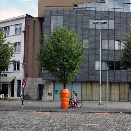
While looking for more information on my topic fo the Change One Thing poster, I found this clever public art piece! So clever and effective, yes? Anyway, I wanted to make a post to share this and at the same time save it for myself for later!