December 5, 2010

Helping Hands Final Process and Comments

With a project with so many elements, it was essential from the beginning that Karen and I create a rigid schedule and checklist to stick to, so we didn't lose track of time or lose pieces of our system.
First, we developed and refined the icon system and colors while playing around with the size and content of the booklets.

We wanted to create a size that was portable, considering that the people who would use these books might not have a lot of space to carry it around with. We first tried to create something that was "wallet sized," but then just changed it to small, hand sized booklet.
Each booklet features a back page that both folds out and tears away. These pages are either forms you can fill out or another resource like a map. This is another part of the project where we paid careful attention to the lack of time and space the users of these books suffer from. These books don't need to be kept on the person all the time. You can read the information, tear out the page, and then utilize it (fill it out or navigate with) while keeping the information from the book in mind, instead of physically with you.

One thing that we had some trouble with during this project was coming up with a suitable name for the whole system. A highlight from the mindmapping of it all:
The first name that be came up with was Patch up. Sort of like a patch on a tire or clothing, or a bandaid patch, this kit was meant to fix you up so you could get control of yourself. That name didn't work, and after that we tried the "Open Hand Books." This was a step in the right direction but needed to hint more at the whole system, not just the books. Plus, not everyone understood the pun in it. So we instead went with the name Helping Hand Guides. This name is more all-encompassing.

Above: Some of the earlier mock up of the booklets.

Working on the copy in the books, we crafted it simply and concisely, making sure they remained helpful tools and not intimidating, text-heavy, encyclopedias of information. Each book has a general "What is this about?" section, a "Tips" section, and a Contacts page. This information is mean to inform and save you time by telling you the basics. For example, show below is the page listing what you will need to bring with you when you apply for the food stamp program. This addresses a problem we saw a lot in the simulation. People seemed to be waiting in long lines, only to realize they were in the wrong place or did not have everything they needed with them.


Then we worked on figuring out some of the other details. This is the custom box that all of the booklets ( and the mission statement card) come packaged in. The flaps of the box were a fun hint at the name, Helping Hand Guides.
Too big. Too small. Just right! The hand were supposed to link together, and lay flat(so they could stack).

Then it was just a matter of putting everything together, and working out tiny kinks. Like making all the books the same size! Here, you can tell which one is actually full of content.


We made stickers that go into the windows of affiliated organizations. They are 5x5 and are simple, dawning an icon and the "Helping Hands Affiliate" text.


And the final presentation!:


Andersonvillalba Presentation

December 3, 2010

Portfolio

Anderson Portfolio
Here's my shot at making a portfolio, the project that never ends. Since taking these snapshots, I've already edited it. Several times.

I've gotten rid of most of the illustrated images. In fact, I'm rethinking the whole idea of using hand-rendered elements at all.

December 1, 2010

Nonlinear Final Statement

My interactive communication model was an improvement on the static version because it allowed for more layers of information, and a greater depth of detail to be displayed. The static version did not have much room for explanation/clarification, but being able to animate different parts of the model really helped with that. Motion was of course another plus of using an interactive medium, since it helped enforce things like the directional movement of the message and such.


November 23, 2010

Readings and Analysis.

I Do Declare.

From this article I gathered that the biggest thing that you need to do when making a presentation is keep the audience in mind the WHOLE time. Also, a little personalty always helps things.

  • Show your outline to the audience from the beginning. It's good to let people know what's coming up.
  • If you can't talk that well, then let the visuals do the bulk of your talking.
  • Be unpredictable in your voice and gestures and style.
  • Combine formal language with informal talk. Makes people feel more comfortable.
  • Give the right amount of information at once. Not too much or too little; enough to keep attention, but not overwhelm them.
  • Tell jokes through your visuals. Humor makes people comfortable (the right kind of humor, at least).
  • If you have to read, keep it short. No one has a long attention span for that. Plus, you're messing with their inner voice that's trying to read what you're reading at the same time.
  • Lastly, let your audience know how long your presentation is, and how far you are into it.


Be Selfish

Know your audience.
You don't want to talk down to or talk above your audience. Providing definitions and explanations will help everyone be on the same page.

Hierarchy
Verbal and written communications should support each other and not be redundant. People cannot process something read and heard at the same time, so try to get information that complements each other.

Visually Engage your Audience
Keep things simple and legible, and give your audience a system so that they can predict where essential information will show up on each slide.

Use you Audience
Create and outline that focuses on the feedback that you need. Start and conclude with the main points you want to make, and guide the Q&A by listing the points that you want to discuss.

Capture Feedback and Reflect
Notetakers! Got one of those! Also, write a reflection of how you felt it went right afterwards, to keep things from slipping away, and try engaging interesting question-posers in conversation after the presentation.


  • Uses simple graphics, they're not pretty, but they are direct.
  • Short slides, concise but interesting statements that go along with each slide
  • Cute jokes that are relevant to the subject, but they make the audience more comfortable and interested
  • he knows his subject, has technical fact (but they're explained well so that everyone can understand them)
  • he makes personal anecdotes, shows that he's interesting in his subject. very enthusiastic.
  • numbers his points, so you have an idea of where he is in the presentation.

November 16, 2010

Narrative: Simplified Communication Model

So after turning in my model in class on Monday, I felt like I still was not satisfied with several of the elememtns of my communication model. After a lot of scooting and nudging, font-changing and color-sampling, I'm pretty satisfied with this new one.

I took some of the details/descriptors out of the model. I think that for this project, I want that information to be reveal instead of already given to the viewer. I'm excited to try and animate this into a non-linear, interactive model.

November 10, 2010

Project 7

To begin, here are the three animations that I put in the the webpage mock-up. The first one is a type-only piece, second is a mostly image animation with houses, and the third is an illustrated animation also with a bit of text. I tried to give them all three different kinds of imagery, but kept them all in the same style.

Text Fact from Kelsey Anderson on Vimeo.


House from Kelsey Anderson on Vimeo.


Growing Up from Kelsey Anderson on Vimeo.


And here is the videos placed into a fake webpage. I didn't go ahead and make a full-out webpage, since that wasn't really the focus of my project, but I did add some shapes and the organization logo to try and simulate some of the noise that would be on a real webpage. The animations would rotate through, and loops and continue to play until the viewer moved to a new page. The best way I can think of describing it is like a web reel.

Web Mock-up from Kelsey Anderson on Vimeo.


This was an interesting challenge since I was making a series of animations instead of only one. I have to take into consideration which style and colors for each would be most appropriate, but at the same time still unify them as a series. I'm satisfied with the cut-out, flat style of the animations, although Frankie made a good point about needing to refine the copy. The primary audience for this the parents, so I need to reword things to make them sound more professional and dependable.

During the production, I had a lot of trouble with timing. I worked this out by asking other people in studio "Is this slow enough now?" over and over and over. I seem to have a problem with making everything too fast.


Storyboarding really helped me on this project (with the exception of text being too fast) because since a lot of my stuff was originally hand-drawn, it let me know every piece that I needed to get ready before I even opened up affect effects. It also helped with the digital rendering, and getting all of the layers in the correct order before animating.

From a technical aspect, I'm still working one learning After Effects. I had some troubles getting started, and all of my issues were just from lack of understanding how the program works. In comparison to working in Flash though, this is light years better.


Edited Logo Build from Kelsey Anderson on Vimeo.

And my logo build. I've got the visual aspect down but could add a few things. I need to add the actual name, "PlayDates" to the logo build somewhere, since you don't know what PD stands for otherwise. Also, some sort of sound could help.

Poverty Simulation Brainstorming

Karen and I had a blast thinking of solutions to some of the problems we found with the impoverished community during the simulation. while we were working some of our thoughts out though, we did run into a few bumps in the road, mainly because of the roles we played in the simulation. In our "families" we were both children, so we did not get the experience of being an adult. We plan on filling this knowledge gap by interviewing people that were adults.


These simple models were what we made to tried and organize our thoughts after we did all our mind mappings. The three directions we came up with were:


The school incentive turned out to be a bit too much. And we were kind of having trouble finding a good design solution. Oops. So we'll be dropping the school idea, and elaborating, refining, and trying to work out our other ideas, while creating a new one.

November 7, 2010

Koenig Layouts : Round 4? 5?


If you can't tell, I'm a huge fan of the illustrated images. I sucked the colour out of all of the images, and did a little correcting to make them have higher contrast. And no, I am not going to make them duo-tone images. They will remain black and white. My Pull-out quotes are a vibrant orange, and I've got blues for the titles. Still tweaking the colors, and I also need to add some images from outside the ones given to us. I seemed to have read over this requirement initially. womp womp.

Narrative Reel Pieces

Untitled from Kelsey Anderson on Vimeo.


Working out the kinks. 2/3 animations down, just gotta plop the last one into illustrator and make it move. Also, I still need to make the fake website frame to drop it in to.

Busy week.

Communication model

  • needs title
  • feedback dots need to be something else, too many dots
  • need to show a directional element at the beginning
  • some people seem to read along the feedback path before reading the actual model
  • shadows too harsh
  • channel is blocking the message
  • "receiver" is not the appropriate word?
  • improve color pallet and type

November 2, 2010

Communication Skeletons

So, my digital compositions seemed be be the more successful of the models that I made. The analog compositions were too literal, using only one scenario to illustrate the method of communication.
I learned a lot about the communication process during the critique, just as much as I learned through the readings and other material we looked at over the weekend.


October 30, 2010

Notes and Learnings - Communications models

A Communication Primer

Noise distortions can alter the meaning of a message, but that does not mean that it destroys the message or makes it impossible to understand. In the example the video uses, the words "buy" and "sell" are sent through the transmitter and received on the other end. Even if they words are a bit distorted (like "boy" and "self") the receiver can still understand what the original message was intended on being.

Ways to make sure the right message gets through:
  • redundancy
  • increasing the power of the transmitter
Bits are the units of message that can be sent. Each bit adds possibilities at an exponential rate.


Berlo Model of Communication

The Berlo model of communication is one that is dyadic and focuses on the relationship between the source and the receiver (something other earlier models neglected).


Source is broken into 5 areas:

Communication
there are 5 verbal communication skills:
  • encoding - speaking and writing
  • decoding - listening and reading
  • both - thought or reasoning

Knowledge
  • the encoders communication behaviour is effected by his or her knowledge of:
  • their own attitudes
  • the ways in which they can produce or treat messages
  • the kinds of choices they can make about the channels used
  • the subject matter

Social System and Culture
People in differing social classes communicat differently. Social and cultural systems partly determine:
  • the word choices which people make
  • the purposes they have for communicating
  • the meaning they attach to certain words
  • their choice of receivers
  • the channels they use for this or that kind of message
Attitudes
  • attitude towards the subject matter - interest and prejudice
  • attitude toward receiver - pretty much, don't look down on your audience, any opinions you have toward them could be reflected in your work.
The Message portion of a communication model has three components: code, content, and treatment. These all mean that in order to have a successful message, you have to make sure that you choose the most appropriate of each of these components.

Channel
Lastly, you must consider the limitations of the channel that you are going to use. There will always be limitations, so as a designer it is important to maximize potential from things such as:
  • what is available
  • how much money can be spent
  • what the sources preferences are
  • which channels are receiver by the most people
  • which channels have the most impact.

Visual Communication From Theory to Practice

Communication as a Process
Concerning the Shannon and Weaver model of communication, there are three levels of the communication problem:

A - Technical - How accurately can we communicate our message? What system should we use to encode and decode the message? Is the system universally compatible or do you need special knowledge to understand it?
The technical level contains things like what media is being designed, and who the target audience is. Designers may or may not be involved in deciding what these elements are.

B - Semantic - How precisely does our choice of language, symbols and codes convey? How much of the message can be lost without losing the meaning of it as well?

C - Effectiveness - Does the message affect behavior the way we want it to? What happens if it fails?
This is all about the feedback, which is what was left out of many off the older communication models. Feedback allows the designer to gauge how effective their work is. If it is not effective, then they go back and modify the original to improve results.

I thought that this was an interesting model since it is a more direct interpretation of how designers translate the communication model.

Noise, Redundancy and Entropy
Noise can be from lots of factors. There can be problems such as misprints, the inability to stand out, or the message is hidden.
Redundancy happens when the decoration in a piece detracts from the visual language that is trying to be conveyed. Redundancy can also add context and aid in understanding though, if done correctly.
Entropy uses technical language, which can add understanding only if you are knowledgeable about the subject. this means that the audience is specializes, much smaller than normal. Because of its specific nature though, one a certain method of entropy is use, it become redundant very quickly.

October 29, 2010

"Test" (edited with more logos explanation)

Original packaging choices:

ACT MOUTHWASH : LOGOS : This product shows a logos appeal because of the diagrammatic list that is on the front center of the package. It lists all the benefits of using the product, logical reasons any person can agree to wanting.
DOVE CHOCOLATE : PATHOS : The chocolates themselves have a lot of emotional connotation. The copy on this package speaks to the audience in an emotional manner ("inspire," "love yourself," "silky smooth") hoping you will make a connection with the inspirational messages from people "just like you."

BUNNY GRAHAMS : ETHOS : Annie's Homegrown is a company with a reputation for well-made, all-natural, kid-friendly foods. This ethical, respectable feeling is upheld by the Whole Wheat Society seal of approval, the 75% organic seal, and the very nature and rendering style of the bunny seal in the logo.
REDESIGN : LOGOS : this design is logos because it is showing the whole-wheat ingredient front and center. It still has a playful air to it, but dominantly speaks to the fact that this food is made with the whole wheat represented by the bunny wheat.

On previous designs of this packaging, I displayed a use of the logos though straightforward representation of the product, another version of the wheat theme that showed the process (wheat in field, then grain that is separated, then the completed cookies), and sort of mathematical equation, showing the combination of wheat and chocolate chips to make a cookie. All of these methods were a very matter-of-fact manner, dealing with the logistic side of persuasion.

REDESIGN : PATHOS : This appeal is achieved by the playful imagery that is speaking to the children that eat this food. It also advertises the opportunity to make the box into a game, appealing to a child's love of fun and interactivity.

Tropicana Reading Response

This article was an interesting insight at an instance where a packaging redesign was not taken well. From the looks for it, it seems like what many of the complaining customers were frustrated with losing the personality that was attached to the earlier packaging. The orange and the straw was something that symbolized freshness, which would speak to both logos (seeing what you get) and ethos, because they are promoting the freshness of their product. But as time went on, customers became so attached to the Tropicana imagery that it became a pathos package too (perhaps they feel nostalgic about it because they grew up with it?).
The customers did not respond well to the solely logos-rebrand (simple sans text with a glass of orange juice on it), and made a big deal about it–in a good way. And the company took note of their customers opinions, and the drop in their sales prices, and brought the old design back.

October 28, 2010

A Useful Chart


I think I prefer the 30 sec or the 45 sec. Yum.

October 26, 2010

Artifact Brainstorming

So after talking with Tyler, I feel like I have a clearer idea of what I want to do for the articfact to go along with my logo build assignment.

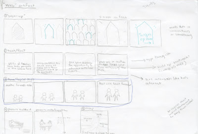
Make a website *slideshow.* I'm not sure what these are called, but they are the little parts of websites that only take up a portion of the webpage, and slowly shows different stories, panning or fading between them.
I'll be making 3 or 4 or these, and plopping them into a little simple mock-up website. The emphasis is not on the website.

Some ideas for the themes of these:
  • maps, with houses lighting up as people "sign up"
  • pictures of parents being relaxed (because kids are away with another family)
  • children playing together, going up together (time lapse)
  • car traveling to house
  • facts about parents and children
Continuing to think about this assignment, I am considering a variation of still images an animated ones. I mean, as a whole, it's going to be an animated series, but each individual piece could be still or animated.

Packaging - Almost done

Ethos appeal:
  • resolve the smaller text on the front
  • "Y" in "bunny" is illegible
  • check all the yellows, they do not seem to match
  • tail on back looks like a mushroom
  • change the text on the back so that it makes more sense
  • simplify
  • scissors are illegible
along with other fixin's.


Logos:
I've actually resolved everything from this packaging, aside from a few things. I still need to add the net wt. (on the other package too). Sean suggests I makes the bunnies brighter. I plan on asking a couple more upperclassmen for advice before finalizing this.