September 27, 2010

Modes of Appeal - Intended audience

Dove Milk Chocolate Promises - chocolate is a comfort food, but it's really a universal product. It's tough to think of what specific audience might be intended with these chocolates. BUT. Considering the way that the current packaging is handled:
-adult audience
-someone looking for higher-quality chocolate (as opposed to Hershey's)
-perhaps more geared toward women

Act Total Care Anticavity Fluoride Mouthwash - this is a hygiene product. Hopefully, everyone is concerned with hygiene.
-adult audience (taste is very strong. also, it's not alcohol-free, and most children's mouthwashes are.)
-someone who cares about more than just the average dental protection (unlike Listerine, this product rebuilds enamel instead of solely preventing cavities).

-parents looking for healthy food for their children
-people who like organic good

September 26, 2010

Logos-Ethos-Pathos Packaging

Logos - ACT Mouthwash
For the logical appeal, I chose a heath-related product. Seemed like a logical choice to make, since many health/hygiene-related products like to list their beneficial facts. Act is no exception. Who wouldn't use a product that can give so many positive results! :


Ethos - Annie's Bunny Grahams
Annie's Homegrown is a brand that likes to market itself as a healthier, more organic alternative to your average food product. This box of bunny grahams demonstrates this. The grahams have passed the test of the Whole Grain Counsel, good to know that Annie's is recognized by healthy organizations. But wait! This box isn't just a text of their character! You need to be a good person and make sure you recycle this box! Save the earth! A side panel of the box is devoted to talking about recycling. What a responsible company.

On a side note, after eye-balling the box on my desk for a while, I carefully unsealed the box and started to eat some of these bunny grahams. They taste terrible, like cardboard and chocolate with a nasty gluey aftertaste. I might just have to use the mouthwash to get the taste out.


Pathos - Dove Chocolates

Chocolate seemed like a logical choice for an emotional appeal product. Chocolate, in itself, is a pretty emotion-linked food. But if being chocolate isn't enough to make it emotional, these little chocolates are advertised as coming with little inspirational messages. You feel good while you eat your treat, and you can look at the wrapper later for an extra pick-me-up. Also, the language used on the packaging has its own feeling. "Silky smooth" chocolate sounds so comforting, and to top it all off, these chocolate squares are called "milk-chocolate promises."

The only promise I see coming out of this bag is assured weight gain. But hey, I'll be fat and happy.

September 25, 2010

Logos


Rough sketches. I ended up going with something almost identical to the text that I had on my research poster. Before doing the poster, I had actually tried something similar to the first sketch. But someone mentioned that it looked like a broken leg, ack. And the ones with the houses just look like...houses.
Small and large version. Seems to lose its readability/clarity as it gets too small. I'll continue refining.

Modes of Appeal Readings

Type and Image

Style as Message
Using pluralistic reinvention to add decoration and, more importantly, meaning to work. Taking references and styles from another time period is a way to add additional meaning to an image. From what I got from this reading, even if your try to create something that is "form follows function," the style that you are creating in (for example, the bauhaus' and their style) still has meaning, still has some sort of historical context. Pluralistic reinvention is when you extract from the vocabulary of form and expression from other times to create graphic resonance. So, decoration can't be pointless, because even decoration can have its own meaning.


Aristotle's Appeal

Ahhh, this semester continues to drag me back in to thoughts of my high school English courses.
Logos, ethos, and pathos are different modes of appeal used to persuade the audience.

Logos - Logical appeal. This is all about facts, facts, facts. Win the audience with a clear, clean, and logical explanation.

Pathos - Emotional appeal. This is probably the most personal of the appeals, and tries to tug at the audiences' heart. This could be through some sort of narrative, or shocking image. But you're trying to make the audience FEEL.

Ethos - appeal to personal ethics / character. Expertise, integrity, you need to seem credible.

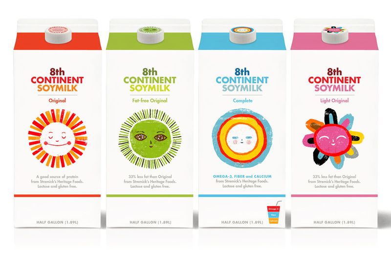
This will be a fun scavenger hunt at the grocery store!

NA Project Detail Narrative # 2

Unfortunately, I do not have an image reference to go with this post. I was negligent in documenting my work before turning it in. That aside, I will attempt to still talk about it without the visual aid.

For this round of the one-channel-only projects, I went along with the image channel. At first, I wanted to create some sort of story book showing the interaction of the audience (parents and their children) with one another. This was promptly shut down, but for good reason. I was thinking out of reach, given the short time frame. One very useful bit of advice that I gleaned from the peer discussion we had on Monday was that I didn't need to label what I was going to make. It didn't need to be a book, or a brochure, or a poster. This helped a lot as I tried to come up with something new.

The concept that I ended up coming up with was an interactive piece that showed a (potentially) infinite relationship that could be experienced by the audience of my organization. The two-sided piece visually told a story of two different families that traveled to one anothers' homes for different reasons, so that the children could have their "playdate." The cars that could be pushed across the board represented the lasting connection that the members of playdates could form. As one car was pushed across the page on one side of the board, at the same time the other car would be scooted back to the starting position (they were attached).

The Bad Plus - Final Product

Rhetorical Trope - Metaphor

The metaphor is a comparison between a storm, and The Bad Plus' music.

This is the final color scheme that I decided to go with, after a spending a lot of time with different color iterations. This version has a dark background and contrasting bold colors for the important elements. One thing that I kind of struggled with was finding colors that were bold enough to convey the strong sound of their music without making the poster look like some sort of indie alternative rock band.

I fragmented the text and the instruments to hint at the nature of the music, but particularly to The Bad Plus' live shows. In their performances, they often do a lot of improv, which to be honest, can sometimes become so much that it's unbearable (at some points during listening to their music, I just wanted to take my headphones off, they were so much!). But underlying all of that chaos was a complex harmony and synthesis of contemporary music with classic jazz. So, these fragmented images were meant to show this "controlled chaos."

Visually to help with the trope, and also make sure I was making this look like a music poster, I used the indexical objects of musical staffs as lightning bolts and music notes and raindrops. As the lighting bolts twist and turn, this represents the interaction of the band members with each other (even though there are 3 band members, I had 6 bolts, as only 3 did not really fill the page enough). The music notes are small, and even with their bright red color are not immediately visible if you just glance at the poster (while driving by, given the context that the poster will be in). But I still wanted to keep them as a smaller detail, something that might be noticed upon closer inspection of the poster.


Ta-da!

September 19, 2010

Understanding Comics - Reading

This reading was an interesting insight into the world of comics, but could also be applied to just about anything visual. Plus, since it was literally a COMIC about comics, it gave useful visual examples that might not have been so clear if it had only been in text format.

Our senses can only show us what is immediately in front of us. The rest of it is just assumed to be there. In the reading, this is called the "faith" that outside of what we immediately experience, there is more. Kind of freaky to assume otherwise. In the visual world though, (like comics, or a movie, for example) it is actually true that outside of what we see, there is nothing, and we just believe that there is more happening outside the frame or in the spaces in between. This is called "closure."

This "closure" device would be a useful tool in my narratives, as I could use it to challenge audiences to fill in the spaces that I leave for them. Since I'm thinking about doing image for my next detail narrative, it seems like using what comics call "gaps," or the space in between panels (or whatever visual spacer I have) would be the best way to make these spaces.

There are 6 types of closure:
moment to moment
action to action
subject to subject
scene to scene
aspect to aspect
non-sequitur

Design Help - 5 cents

Good F*ing Design Advice

It's like a little, foul-mouthed check list. For someone who is almost infamous for missing simple, but relatively common-sense mistakes, this is a fun little site to make you think about whatever you're working on!

September 18, 2010

Poster Rounds 2 and 3

Round 2:


Notes:
TYPE HEIRARCHY 1-2-3 : BE MORE CLEAR WHICH IS AT WHICH LEVEL, THERE’S NOT ENOUGH DISTINCTION RIGHT NOW.

“The” : Move it somewhere else, or make it a bit smaller, or bring it in closer.

The name does not need to span the whole page

Make the name more bold by changing the color, or making it bigger. just make sure it is visually different from “sept.”

Keep away from the edge, 1 inch border

don’t let stuff touch the banner, lift up the text

consider revising, removing some of the outlines on the instruments

color change between the different levels of type, to show the difference

clouds do not need to be cut all the way through every time.

keep in mind the color of the folly frame

red and yellow combination not working

don’t let the lightning cross over the type

work on the placement of the type in relation to the instruments

more color in the insturuments

type too scattered, stack more

Thanks a bunch to Vi, my official and proficient note-taker. I don't know how I would write all this down or remember it without her help. Between Monday and Friday, I spent a lot of time trying to work with the colors. That's something that I've had a lot of trouble with, it seems. I was also trying to clarify some issues with the type, and overall unify everything my removing stuff like digital craft issues and some details in the images, like overlapping layers and removing the music notes.

Round Three:


There was actually one more poster that went along with these, with another color scheme. But I accidentally saved over if while I was working on it Friday after class, fiddle sticks! It looked SOMETHING like this:

Anyway, this is the sort of color scheme that I decided to go with. Kind of dark? Yes. It's a lightning storm. But I am in the process of working out some of the color kinks (story of my life, apparently, haha!) Also, I am messing around with adding the band name back into the cloud at the top. But at the same time, I really like the formal appearance of the all of the text and instruments crashing together at the bottom of the page. We'll see how it goes. Perhaps another post before bedtime?

Tender Buttons - excerpts from the final


Tender Buttons!

The final poems were arranged through a method of verbal deconstruction. Each poem was read aloud, and then, using case, style, and changes in size, laid on the page in a manner that reflected the oral interpretation.

Minor mistakes, some small things I could improve on, but altogether I'm pretty pleased with the final product. Deconstructing so much text was a real challenge, especially since–being poetry–every word is potentially important. But (for a girl) I think I did a pretty good job of coming up with a concept, and then doing a good job of executing it and staying within a selection of variables to express everything visually.

September 15, 2010

NA Project 3 Detail Narrative


For this assignment, I utilized solely the channel of text to "narrate" the PlayDates mission statement. One thing that I found to be a challenge was the task of animating the text in a fashion so that it revealed more to the message than the words themselves. Through color change, movement and arrangement, I attempted to illustrate the mission statement with some special flares. I also tried to move the text in a quick, fluid manner so that it was read as one continuous thought, instead of broken up, unrelated phrases.

I constructed my narrative in a linear fashion, and only allowed the viewer to see smaller parts of the whole message as I revealed them. At the same time, I also allowed the viewer to "look back" at the previous portions of the sentence, or narrative, by keeping it at the top of the screen. This also helped unify the message as a whole, as mentioned before, in contrast to only being seen as pieces.

September 13, 2010

I want.

I Will Try Not To.

Very pretty, and pretty funny.

September 11, 2010

Everest F+S

You should go make a snack while this video loads. It's pretty long, but worth watching if you've got 15 minutes. :)


Traces the journey of three guys up everest. They produced the footage, edited it, and published it to the internet AS THEY WERE CLIMBING.

Props to men who are willing to take the time to video editing in the freezing cold, on top of a flippin' mountain.

September 10, 2010

The Bad Plus Poster Directions


So after the critique with Jamie today, I got some stuff to work on, and I've ruled a lot of these posters out. I'm going to continue upon elements that are in the last two posters shown here. I'm going to work on better compositions that combine different elements from both, like the lighting from the last one, and the fragmented type in the one above.

Also, I'm working on fixing the color palette, because these looks like indie alt rock band posters, not jazz posters. Fiddle sticks.

September 8, 2010

Narrative Poster / Final Print

I feel like this is a major improvement upon the last exercise. I try to use the houses in a community as a diagram to show how the "PlayDates" organization works. While Tyler said they look like arrows, and not houses, the idea is still there, I think. Plus, I added some photographs that might help further aid the communication of what the organization does.

Additional Tropes

Oops! Forgot to put these up. I only did 7 additional tropes, mostly because I felt like I had a pretty good grasp of what I was going to do before I started the half-sheet sketches. But still, sticking with one symbol (like triangle and rain) helped a with my elaborations on the different directions that I ended up going in.


September 5, 2010

Narrative Poster / preliminary research

  • historical references / recent precedents (what came before? what inspired this? how did this start? etc)

Playdates are a late 20th century innovation.[citation needed] Playdates are becoming part of the vernacular of popular culture and form a part of children’s "down time." Most parents prefer children to use these hours to form friendships by playing with other children either one-on-one or within small groups. When children are very young, most parents stay for the playdate and use the time to form their own friendships and parental alliances.
http://en.wikipedia.org/wiki/Play_date

Parents of both sexes are spending an average of ten or twelve hours less per week with their children than when they did in 1960. (Journal of the American Medical Association study, from The New Yorker.)
Forty-two percent of working parents are spending less time with their spouses. (Yankelovich Partners 1996 poll; San Francisco Chronicle 1/11/1998)

  • visual language/culture surrounding the topic
http://www.wahm.com/articles/play-dates-for-the-kids-scheduling-time-with-other-wahms.html
This article has been a HUGE help in helping me articulate all the information I want to cover. There are other articles on this website that have been very helpful. The site in general is VERY useful. Thank you, Work-At-Home-Moms.
  • sources of stylistic visual inspiration
Here's a few. I've got a whole little folder going though. I still like the idea of incorporating things that look child-made into the poster, even though the audience is more the parents. So, child influence, but ultimately speaking to the older audience.


  • objects or products associated with the topic
Any children's objects related to recreation and group play. Outdoor toys, games, craft supplies. NOTHING like TV, video games, anything that take away from a social experience.
  • diagram of a “participant’s experience” with the topic or organization (how do they interact with the topic, product, or service?)

Tender Buttons

Ok, so. For the Tender Buttons poems, my approach is reading each one aloud, and then attempting to convey the verbal version of the poems by arranging/casing/bold and italicizing so that they visually deliver the tone of the words as I perceive them to be spoken.Here's a spread of two separate poems, with the gridlines I'm working with shown on them. The size of the page that I'm using is 6x8.5 , and I've added a pretty big gutter around the whole page, leaving a lot of open space.

Narrative Video/ some process

Behold! Here are some of my notes, research, and thoughts pre-game to the actual making of the video. It took a while to work out what I wanted to convey through the 15-seconds that we were allowed (even though I didn't end up conveying it so well). I tried to figure it all out by writing down everything I could think of, and highlighting the most important things.


Then I tried to separate out while I thought that I could cover visually, and what I could cover through the audio.
Setting things up:
And once again, here's the video. While the still shots seemed to look fine in quality, and the actual process of making the stop motion wasn't that difficult, bringing it into the computer and rendering it into a video was pretty frustrating. But that's a technical issue, not something that had to do with the conceptual level of the video. I'll work harder in the next portion of this assignment to make sure that I more clearly define the points that we are suppose to cover.

Folly Poster Progress

YEAAAAAAH POSTERRRRS

So here are my three directions that I decided to go in for my rough sketches.

Personified with limbs
Upsidedown
Storm
As of this very moment, I'm still not sure what direction I want to go in. I really like all three, all to the same degree. I'll begin messing around with making some of them into more refined posters, and go from there. Here are some of my material tests:

The cut paper seems to have too much of a retro feel. But The magazine cuttings, with the bold colours and lines, work pretty well. Another option that I'll be exploring will be vector-based digital rendering. With such a contemporary group, and trying to appeal to the younger audience, vectoring will be an appropriate method of rendering, assuming I'm able to due the material justice.