October 31, 2009

My First Dictionary


My first dictionary is a clever website I check often for a good laugh. While working on the abstract pictures for visual communications, this site keeps coming to mind. These pictures are similar to our abstract shapes and can change meaning depending on how they are labeled.
I feel a little guilty laughing a some of the definitions, but the combination of childrens' book pictures with the words is just so funny. Plus, it's great to consider how far of a meaning change can be made by just switching the text out.

October 30, 2009

List of Objects

  1. Prisms (moonlight)
  2. paper stars
  3. earplugs
  4. bark (wood)
  5. eye dropper
  6. shoes
  7. feet
  8. pressed flowers
  9. lantern lights
  10. ice
Hopefully some of these will work!

October 26, 2009

Anatomy of a Visual Message

The Primer of Visual Literacy by Donis was a really informative read, and helped to clarify the distinctive differences between the three ways that we express and receive visual images.

Representational • Vs • Abstract • Vs • Symbolic

Representational images are mostly images like photographs, which are most successful in recreating a picture with all of its details intact. Realistic drawings and paintings can also be representational, but often tend to lean more towards abstracts. The intended meaning behind a representational image is just supposed to be the image itself, nothing more. But meaning is left for the viewer to decide, so sometimes even photographs don't have only one meaning. Dondis uses the example of a photograph of a bird-one person may see the image as a representation of bird, while someone else might interpret as a representation of flight.

Abstraction begins as the extraneous details are removed from a picture, and all that is left is the emphasized distinguishing features. It's an abstraction only conveys the essential meaning in an image, whatever it is. The visual message in an abstracted image is left up to the viewer to decide, and as opposed to a representational image, the meaning of an abstract one is a little more versatile.

Sybolism is the most simplified of the bunch. "Less image, more meaning" would be the most succinct way of explaining it, even though it's not nearly as easy as that. The visual data that is represented by the a symbol is important to consider as a designer, because of the vastness of the data. One point that Dondis made that I found particularly interesting was the fact that in order for a person to understand a symbol, they have to have previous knowledge about it. Without the education of the meaning, the 'code' of symbolism is completely lost.

Lupton's review of Dondis further emphasies the importance of visual literacy when creating symbols. I'll keep all of this in mind when beginning to sketch my thumbnails for my haiku. It's a lot to remember, but the readings definitely helped with understanding the differences between representations, abstractions and symbols, and I'll try to avoid representational images in my drawings.

October 25, 2009

Haiku and words

Crossing it Alone
in cold moonlight...the brittle bridge
echoes my footsteps.

Taigi

Crossing it alone
  1. crossing
  2. travel
  3. walking
  4. path
  5. passing
  6. over
  7. alone
  8. old
  9. lonely
  10. sad
  11. crying
  12. tears
  13. dark/night
  14. cold
  15. quiet
  16. singular
in cold moonlight...the brittle bridge
  1. blanket
  2. ice
  3. harvest
  4. moon
  5. brightness
  6. candlelight
  7. brittle/fragile
  8. moon/moonlight
  9. old
  10. bridge
  11. suspend
  12. crumbling/crumbs
  13. wooden
  14. transition/change
  15. water
  16. moving
  17. stability
echoes my footsteps
  1. echoes
  2. cave
  3. vast
  4. empty
  5. hollow
  6. noise
  7. footsteps
  8. feet
  9. shoes
  10. movement
  11. walking
  12. sound

Final Book

Oppositional pairs:

Here's my final book for the oppositional pairs. I feel like it turned out pretty well; printing on the Konica really helped with the quality of the images. I chose the pairs Stability-Instability, Contrast-Minimal Detection, Foreground-Background, and Depth-Transparency.


Putting the book together was a challenge, but it turned out pretty well in my opinion.

October 23, 2009

Final Statement - Project 2

a Tourist's Guide to Kansas City's Smaller Attractions


Like any city, Kansas City is full of tourist-oriented things to see and do. In this book, none of those things matter. These pages take a closer look at parts of Kansas City that often go unnoticed, despite their beauty. Shadows, cracks on the ground and weathered wood matched with line studies combine to make this book your own personal guide to the tiny lines of Kansas City. So stop looking where the signs and pamphlets tell you to, and explore your environment with a keen eye to find the linear details of everyday life with this line reference book in hand.

--------------------------------


So, the main focus of my book was on the smaller details of Kansas city, as opposed to a more architectural approach. Buildings are designed with their appearance and structure in mind, while these photographs contain objects that are less planned than that. These are images are unique to Kansas City but could also be universalized and the idea could be applied to any location.

Formally speaking, I chose to arrange my pairs so that they alternated from line study->image to image->line study. I also tried to arrange them in an order that created a sense of flow or movement between the pages, like one long continuous line throughout the whole book. So each half of a photograph is intended to complete the path or pattern into it's counterpart, and also interact with the pair it's touching.


For example, in this pairing I used one of my combined diagonal line studies and continued the pattern into the adjacent photograph. It feels sort of silly to explain something that seems pretty straight forward. Pretty much, I sorted through both my photographs and line studies, looking for similarities in the line structure, rhythm or direction. I personally had the most fun with the curved lines even though I ended up not having very many in my book. Cropping and framing isolated areas of the lines allowed for me to simplify their composition and match them with photographs more easily.


At first it was difficult to find pairs that created a conversation between each other, and I was just trying to match edges up between the two images. This might have worked just for the sake of piecing two things together, but all of those compositions were visually stagnate-they needed more than just to line up. But once I got the hang of it, creating dynamic comparisons through juxtaposition was something that became a really interesting challenge. Each half of a duo added information to the other half, so that 1+1 really added up to more than just 2! :)

The construction of the actual book was a lot more challenging that I expected it to be. Maybe I overestimated my ability to cut straight lines or measure accurately. But just like when selecting the images for the pages, the key to a good finised product was to created an excess at first, and then select only the best (square cut-outs, in this case) for the final artifact.

October 22, 2009

Sequential Process

Linear Process for project 2:
(click to enlarge)

This project was a great learning experience, not just because of the material we covered, but because of the process and evolution involved. In my opinion at least, having accumulative parts of the project made the final artifact more impressive than if we had been aware of what we were doing from the beginning. Plus, we gained experience with so many different mediums, which was greeeeaaat!

At the beginning it seemed like a straightforward "visual communications" practice, making simple lines reflect the given words. But as the days progressed, simple lines evolved into juxtaposed pairs quicker than I could realize.

Focusing on just the line studies, and then just the manipulations was a really intense and required us to pay attention to the fine detail of each. It was a little frustrating to create x amount of line studies that defined "balance" or "progression," and quite frankly, after a while all my mine started to look the same.

Tracings ➘
The tracing experience was something that I had a lot of trouble with, even though it seemed simple at first. It was like a paper version of photoshop layering, but without the undo action. I won't lie, I got terribly frustrated with all the problems I had with the tracings. Wobbly lines, uneven strokes, and dull pencils made doing the curve drawings really difficult. But I've gotten the hang of it now, and I'll do my best to maintain good line quality in my tracings in the future.


Vectoring ➘This is the only part of this project were I felt I might have an edge up, so it was almost therapeutic working on these. There's just something about zooming to max magnification and scooting anchor points that is so relaxing. It was also a good example of how detail-oriented this project was. One wrong angle or one misplaced anchor, and it was totally visible once it printed.


Photography ➘
You never have enough photos. Never ever. Exploring the city and taking pictures is really fun, and now at the end of the project I look at my environment as nothing but potential line studies. It's crazy to think that one school assignment changed the way I see things.

Another big part of this assignment was learning how to be really selective. Make more than you need of everything, and then work down from there, refining every tiny step so only the best make it to the end.

Having a project with so many elements seemed over whelming, but it all came together in a tidy little book, which is a pretty awesome way to present all our work. The book was definitely labour intensive, and cutting squares turned out to be a lot more difficult than I thought it would be. But the final piece is only the best of everything - clearest photos, smoothest line studies, most interesting manips, and squarest squares.

Scher Video

In Paula Scher’s video, she talks about how her designs often reflect the city that she lives in. Crowded, bold, and tall shapes define both New York City and her artwork. This seems to be an inevitability for every artist, although it’s in no way a negative thing.

This was a really cool video to watch, since it’s easy to relate to what Scher was talking about. While working on this project, I seemed to have a tendency to prefer my photographs of small objects or macro shots over those that were of large things like buildings. I’m fairly new to Kansas City, living here only one year, and my frame of reference for this city is mostly the area immediately around the campus. Even back home, I’ve always been intimidated by dense areas of city, and find details in small things in my immediate area to be way more interesting. Even after going into the business district of Kansas City and taking lots of pictures there, I seemed to prefer photos of staples poking out of a telephone pole more than glossy skyscrapers.


Even though this is interesting, it's also important to realize what I'm comfortable with in order to move away from it. It's cool to have preferences and tendencies, but getting stuck in one style could be bad since it would prevent me from moving forward.

Project 2 Reading Response

"Graphic Design: The New Basics" Reading on figure/ground - framing


The purpose of our line studies is an evaluation of positive and negative space and the interaction of these spaces with each other. The figure/ground relationship of the line studies aren't just important in themselves though, the photographs that we pair with them are informed by the lines. A photograph can relate to several different line studies, but each line study activates a different figure/ground relationship.

Without the line study next to it, the rounded shaped in the background of this photograph would be much less apparent. But the background becomes a dominant element of the photograph once it is compared to the juxtaposing round lines.

Scale is a really important element in the books we are working on, and cropping was a leading factor in enabling me to create dynamic photo/line pairs. Like in this pair, where the cropping allowed me to make a formal comparison of lines between these two pieces. And framing created by the images themselves create an additional divide, making it seem like 4 panels instead of 2.

Allan Drummond

Today in Western Thought II, a speaker came in to give us a lecture. I'm not sure how it related to the course, but it might be my favorite thing we've done in philosophy so far. The speaker was Allan Drummond, the chair of the illustration dept. at SCAD. In his lecture, he spoke about some of the books that he's published, and also his work experience leading up to where he is now. He started out as a journalist, then moved into graphic design work, and now teaches at SCAD and writes children's books.

Listening to him speak, and looking at his visuals was a nice treat, as it was a real-life example of things we have been learning in all of our studio classes. His work combined the elements of layout, type and copy, and illustration, which I found especially relevant to the books we've been making in VisCom and CDF.

On a more personal note, I absolutely LOVE anything related to children, ESPECIALLY children's books, so this lecture was really really interesting for me. At the end of class, he showed us pictures of students with their own books that they made in a children's storybook course at SCAD, and I was really jealous. Most of them were pretty nice, but you could tell who had experience with design and who did not (one of the books had wonderful illustrations, but the text was Comic Sans--I gagged a bit when I saw it). This just emphasizes the importance of being well-rounded, no matter what your specialty is, because something as simple as the wrong font choice can make something beautiful look like crap.

October 18, 2009

3 Found Color Ideas

Inside of a Craft Story (focus on fabrics)

The inside of a Hobby Lobby or a JoAnne is filled with lots of vivid colors, and I was thinking of focusing on the color combinations found in the fabric section of the store. Since the patterns on fabrics typically have limited color pallets, it would be a good way to study interactions of only a few colors at a time.

Toys

This would be a color study about children’s toys. I think this would be a really cool study, due to the really bright colors always associated with youth. Plus, there are always different colors schemes for different age groups and sexes of kids, so I think there would be a lot of variety.

Candies

Candies come in a plethora of different colors and are for the most part are really basic shapes. Macro shots of different candies or candy wrappers would allow for nice color studies, and really nice pictures too!

Iterationsssssssilicon


I could do these things all day. If I had time.

SILICONNNNN


Here's my rough sketches for the monograms in Typography. I got the element silicon, which is a really cool element with a lot of uses. Doing so many sketches was a lot of fun, and even though using the letter "i" is tricky sometimes, it was really interesting to make the letters fit together in many ways.


Now, we are working on iterations of 3 different sketches, refining the compositions and elaborating on the ideas. Wooo!

Oppositional Pairings

These are my final pairs for the Contrast assignment in CDF:


Foreground/Background

Contrast/Minimal Detection

Stability/Instability

Depth/Transparency


I got off to a bumpy start on this project, but I think I cleaned everything up in time to have a decent final product. I've changed a few of the photos, and cleaned everything up a lot. Before, all the photographs were really murky, but now they're more crisp and ready to print!

October 14, 2009

Title and Discription Options

Title Ideas:
  • Little Lines / Hidden Lines (in case alliteration is too hokey)
  • Looking Closely for Lines
  • Kansas City : The Smaller Attractions
  • A Tourist's Guide: Line-Finding in Kansas City
  • Paths and Photographs
  • Profiles of Kansas City
When walking around Kansas City, it is normal for us to notice the buildings, the people, and the attractions. But this book takes a closer look at the city, at things just as interesting, but not as commonly noticed. Lines are everywhere, and just as beautiful as the typical tourist attractions that draw people to the city. Cracks on walls, window panes, and shadows on the ground make up this book of the tiny lines of Kansas City.

Lines make up everything we see, but their beauty often goes unnoticed. Lines create shapes, then the shapes create the forms that we recognize as the objects around us. This books establishes the connections between the basic form--the line--and photographs of the complex forms from around Kansas City that show strong examples of line compositions in their structure.

F+S Project 2


This is a photograph taken by Matt Stuart. He does a lot of photographs like this where he finds these seemingly accidental objects that line up, similar to the one in the NY Times article. With his pictures, juxtaposition is extremely important, otherwise the elements in the scene would not line up to make a new meaning in the photograph.

October 11, 2009

Making it Storm

After a couple weeks of working with Ws, the project is coming to a finish. Here's a recap of the process, some of these pictures I've posted before in previous posts.

First, the cropped sketches of ours two font choices. We selected the most visually compelling sketches and put them into illustrator, using clipping masks to frame them. These final choices were then taken to the next part of the process.


Images were imported into the files. The subjects of these images had to start with the letter we chose, and together they had to make some sort of connection. I chose weather and windows. These are my favorite compositions from each font-I decided that for the next step, images of closed windows were preferable over open ones.


At the same time, we were creating 8-step sequences between the two compositions, showing different ways in which one letter could transform into the other. Some of the methods used were twisting, scaling, and moving the letters off the frame.


All of these were compiled into Adobe Flash, where we used the sequences we did to help animate the letters. Learning the program was tricky, but well worth it; putting letters in motion is an interesting project, and allows you to explore the shapes of the letters more than static images can. He's my final result, with a little added sound to go with it!

W Flash from Kelsey Anderson on Vimeo.

October 9, 2009

Group Crit (Karen and I)

Here's the progress I've made on the line study project since Wednesday and the notes that correspond with the group crit.

  • Projection quality? The image is too gray, needs to have a higher contrast so it can have purer colours.
  • Straight lines in projection versus softer shapes.
  • good compostion! :)
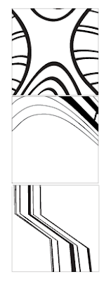
I put this one first because it is my favorite out of the new pairings! During the crit, there was discussion about whether or not when cleaning up the lines, I should transform the dots back into hard-edged squares, or somehow leave them rounded. Personally, I like them better when they are rounded, even though they're not "line" studies since they're not crisp. I've done a couple tracings with the hard-edged version, and it just seems to not match up quite as well.

  • Consider iterations on the juxtaposition of the images
  • boost contrast in image, it's a little muddy
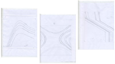
This was one of those images that when put in front for critique, there was a long silence. It's an interesting image, and there's definitely some conversation going on between two sides, but we are both unsure if it works. I had these two pictures during the very first crit in class, and Jamie suggested to "keep them in the mix." I really like both the line study and the photograph, so I want to try and make them work together. Karen suggests that I continue to explore the images in relation to each other, changing their orientation to see different outcomes. I plan on doing this, and having a group of iterations to choose from, if any of them work.

  • adjust line orientation
  • top right corner, crop out the floating bit of image?
Even though these lines in this don't all line up, enough of them make solid connections and the spacing of them is similar to the photograph, so the pairing works pretty well. When doing the tracings for this line study, I cropped out a lot of fuzzy edges, which made the lines thinner, which I think will help connect the two halves into a more cohesive composition. Also, a point was made about the top right corner of the photograph, where there is a bit of something floating by itself. I'll make a version of the composition with it cropped out, but I am going to keep this version too, because I'm not sure if it really needs to leave the image!
  • not working
I think the only thing to say about this is that it is very much a failed attempt. It wasn't even worth critiquing, so I just flipped past it. I don't know what I was thinking, sorry.
  • add some horizontals?
  • better than first line study paired with it, but try to find another one that's even closer
  • lots of tracings
Ok, this one will make more sense once I scan and upload the tracings for all these pairings, which I will do later today. I just want to write down all the comments on these and save them here before I forget them during lunch. For the line study, what I am trying to focus on is the large curved shapes that appear to be emerging from each side of the image. The thinner lines I might not use, or if I do use them, I will only use a few. I'm trying to bring attention to the curved ceiling in the back of the photo, not the checkered lattice in the foreground. I'm really struggling to find a suitable line study to go with it though. Karen suggests to make a few variations on the tracings, and look through my line studies as I'm working on new pairs, keeping an eye out for another one that could work.


  • Mess with the levels in the photo, it's a little too gray
  • top bar on line study - remember to remove it in tracings!
  • Match angles (maaaaybe)
Ok, so I had actually already done the tracings for this one and I edited out the black bar along the top of the page. But it was good that she suggested to remove it before she saw the racing for it-I knew I was on the right track! I'll edit the photo so it's not so gray; I'm having trouble with clear images today for some reason! The angle change from one image to the other came up, and I'm not really sure that I want to rotate the lines so the sloping angle matches with the photograph. I think it looks fine with the change, especially since it changes twice in the line study, and the on the border between the connect. Plus, if I change the slope in the line study, I would cause the vertical lines to go crooked, and not match up with the window panes anymore.


Overall, I'm becoming really frustrated with this project. I feel like I'm not producing enough pairings fast enough, and the ones that I am making aren't that interesting. I'm going to take some serious photography time later today, and tomorrow to. I think now that I know what I'm taking photos for, I will have a better idea of things to look for-like diagonal and combined lines on buildings or nature instead of 20 pictures of spider-web cracks on the ground and tangles of wire. Today did help me a lot though; I went around and looked at other people's lines after we were done with the group critiques. Looking at what everyone else is doing really seems to make things make sense, and I get ideas and inspiration-if you want to call it that- from looking at something fresh (my eyes are tired from fliping through the same photos and lines over and over and over).

So this weekend, I'm gonna grind out a lot of photos and pairings! And HOPE FOR SOME SUNSHINE! :)

October 8, 2009

Compilation of Flashwork


Flash Practice from Kelsey Anderson on Vimeo.

Here's the beginnings of some flash stuff. Still working on the final though! Just practice pieces for tweening, fading. and rotating. This was also a good way to figure out how to upload on Vimeo.

Project 2 Reading Response/Progress Report


Juxtaposition of lines to create depth, space, rhythm or shape


While working on the line study pairings, I'm trying to keep in mind the ideas discussed in the reading (which I am late on posting about) in the Graphic Design: the New Basics book. Juxtaposing my line studies with the photographs has proven to be pretty tricky-it's not just about matching up corresponding line weights and directions, as I thought it was initially. The pairs are a lot more interesting-and tell better stories-if I pay more attention to the less obvious similarities.

This random straight line study is not mirrored in any way, in fact, to be honest, I didn't check to see if the lines in each image lined up at all. Even if they don't match up, the rhythm in each is similar. It's almost as if the random line is reflecting the overall texture of the woodgrain.
Individually, these two images give off a completely different feel, and I flipped past them while looking for good pairs without considering their relationship several times. but once I laid them down next to each other, and worked on the cropping of the photograph, the lines from the photograph created a path from the line study that gave the combined image a more interesting composition. Plus, the pipes in the photo translate into line study, giving a sense of shape and depth to what would otherwise be a flat image.

October 1, 2009

Lette Image Placements

These are a few examples of the project we're currently working on in typography.

So far, we have chosen a letter, and then two different fonts. After arranging the letters in 3x3 cropped compositions, we sifter through to find our favorite ones that best represent the letter and the fonts.


Now, images relating to the font (here I am using "weather" and "windows") are masked into the compositions, and we will begin using flash to transform from one font to the next.


These still need some improvements, but the general idea is there. :)