
December 17, 2009
December 10, 2009
Bitmap


December 9, 2009
Taxonomy

Final taxonomy! I made a little sleeve for it, and hopefully it will hold up. In the end, I didn't make any changes to the book other than making its title sleeve. If I were to re-do anything, I would reprint all of the pages, but I'm a little skeptical to pour more time and money into the konica when I have a sneaking suspicion that one of the reasons my images got more and more blue as I printed was because of the black ink levels. The images were not all so terrible that I needed to redo the three books, anyway.


Here are some examples of the pages inside. With the perfect binding method, I was able to place images across the spread, which is something I would not have been able to do if I had continued with the stab-binding.


I got a little silly with these pictures, but I'm pretty proud of my sleeve, so I wanted to show it off a bit! :)
Final Statement
Final Evaluation:
 For the final assignment of the semester, it's hard for me to think of this as anything else besides an accumulative learning process, in which it was important to revisit the earlier lessons in order to aid in the production of this latest project. A lot of the time, in a fast-paced class such as visual communications, it's easy to get caught up in the rush to produce adequate amounts of work and focus on meeting deadlines. Sometimes while pushing to complete all these things, I forgot the basic concepts from the beginning of the year, and because of it my work suffered.
¡ BUT !
About halfway through, I realized what I was forgetting, and from then on attempted to be mindful of what I had learned in regards to the haiku project. And even before that, there were a few things I did right, even if I hadn't realized it! :)
As to the principles and practices, I've learn how to communicate...visually? No no, just kidding. I feel as thought I made a lot of progress in learning how to:
Critique of older piece:
 This is one of the earlier pairings for the line book. The reason I chose this one is because, looking back at all the works, this is one of the pieces that gave me the biggest "what was I thinking!?" feeling. When we initially began pairing the photographs with the line studies we had done, I tried making rather bland match-ups like this one. This pairing, to begin with, is visually very ugly. On top of that, the photograph and the line study do not add anything to each other. Even if I had gone along and digitally edited the line study, smoothing out the curves, it would still be a visually boring image that lends nothing to its partner. There's no conversation between these halves aside from the fact that they are similar in shape. This was an unsucessful attempt at creating a link between two incompatible images.
 For the final assignment of the semester, it's hard for me to think of this as anything else besides an accumulative learning process, in which it was important to revisit the earlier lessons in order to aid in the production of this latest project. A lot of the time, in a fast-paced class such as visual communications, it's easy to get caught up in the rush to produce adequate amounts of work and focus on meeting deadlines. Sometimes while pushing to complete all these things, I forgot the basic concepts from the beginning of the year, and because of it my work suffered.
¡ BUT !
About halfway through, I realized what I was forgetting, and from then on attempted to be mindful of what I had learned in regards to the haiku project. And even before that, there were a few things I did right, even if I hadn't realized it! :)
- Mind Mapping : I begin this project by mind mapping each individual line of the poem. This is something that we learned in the dot project, to help us dig deeper into the topic, and also come up with more surprising ideas that we might not have thought of otherwise. When it came to mind mapping the haiku lines though, I realized there is a point where the ideas are too far reaching. I will keep this in mind from now on.
- Iterating iterations of iterated iterations : Thank goodness for never using the first ideas that pop into our heads. Or at least, thank goodness for giving yourself something to compare them to. With all of the project this semester, and not only in visual communications, iterations saved my projects from being shallow and poorly developed. It's good to have choices, and it's good to try and consider other versions of an idea. For the dot book, we did countless amounts of thumbnails to refine and clarify our compositions. And also with the line studies, using the initial pairings as stepping-stones, I was able to learn from their critiques and make better compositions as I better understood the assignment. Time allows for more understanding to sink in, and our iterations are like a physical indication of this.
- Being Selective : This kind of goes with iterations, but I feel like it makes a more direction connection between the animation and the line studies. I could have done iterations of my haiku symbols all day, but being selective about them was a process in which I had to consider all the elements of the project in relation to the image I was choosing. In the line studies, the objective was to make photo/line pairings that not only matched, but also added to each other--completing a conversation--and were still visually pleasing. In the same manner, choosing the final icons was something that wasn't just about what looked good. Each symbol was chosen out of a group of icons (see the project evolution for examples) because it best reflected the meaning behind the line of the haiku.
- Just letting things happen : This was the most fun part of these assignments, for sure. The serendipitous nature of the projects was something that I was new to, and learned a lot from. Having line studies magically line up with photographs, and having unorthodox tools accidentally make better marks than I ever could have thought out on my own was a big learning experience, and something I'm going to try to incorporate as often as I can in the future. In general, getting away from mechanical tools like computers and their programs was a breath of fresh air.
As to the principles and practices, I've learn how to communicate...visually? No no, just kidding. I feel as thought I made a lot of progress in learning how to:
- problem solve
- focus on process as much as the final artifact
- better articulate concepts and ideas using a formal vocabulary
- recognize individual elements combining to make a cohesive whole
Critique of older piece:
 This is one of the earlier pairings for the line book. The reason I chose this one is because, looking back at all the works, this is one of the pieces that gave me the biggest "what was I thinking!?" feeling. When we initially began pairing the photographs with the line studies we had done, I tried making rather bland match-ups like this one. This pairing, to begin with, is visually very ugly. On top of that, the photograph and the line study do not add anything to each other. Even if I had gone along and digitally edited the line study, smoothing out the curves, it would still be a visually boring image that lends nothing to its partner. There's no conversation between these halves aside from the fact that they are similar in shape. This was an unsucessful attempt at creating a link between two incompatible images.
December 8, 2009
Haiku : Project Evolution
Here is the linear evolution and the final artifact for the haiku project! Hopefully the transition from sketches to mark making, then from the marks to the final animation is pretty clear. And this time the animation exported with *almost* no snags! :)


Crossing it alone
in cold moonlight...the brittle bridge
echoes my footsteps
in cold moonlight...the brittle bridge
echoes my footsteps


Final Haiku from Kelsey Anderson on Vimeo.
Music credits: "The Windmill's Tale of the Music Box Floats Through the Air. Riding the Windmill" by Unwed Sailor
December 6, 2009
Final Photos
These are the final photos for the color book! I've printed and cut them all out except one, the contrast of saturation, which I'm have a bit of trouble printing. Tomorrow, I will begin construction of the actual accordion book.


December 2, 2009
November 29, 2009
Matching Colors
 Here is my attempt at the PMS to CMYK color matching, it was pretty tough! The first set of colors are the printed ones, and the second set are the color-aid colors. It seems like the cmyk colors are all a lot more saturated than the ones I'm trying to match them too, so I need to work on toning down the brightness. And of course, there is some color tweaking that needs to be done too.
And these colors are my attempt at an RGB match-up. It's not as easy as I thought it would be, although it was easier than the CMYK version. Using the color chooser, it was nice to be able to change each variable ever-so-slightly. Nudging saturation or value or hue, one little digit at a time. It was also a nice way to see how the hexadecimal color-coding system works.
Line-Shape-Tone-Texture
Line Shape Tone Texture

For the colors, I used the opposites blue-green and blue-green and red, and then for the final section I used Munsell's vertical score. I particularly like the gradients and textures. They were the most time consuming to make, but they also came out as the most visually appealing.

November 25, 2009
Animation Progress
Edited: it's up finally! :)
Haiku Progression from Kelsey Anderson on Vimeo.
November 22, 2009
Fill in the Missing Pieces
 Here's what I've got for the color study photographs (click for a larger, clearer image.) Now it's just a matter of filling in the blanks! Triad shouldn't be too difficult to find, and then I just have to choose one more Itten color contrast, and a few Munsells. I imagine the color scores will prove to be the most difficult, given that my subject matter typically has high-chroma colors only (who wants to eat gray candy, blech.) I'm doing one last sweep through the candy-saavy places around here, then I'll finish this up while I'm on the (kind of) break! :)
November 18, 2009


Final storyboard and text stills
Here are my final transitions for the haiku animation storyboard:
The arrows are not part of it, they're just to help see the movement of the little man across the page.


The arrows are not part of it, they're just to help see the movement of the little man across the page.


November 14, 2009
New Attempts at Web Layouts
So after not being happy with the layouts that I made Wednesday, I tossed everything and started from scratched, trying to make some new ones.

.jpg)
.jpg)

.jpg)
.jpg)
November 13, 2009
Color Photographs
Here's this week's batch of color photos!
 Munsell's color circle
 Harmonious hue, value, and chroma

Extension of color: R & G

Monochromatic
 Munsell's color circle
 Harmonious hue, value, and chroma
Extension of color: R & G

November 12, 2009
Bitmap vs. Vectors
Bitmaps
Bitmap images are pixel based, and can support hundreds and thousands of colors per image. This allows for a great amount of detail and tonal quality to be achieved. The millions of pixels create a very rich image, and cannot be detected unless you zoom in.
Pros:
Vectors are shapes that consist of points, lines, and curves. They are mathematical images, allowing for more manipulations. These images are made in computer programs.
Pros:
Bitmap images are pixel based, and can support hundreds and thousands of colors per image. This allows for a great amount of detail and tonal quality to be achieved. The millions of pixels create a very rich image, and cannot be detected unless you zoom in.
Pros:
- more colors available for each image
- details are greater
- each pixel can be manipulated, allowing for a lot of freedom when editing/altering an image.
- an image cannot be enlarged past its original size, or the computer attempts to create the missing data where there are no pixels, resulting in a fuzzy/blurry image.
- pixelation of an image also occurs when you try to manipulate or warp it
Vectors are shapes that consist of points, lines, and curves. They are mathematical images, allowing for more manipulations. These images are made in computer programs.
Pros:
- retains its quality, no matter how much the image is enlarged
- can be filled with solid colors, gradients, and even patterns
- ideal for things that need to be represented in multiple colors and sizes, such as logos
- typically very simple in comparison to bitmaps
- look rather flat
November 11, 2009
Final Marking Selection
Here are the two final versions that I am considering for my haiku:

Currently, I'm leaning toward the one on the right side. I feel like it's got more texture and completes a more cohesive set of images than the dense "nighttime" symbol on the left. I'll continue on with this second set of images for the animation storyboard.

Currently, I'm leaning toward the one on the right side. I feel like it's got more texture and completes a more cohesive set of images than the dense "nighttime" symbol on the left. I'll continue on with this second set of images for the animation storyboard.
Time and Motion notes
The most basic differences between having a flat image and having an animation is that animation allows a time-dependent exploration on changes in scale, transparency, color, and layering. Backgrounds and images can each move or remain fixed, allowing for different changes and interactions in the environment in the different layers over a given period of time.
The production of an animation begins with a storyboard, where the most important parts of the animation are laid out. This includes notes on the camera angles, soundtrack, movement, and transitions. Style frames are another essential element to the production or the animation, and contains information on the typography, colors, patterns, illustrations, and photographs to be used, along with the aesthetic tone and other formal elements.
Animation works due to the term "persistence of vision," which describes how the brain retains an image longer than it is actually shown, so when many images are shown in rapid succession, it appears to be moving. When making an animation, "key-frames" are the important frames that define the sequence, often located at the beginning and end. All of the in-between frames are called "tweens." Tweens can be automated by the computer programs, but doing tweens by hand allow for cleaner edges, better quality of motion, more accurate details, and greater control of the subtle elements.
Change in position, rotation, scale, shape, color, depth, and transparency over time are all elements of an animation that can be altered, and it's often some combination of those that make a successful sequence. It's important to note that when animating text, it is especially important that these elements to not remove the legibility or change the reading order of the text.
November 10, 2009
F+S Project 3

This is a cover for the album Sounds from the Alps made by Rudolph DeHarak in 1961. The three strokes signify the Swiss Alps, but they also have the dual purpose of representing sound waves. It's a pretty straightforward comparison to our mark making process, and a good example of using symbols as universally understood shapes.
Taxonomy Proposal
For my book of marks, I would like to do a Japanese binding to mirror the haiku, which I would like to incorporate into my book. For the dementions, I am kinda still stuck; I like the idea of having a smaller (more pocket-sized) book, like 6x6. But I'm afraid that with such a small format, the book would become rather thick, so maybe a large 9x9 size would be better?
As for the organizations, I would like to sort them first by the tool they were made with, in relation to the line of the haiku they're from.
Line 1: Crossing it Alone

The white outlines would not be in the actual book though, those were just to help me remember to stay away from the edge where it would be bound, since you tend to lose a lot of the page in Japanese page binding.
Here are a few things I'm not sure about; things I'd like to jot down so I don't forget them:
Denotative
Connotative
As for the organizations, I would like to sort them first by the tool they were made with, in relation to the line of the haiku they're from.
Line 1: Crossing it Alone
- footprint
- eye dropper
- ice
- wood
- lantern
- glass
- shoe 1
- shoe 2

The white outlines would not be in the actual book though, those were just to help me remember to stay away from the edge where it would be bound, since you tend to lose a lot of the page in Japanese page binding.
Here are a few things I'm not sure about; things I'd like to jot down so I don't forget them:
- Is 12 marks to a page too many?
- black background or white? I did the thumbnail in black but now I'm leaning towards white/ @_@
- still considering other book formats, perhaps O-binding that would allow for two-sided pages?
- paper weight thick vs thin
Denotative
- density
- dark
- light
- large
- tiny
- geometric shape (circular, box, triangle)
- cleanliness
- movement
- tool used
- clarity of tool
Connotative
- haiku line mark corresponds with
- loneliness
- cold
- brittle
- movement
- traveling
- sadness
- noise
- strength
- weathered
November 9, 2009
Color Correcting
Thank goodness for photoshop, it's like my backup set of eyeballs. As we learn color correcting tools like the Hue/Saturation box, Selective Colors, and Levels/Curves, it's crazy how much nicer my colors can look. I tried to make some gif animations to show the changes in a few (although they are a bit subtle).
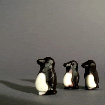
Like my penguins looked a little red, but with selective colors I was able to get rid of it!
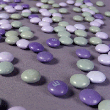
And these M&Ms were supposed to be gray, but the looked rather green.
Like my penguins looked a little red, but with selective colors I was able to get rid of it!
And these M&Ms were supposed to be gray, but the looked rather green.
November 7, 2009
Not Quite
The element layouts are really coming together nicely! Comparing them to my first set of tries, the improvement is exponential.
This is the overall favorite of other people:
This is my personal fave (fir the first one is slowly growing on me):

Other one:
They all still need some tweaking, but they're definitely closer to being acceptable. :)
This is the overall favorite of other people:

This is my personal fave (fir the first one is slowly growing on me):

Other one:

They all still need some tweaking, but they're definitely closer to being acceptable. :)
Color Color Color
Here's what I've got so far for the color photography! It's pretty easy to see which color combination each is (I hope). Initially, my theme was candy. But as I continue to take photography, I'm considered the idea of broadening the theme to something like sweets? I'll sit on the thought a bit longer though before I decide.
Triad

Achromatic

Color Vibration


By the way, I don't expect to eat all this candy, so once I'm done with it, it's a FFA for whoever wants some. :)
Urge to Make
The article "The Urge To Make Things" was a refreshing and interesting read, and I found myself agreeing with everything that Leo Lionni was saying in it. The simplicity of being able to use our hands to make something is a wonderful thing, and Lionni says it perfectly when he calls it "that magic moment of pure making, when suddenly all interface vanish, leaving the hands free to perform their assigned task swiftly, lightly..."
While working on the mark makings this week, I've been reminded of the line project a lot because of how we are looking for connections between our marks and our symbols the same way we tried to match our lines with photographs. But personally, the haiku project is more fun. Using unorthodox tools to make our stamps and smears and spots is an almost therapeutic process. Just allowing the tool to do it's own thing, then discovering serendipitous markings that are similar to our symbols is a "magical moment." I think I prefer the more hand-made projects over the ones where we have to spend lots of time in front of the computer.
While working on the mark makings this week, I've been reminded of the line project a lot because of how we are looking for connections between our marks and our symbols the same way we tried to match our lines with photographs. But personally, the haiku project is more fun. Using unorthodox tools to make our stamps and smears and spots is an almost therapeutic process. Just allowing the tool to do it's own thing, then discovering serendipitous markings that are similar to our symbols is a "magical moment." I think I prefer the more hand-made projects over the ones where we have to spend lots of time in front of the computer.
November 1, 2009
CDF update
So this week we finished up with Itten's colors, and now we are moving on to Albers. I don't have any good photos of my work for this post, because my camera recently broke, and I was too dumb to remember that there is a scanner in studio that I could have used. Anyway, Albers.
Working on the Albers color relations is like working with color maaaagic. Turning 3 colors into 4 colors, or 4 colors into 3, it's interesting to see the effect that colors have on each other. Scanned examples to come later today, or tomorrow morning.
October 31, 2009
My First Dictionary

My first dictionary is a clever website I check often for a good laugh. While working on the abstract pictures for visual communications, this site keeps coming to mind. These pictures are similar to our abstract shapes and can change meaning depending on how they are labeled.

I feel a little guilty laughing a some of the definitions, but the combination of childrens' book pictures with the words is just so funny. Plus, it's great to consider how far of a meaning change can be made by just switching the text out.

Subscribe to:
Posts (Atom)