November 23, 2010

Readings and Analysis.

I Do Declare.

From this article I gathered that the biggest thing that you need to do when making a presentation is keep the audience in mind the WHOLE time. Also, a little personalty always helps things.

  • Show your outline to the audience from the beginning. It's good to let people know what's coming up.
  • If you can't talk that well, then let the visuals do the bulk of your talking.
  • Be unpredictable in your voice and gestures and style.
  • Combine formal language with informal talk. Makes people feel more comfortable.
  • Give the right amount of information at once. Not too much or too little; enough to keep attention, but not overwhelm them.
  • Tell jokes through your visuals. Humor makes people comfortable (the right kind of humor, at least).
  • If you have to read, keep it short. No one has a long attention span for that. Plus, you're messing with their inner voice that's trying to read what you're reading at the same time.
  • Lastly, let your audience know how long your presentation is, and how far you are into it.


Be Selfish

Know your audience.
You don't want to talk down to or talk above your audience. Providing definitions and explanations will help everyone be on the same page.

Hierarchy
Verbal and written communications should support each other and not be redundant. People cannot process something read and heard at the same time, so try to get information that complements each other.

Visually Engage your Audience
Keep things simple and legible, and give your audience a system so that they can predict where essential information will show up on each slide.

Use you Audience
Create and outline that focuses on the feedback that you need. Start and conclude with the main points you want to make, and guide the Q&A by listing the points that you want to discuss.

Capture Feedback and Reflect
Notetakers! Got one of those! Also, write a reflection of how you felt it went right afterwards, to keep things from slipping away, and try engaging interesting question-posers in conversation after the presentation.


  • Uses simple graphics, they're not pretty, but they are direct.
  • Short slides, concise but interesting statements that go along with each slide
  • Cute jokes that are relevant to the subject, but they make the audience more comfortable and interested
  • he knows his subject, has technical fact (but they're explained well so that everyone can understand them)
  • he makes personal anecdotes, shows that he's interesting in his subject. very enthusiastic.
  • numbers his points, so you have an idea of where he is in the presentation.

November 16, 2010

Narrative: Simplified Communication Model

So after turning in my model in class on Monday, I felt like I still was not satisfied with several of the elememtns of my communication model. After a lot of scooting and nudging, font-changing and color-sampling, I'm pretty satisfied with this new one.

I took some of the details/descriptors out of the model. I think that for this project, I want that information to be reveal instead of already given to the viewer. I'm excited to try and animate this into a non-linear, interactive model.

November 10, 2010

Project 7

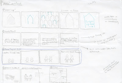
To begin, here are the three animations that I put in the the webpage mock-up. The first one is a type-only piece, second is a mostly image animation with houses, and the third is an illustrated animation also with a bit of text. I tried to give them all three different kinds of imagery, but kept them all in the same style.

Text Fact from Kelsey Anderson on Vimeo.


House from Kelsey Anderson on Vimeo.


Growing Up from Kelsey Anderson on Vimeo.


And here is the videos placed into a fake webpage. I didn't go ahead and make a full-out webpage, since that wasn't really the focus of my project, but I did add some shapes and the organization logo to try and simulate some of the noise that would be on a real webpage. The animations would rotate through, and loops and continue to play until the viewer moved to a new page. The best way I can think of describing it is like a web reel.

Web Mock-up from Kelsey Anderson on Vimeo.


This was an interesting challenge since I was making a series of animations instead of only one. I have to take into consideration which style and colors for each would be most appropriate, but at the same time still unify them as a series. I'm satisfied with the cut-out, flat style of the animations, although Frankie made a good point about needing to refine the copy. The primary audience for this the parents, so I need to reword things to make them sound more professional and dependable.

During the production, I had a lot of trouble with timing. I worked this out by asking other people in studio "Is this slow enough now?" over and over and over. I seem to have a problem with making everything too fast.


Storyboarding really helped me on this project (with the exception of text being too fast) because since a lot of my stuff was originally hand-drawn, it let me know every piece that I needed to get ready before I even opened up affect effects. It also helped with the digital rendering, and getting all of the layers in the correct order before animating.

From a technical aspect, I'm still working one learning After Effects. I had some troubles getting started, and all of my issues were just from lack of understanding how the program works. In comparison to working in Flash though, this is light years better.


Edited Logo Build from Kelsey Anderson on Vimeo.

And my logo build. I've got the visual aspect down but could add a few things. I need to add the actual name, "PlayDates" to the logo build somewhere, since you don't know what PD stands for otherwise. Also, some sort of sound could help.

Poverty Simulation Brainstorming

Karen and I had a blast thinking of solutions to some of the problems we found with the impoverished community during the simulation. while we were working some of our thoughts out though, we did run into a few bumps in the road, mainly because of the roles we played in the simulation. In our "families" we were both children, so we did not get the experience of being an adult. We plan on filling this knowledge gap by interviewing people that were adults.


These simple models were what we made to tried and organize our thoughts after we did all our mind mappings. The three directions we came up with were:


The school incentive turned out to be a bit too much. And we were kind of having trouble finding a good design solution. Oops. So we'll be dropping the school idea, and elaborating, refining, and trying to work out our other ideas, while creating a new one.

November 7, 2010

Koenig Layouts : Round 4? 5?


If you can't tell, I'm a huge fan of the illustrated images. I sucked the colour out of all of the images, and did a little correcting to make them have higher contrast. And no, I am not going to make them duo-tone images. They will remain black and white. My Pull-out quotes are a vibrant orange, and I've got blues for the titles. Still tweaking the colors, and I also need to add some images from outside the ones given to us. I seemed to have read over this requirement initially. womp womp.

Narrative Reel Pieces

Untitled from Kelsey Anderson on Vimeo.


Working out the kinks. 2/3 animations down, just gotta plop the last one into illustrator and make it move. Also, I still need to make the fake website frame to drop it in to.

Busy week.

Communication model

  • needs title
  • feedback dots need to be something else, too many dots
  • need to show a directional element at the beginning
  • some people seem to read along the feedback path before reading the actual model
  • shadows too harsh
  • channel is blocking the message
  • "receiver" is not the appropriate word?
  • improve color pallet and type

November 2, 2010

Communication Skeletons

So, my digital compositions seemed be be the more successful of the models that I made. The analog compositions were too literal, using only one scenario to illustrate the method of communication.
I learned a lot about the communication process during the critique, just as much as I learned through the readings and other material we looked at over the weekend.