 Here's the neeeeew version of the designer poster! I freshened up the color, vectored all the wire framing, and changed the "Information Landscapes" perspective a bit. Tiled and ready to go for a last crit before sending it to the plotter!

Showing posts with label Typography 2. Show all posts
Showing posts with label Typography 2. Show all posts
May 2, 2010
Finishing things up!
Here's the neeeeew version of the designer poster! I freshened up the color, vectored all the wire framing, and changed the "Information Landscapes" perspective a bit. Tiled and ready to go for a last crit before sending it to the plotter!

April 30, 2010
Poster improvements

A few things noted:
have some bright yellow lines that mimic the website lines?
line weights are thick when it is too big
colors are dust and organic, need bold synthetic colors, change the bg to black
outline her name and see what i looks like, magentaaaaa?
maybe try wrapping the text like the top building image?
title messed up, fix it
bottom building drop a bit more
Time to get to work!
April 29, 2010
New Posters
DEMENTIIIOOONNNNNNNNNNNNN
 woooosh. Ok, still adding a lot of dimension with these, but trying to clean them up a bit! No more photos, although you can still see the buildings in them, not too abstract. Now I gotta figure out the text! Gonna try doing it digitally and analog, seeing what works to get the dimension.

 woooosh. Ok, still adding a lot of dimension with these, but trying to clean them up a bit! No more photos, although you can still see the buildings in them, not too abstract. Now I gotta figure out the text! Gonna try doing it digitally and analog, seeing what works to get the dimension.
April 25, 2010
Muriel Cooper Posters, Plus a Laugh
Here's my first shot at the Muriel Cooper lecture posters! For all of these, I tried to keep with the look and feel of her work with the Visible Language Workshop that she taught for twenty years, instead of her earlier, more concrete work.


I'll be continuing along the lines of the first and third versions, the versions with more dimensionality and spaaaaaace. Time to refine!
And now for the joke!


My first attempt at using the press! I think it's pretty clear from this that I need to pay more attention!
April 2, 2010
Magazine Spreads - playing catch up
Image heavy post!
I've been a bit behind on my blog posts lately, shame on me! Anyway, I don't want to STAY behind, and I don't want to skip what's been done already. SO: here's all the layouts that I've not posted yet! The past three rounds for magazine spreads, all blurring together in one post.
FIRST ROUND
V1.


 V2.
V2.


There were a lot of problems with the first set of spreads, beginning with their size! I got stuck with the idea of tiny spreads, and they evened up looking more like book pages than magazine pages. Plus, I also made my text too tiny. 8pt garamond is not readable (even though it totally is :P ). I need to stop making things tiny enough for dolls, and start making things for people. Also, In these articles, I want to note that I used an article about the new food pyramid system. I am NOT using this article anymore! It was an interesting read, and kind of relevant, but I think that the new text that I found is more
SECOND ROUND
V1.


 V2.
V2.
 V3.
V3.


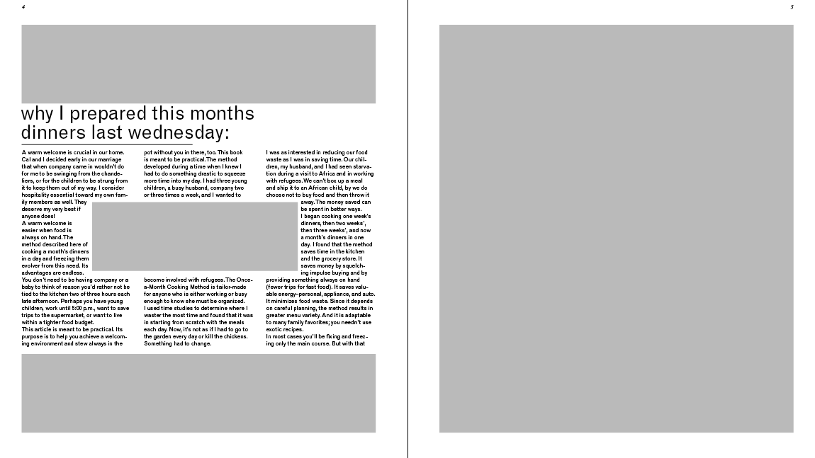
This round contains new material that is about making a month's-worth of meals in one day, so that all your meals are all planned out. I like this text better because it will go well with the information that I collect for my information graphics. Both the page size and the font sizes are easier on the eyes in these versions. I tried to play with 2 and 3 column layouts here. In the end, the layout that I decided to expanded upon is the V2 layout. I was partial to the 3-column style , and the layout of the left page of the 3rd spread. Pretty proud of it, even though it still needs some tweaking.
THIRD ROUND


 Here's the version that I came to class with today! Well, I have more iterations, but since they are all similar, I just chose one to represent them all. I've still got the same left-hand page that was in the previous round, with some minor changes. Where I have the egg right now, it a possible spot for an information graphic, as is the blank square on the facing page. so I don't forget:
spread one: Move the title away from the top edge, it's too close. Give a bit more space between the o and the k, to account for the fold of the page. Try moving the small text to the bottom of the right side of the page, so that it creates more of a flow. I like this advice, since it would not only move the eye across the pages, but also to the bottom corner where you turn the page to read on!
spread two: All the bars that are below the titles in this article need to conform to the width of the body text. I learned that rule today! I could also give it some more space, too. Varying the length of the type columns is also something that I'm going to do; I seem to like boxing things in--too much conformity to the grid is boring!
spread three: I'm going to mess around with the list in this section, and see if I can manage to get all the section titles to line up with each other. I'll also play with the text, maybe bold some stuff, whatever. :)
These are some things that I will continue to keep in mind, along with some other notes that are written on my spreads. I think I'm making some good progress, and it's very exciting to see these pages turning out nicely!
March 22, 2010
Magazine Research
Links for Type articles and research!
http://ezinearticles.com/?Tips-to-Avoid-Common-Cooking-Mistakes&id=3922763
http://www.cookinglight.com/cooking-101/techniques/cooking-questions-tips-00400000064986/
http://genealogy.suite101.com/article.cfm/creating_a_family_cookbook
http://johnteshblog.typepad.com/john_tesh_blog/2009/05/simple-ideas-that-might-save-your-cooking-mishaps.html
http://genealogy.suite101.com/article.cfm/creating_a_family_cookbook
http://ww.streetdirectory.com/food_editorials/cooking/recipes/the_worlds_best_recipe_article_ever_written.html
http://chestofbooks.com/food/recipes/De-Graf/Everyday-Mistakes-In-Cooking.html
I also have 3 essay-stories from a book that I checked out from the library, and a magazine article from Food Network Magazine.
March 12, 2010
Final Applications
Still have a lot of things to fix.


The video keeps skipping and messing up when I try to upload it as a .mov file on vimeo, so I'm going to research into how to fix that tonight. I don't really want to upload a seven second video that skips most of itself. Blech! Also, something seemed to get buggy when I exported the video, and the night portion of the interstitial didn't blink like it's supposed to, even though all the keyframes are still on the right layers.


The video keeps skipping and messing up when I try to upload it as a .mov file on vimeo, so I'm going to research into how to fix that tonight. I don't really want to upload a seven second video that skips most of itself. Blech! Also, something seemed to get buggy when I exported the video, and the night portion of the interstitial didn't blink like it's supposed to, even though all the keyframes are still on the right layers.
March 5, 2010
Now For You Local Weather Update!
Stuff to fix:
I need to work on making the backgrounds of these images darker, or making a little dark spot, to support the text so that I don't need to use the banner, which looks really awkward. I also need to continue to work with the type. I used helvetica in the billboards, and impact in the buses, just to continue messing around with them. I'm not sure what font I want to use, but I'm sure I don't want to use either of those, haha. I'll continue looking.


Stuff to fix:
Again, the type is going to be change. I know that impact is way to cheesy, I was just trying to play around with the density of the text and squishing it as much as I could. Also, again, I need to find dark spots to arrange the text in, so that the type is readable. In addition to that, I'll be reducing the size of the logo on the background, even though I kind of like a huge and obnoxious it is.


And here's my first try at the interstitial! What a funny word! I had a lot of fun with this, and I'd like to think that I've got a good start and am going in the right direction (with a lot of stuff I need to work on, of course). Flash is a pain in the tush, but I have to admit it's growing on me. Maybe it's the motion graphics though, and not the program, haha. It's almost silly to upload it, being that it's only 8 seconds long, and without being able to loop it it's hard to see everything in such little time.
Notes to work from:
I need to work on making the backgrounds of these images darker, or making a little dark spot, to support the text so that I don't need to use the banner, which looks really awkward. I also need to continue to work with the type. I used helvetica in the billboards, and impact in the buses, just to continue messing around with them. I'm not sure what font I want to use, but I'm sure I don't want to use either of those, haha. I'll continue looking.


Stuff to fix:
Again, the type is going to be change. I know that impact is way to cheesy, I was just trying to play around with the density of the text and squishing it as much as I could. Also, again, I need to find dark spots to arrange the text in, so that the type is readable. In addition to that, I'll be reducing the size of the logo on the background, even though I kind of like a huge and obnoxious it is.


And here's my first try at the interstitial! What a funny word! I had a lot of fun with this, and I'd like to think that I've got a good start and am going in the right direction (with a lot of stuff I need to work on, of course). Flash is a pain in the tush, but I have to admit it's growing on me. Maybe it's the motion graphics though, and not the program, haha. It's almost silly to upload it, being that it's only 8 seconds long, and without being able to loop it it's hard to see everything in such little time.
Weather tests from Kelsey Anderson on Vimeo.
Notes to work from:
- wind is like lighting, it's moving around too much!
- the snow needs to only go in one direction, it's also doing too much.
- tagline is ugly. Maybe make it one line or something, but it needs to change.
- think about using different fonts (I sure am having trouble with fonts on this.
- too pretty or something? someone mentioned this, and I wrote it down, but looking at it now I have not idea what it means. :(
February 26, 2010
Type Experiments
Here are some of my corrections and new versions for the weather types. I'm beginning to finish up with all of these, an begin merging them on to the billboard and bus templates. First, I'll probably make a few more cloud images. The theme that I'm trying to do for is the "worst of conditions", specifically at night. I haven't quite worked out a tagline yet. Anyway, I need to switch up some of the words in the cloudy composition now, since "fluffy" and "wooly" aren't exactly terrifying, dangerous words.

The snow composition is almost finished, I'm just going to add a few more teeny word 'flakes.' I don't want it to look like a pathetic snowfall, but I don't want it to look like a blizzard either. I want the words to be clear enough, and still look quiet.
 Done with night! I think I've done all that I'm going to do to this little guy. I added more words, and made some drastic scale modifications. I also added a slant to everything in an attempt to give it a little extra depth. There's no danger in this composition, but that's because in respect to the narrative of the series, this is the beginning, where there is no danger yet.

WIND! This is my favorite weather piece, for sure. These were made in camera, and now I'm beginning to composite them into one massive, scary image. I added in the colored version of the first image, just for fun. Purdy, right? Anyway, this also shows who I've chosen as my news channel--CNN. Given the serious nature of my weather types, I don't think I want to use any of the other channels. CNN is serious business.


The snow composition is almost finished, I'm just going to add a few more teeny word 'flakes.' I don't want it to look like a pathetic snowfall, but I don't want it to look like a blizzard either. I want the words to be clear enough, and still look quiet.
 Done with night! I think I've done all that I'm going to do to this little guy. I added more words, and made some drastic scale modifications. I also added a slant to everything in an attempt to give it a little extra depth. There's no danger in this composition, but that's because in respect to the narrative of the series, this is the beginning, where there is no danger yet.
WIND! This is my favorite weather piece, for sure. These were made in camera, and now I'm beginning to composite them into one massive, scary image. I added in the colored version of the first image, just for fun. Purdy, right? Anyway, this also shows who I've chosen as my news channel--CNN. Given the serious nature of my weather types, I don't think I want to use any of the other channels. CNN is serious business.


February 20, 2010
CHANGE ONE THING. Then change another, and another.
So I just sent in my submission of the Change One Thing poster competition. Gotta admit, whenever I submit something, it's just a bit nerve-racking. Anyway, this is the final version of the poster, scribbles and all!
 My intention with this poster was to incite people to want to garden, no matter where you live! Urban gardening is in an upward trend, and for good reason. It's a great way to save a little bit of money on the groceries, eat better, avoid the chemicals of store-bought veggies, and relieve the stress of everyday life (watering and tending to plants is therapeutic, you know)! Most importantly though, you don't need an fancy-schmancy garden to plant your produce in, almost any household object can be made into it's own plant pot (like a shoe, for example!). Also, I added a link to a reliable, easy to navigate site that has a lot of helpful information on urban gardening.
Here are some of my early versions and iterations that got me to where I ended up (click for a bigger, more detailed image):

 My intention with this poster was to incite people to want to garden, no matter where you live! Urban gardening is in an upward trend, and for good reason. It's a great way to save a little bit of money on the groceries, eat better, avoid the chemicals of store-bought veggies, and relieve the stress of everyday life (watering and tending to plants is therapeutic, you know)! Most importantly though, you don't need an fancy-schmancy garden to plant your produce in, almost any household object can be made into it's own plant pot (like a shoe, for example!). Also, I added a link to a reliable, easy to navigate site that has a lot of helpful information on urban gardening.
Here are some of my early versions and iterations that got me to where I ended up (click for a bigger, more detailed image):

February 6, 2010
Design Process
This article helps a lot with the designing process, really breaking it down piece by piece. While the importance of process is constantly emphasized in studio, Meggs articulates each part of the process really well, which only further helps understand the significance of it all.
In relation to the project we are currently working on, the step on information gathering seemed to really pop out at me. While working on our Change One Thing project, collecting information on the topic that we chose is imperative to the outcome of the poster. The article mentioned that as a designer works on an assignment, they made need to look up more information than what they gathered at the beginning. This is a big part of trial-and-error--if you continue in the same direction without the proper information, then you're going to get stuck in a rut as your idea hits a dead end and become stagnant. This kind of happened to me earlier, and looking up more stuff about my topic, urban gardening, really helped me gather more ideas. I'll continue to look back on this reading as a template for the creative process.
In relation to the project we are currently working on, the step on information gathering seemed to really pop out at me. While working on our Change One Thing project, collecting information on the topic that we chose is imperative to the outcome of the poster. The article mentioned that as a designer works on an assignment, they made need to look up more information than what they gathered at the beginning. This is a big part of trial-and-error--if you continue in the same direction without the proper information, then you're going to get stuck in a rut as your idea hits a dead end and become stagnant. This kind of happened to me earlier, and looking up more stuff about my topic, urban gardening, really helped me gather more ideas. I'll continue to look back on this reading as a template for the creative process.
February 5, 2010
Change One Thing Posters


 These are the three new posters that I made for the Change One Thing competition. To be honest, I feel like I have no idea what I'm doing. I know what I want my subject to be, but my posters are obviously lacking. I tried working with the cut paper again, and I guess it looks ok, but it doesn't look super interesting in the end result. Adding the message is where I seem to get really stuck, which is er...bad, since it's the point of the poster. It's been a tricky week.
January 27, 2010
Change One Thing
The three themes I chose to pursue for the Change One Thing poster are:
- spending time with your children
- give yourself a personal project
- learn a new word everyday
I wanted to focus on topics that were less politically/socially charged, but still important to everyday life. Particularly though, I decided to focus mainly on the first one. Taking time out of one's day to spend with their kid is important, and I'm not just talking about the fun stuff. I mean to help with homework, to be present at their sport games and stuff like that too. It's a vague idea still, but I'll be spending today working thoughts out a bit more clearly and working on the poster sketches!
Relevant reference pics:

Relevant reference pics:

Subscribe to:
Posts (Atom)