
Image heavy post!
I've been a bit behind on my blog posts lately, shame on me! Anyway, I don't want to STAY behind, and I don't want to skip what's been done already. SO: here's all the layouts that I've not posted yet! The past three rounds for magazine spreads, all blurring together in one post.
FIRST ROUND
V1.


 V2.
V2.


There were a lot of problems with the first set of spreads, beginning with their size! I got stuck with the idea of tiny spreads, and they evened up looking more like book pages than magazine pages. Plus, I also made my text too tiny. 8pt garamond is not readable (even though it totally is :P ). I need to stop making things tiny enough for dolls, and start making things for people. Also, In these articles, I want to note that I used an article about the new food pyramid system. I am NOT using this article anymore! It was an interesting read, and kind of relevant, but I think that the new text that I found is more
SECOND ROUND
V1.


 V2.
V2.
 V3.
V3.


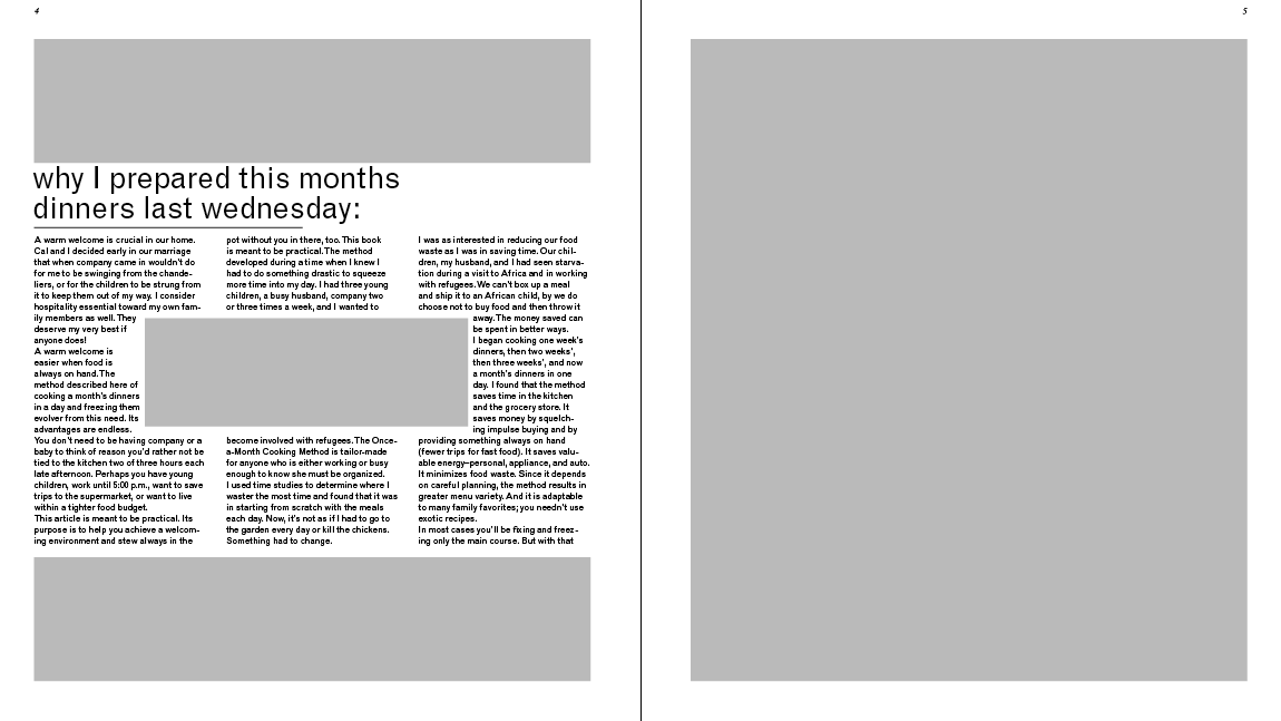
This round contains new material that is about making a month's-worth of meals in one day, so that all your meals are all planned out. I like this text better because it will go well with the information that I collect for my information graphics. Both the page size and the font sizes are easier on the eyes in these versions. I tried to play with 2 and 3 column layouts here. In the end, the layout that I decided to expanded upon is the V2 layout. I was partial to the 3-column style , and the layout of the left page of the 3rd spread. Pretty proud of it, even though it still needs some tweaking.
THIRD ROUND


 Here's the version that I came to class with today! Well, I have more iterations, but since they are all similar, I just chose one to represent them all. I've still got the same left-hand page that was in the previous round, with some minor changes. Where I have the egg right now, it a possible spot for an information graphic, as is the blank square on the facing page. so I don't forget:
spread one: Move the title away from the top edge, it's too close. Give a bit more space between the o and the k, to account for the fold of the page. Try moving the small text to the bottom of the right side of the page, so that it creates more of a flow. I like this advice, since it would not only move the eye across the pages, but also to the bottom corner where you turn the page to read on!
spread two: All the bars that are below the titles in this article need to conform to the width of the body text. I learned that rule today! I could also give it some more space, too. Varying the length of the type columns is also something that I'm going to do; I seem to like boxing things in--too much conformity to the grid is boring!
spread three: I'm going to mess around with the list in this section, and see if I can manage to get all the section titles to line up with each other. I'll also play with the text, maybe bold some stuff, whatever. :)
These are some things that I will continue to keep in mind, along with some other notes that are written on my spreads. I think I'm making some good progress, and it's very exciting to see these pages turning out nicely!
No comments:
Post a Comment