
 I arranged the paper shapes into the different letters of the name "Atypeical" and photographed them at varying angles. My initial idea was to make the whole symposium name out of these shapes, and maybe make it into a workable logo. The concept behind it all was again the idea of the many parts or players that came together to make this symposium, including the class and the people who come to the symposium. But after laying them out all together, I was unsatisfied with how it all came out. It looked like a cross between a beehive and an icecube tray! Luckily I did glean some stuff from the individual photos.

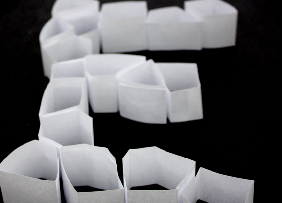
While the letters together seemed like a mistake, the individual letters very really interesting! It created a nice texture, nice dimension, and were visually interesting. It was after making these and laying them all out that I thought that traditional text would best suit these.
No comments:
Post a Comment