

 The patterns are one of the directions that I am continuing with, although the need a lot of work. I need to work on all the the text, and on unifying the colors, keeping things ucluttered, etc etc.

 These photo are something that I plan on working into the pattern series, making a hybrid of them!
 woooosh. Ok, still adding a lot of dimension with these, but trying to clean them up a bit! No more photos, although you can still see the buildings in them, not too abstract. Now I gotta figure out the text! Gonna try doing it digitally and analog, seeing what works to get the dimension.


 The final set of book covers are finished now, complete with their own little books to wrap around. From the last round of revisions, I changed may things, but most of them were tiny details meant to help unify them as a set of books.
 Don't Try This at Home is a collection of short stories told by chefs about their mistakes made before they became successful. It relates to my icons and my story because of a the disaster aspect of the short stories. To convey the theme of the stories on the cover, I combined a stop sign with a rather unappetizing piece of food. This combination of normally unrelated objects makes a message of warning.
 Good Housekeeping's Family First Aid is an instructional book focusing on first aid you should know for accidents that might happen around the home. Because of it's family-oriented theme, it seemed appropriate to show a children's toy patched up with a band-aid, an easily recognizable object related with the medical theme.
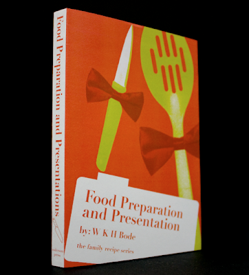
 Food Preparation and Presentation is another instructional book, this time about the art of food presentation. Even though it's a pretty formal topic, I decided to go with a lighter kind of image, adding bow-ties to cooking utensils. I tried to keep away from actually showing food on this book cover, since it would have been redundant, both because of the title and also because of the food images in 2 of the other book covers in the set.
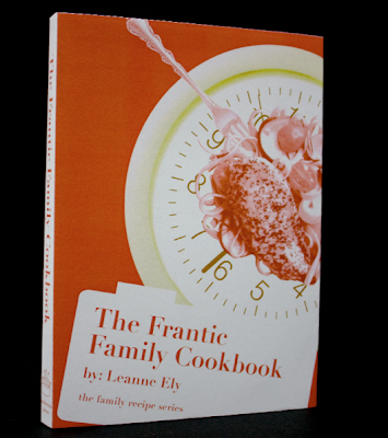
 The Frantic Family Cookbook is a recipe book containing fast, healthy meals for busy families. Again, I wanted to avoid being too redundant with the title, so I avoided showing a family, or children, or recipes from inside. Instead, I used a clock to indicate the fast-paced theme of this book, but used it as a plate on which one of the meals is placed.
 By juxtaposing seemingly unrelated images using a simple plain background, bold complementary colors, and clear imagery, these book covers are meant to represent their contents by hinting at their overall theme.
 For this infograph, I took the information from a magazine article. It was a very useful article, with lots of factoids about food, and then a timeline of food that a person ate over the period of two days. On one day she snacked all day, and on the other she planned out her meals. The purpose of the information is to convey the importance of forethought when it comes to eating.
 For the first step of the graph, I needed to just get the information down on paper, and give it some organization. The idea of meals around the clock is formed, but at this point there's no hierarchy or real system to it.
  These two versions play with a more refined version of the clock (although that clock is not a good clock to use). The icons are used as a coding system instead of just standing with random blurbs of information. The pizza box is used for poor choices, and the carrots are used for good choices. There is color coding in this stage, as well.

 Ta-da! This is the final that was added to the magazine. It is a gate-fold that flips out from the second spread. In this version, I attempted to resolve the issue of the information divide by added bars to the top and bottom, that echo the shape of a recipe card. The bottom portion still needs some resolution, but it's gotten a lot better!
 Ew gross! So for this one, I changed the food in the middle and added a little red in the shadows. I also added a bar across the food to make it look more like a warning sign!
 Again, I added mixed the colors in both the clock and the food. I'm getting more confident when it comes to mixing the colors, and figuring out how mixing them can add more depth.


 KITCHEN MAP
 This one is a map of a kitchen with clean-up and safety tips. It is color coded, with the icons being used as the key. I'm not going to be using a drawing though! I was also playing around with using a montage of photos all placed together, buuuuut that's not looking to good. Here's the digital translations:
 From this version, I like the organization of the information at the top of the image, although I need to put the information in a 3-column grid like it is in my article.
 Once again, I need to pay more attention to the infographs and article as ONE unit instead of separate projects. This information is SO MESSY! I will be cutting down the information in this graph, changing the colors to match the icon colors, and changing the text so that it is unified with the text in the article. Also, the text needs to be in grids that will match the article. This particular infograph might become a gate-fold page, or a fourth spread. I'm not sure which at this very moment, we'll see how the day treats us, but I'm hoping for the gate-fold. This graph has enough information in it that it could be an article of its own.