October 21, 2010

Initial Koenig Layout

So here's the first stab at the Koenig page layouts. One text-dominant, the other image-dominant. I wanted to reflect the form of his architecture in the combination of the image and text. Moving forward, I will be using a more complex grid, and will probably be putting text on the page more sparsely, leaving lots of nice pretty white space.

Newer Logo Build

Edited Logo Build from Kelsey Anderson on Vimeo.


Can you spot the differences between the first logo build and this new one? It's just some tiny tweaks. But, I think I'm pretty much done. I would like to consider adding some sound, maybe a little bit of children's laughter at the end, but so far, I'm having trouble finding just the right sound clip. Anywho, it's time to get moving on the next part of the assignment.

October 19, 2010

Packaging - Pathos

For the pathos appeal, I'll be working on an interactive box where a child can cut the Annie's Homegrown mascot, Bernie the Bunny and decorate him with objects found around the house. I wanted to try and keep with the idea that Annie's is all natural, and on the original box they stress recycling the box.

Again, working in an analog form has been a lot of fun, but along with all the other corrections and refinements I need to make to this package, I would also like to play around the text some more.
Anyway, I need to first focus on giving Bernie Bunny a purpose. And more more more illustrations.

Mailer Documentation

Oops, way over-due, here's the mailer. The two typefaces that I chose were Baskerville and Avenir. I chose to mostly represent them through a more abstract means, with curls for Baskerville and more geometric shapes for Avenir. I also added the birds, each made from one of the typefaces.


The inside is the portion of the mailer that shows the different typefaces listed out. This is also where I played around with the overlay, as well.

Logo Build Process

Ok, so here's the BASIC draft for the 5 second logo build. Now that I have the general motion down, I want to try and make it a little more lively. Right now it's preeeetty dull. I'm thinking by using things like ease and a couple other little tricks, I can keep the same story but add a little snazz.

Packaging - Logos


Sketches from the venn diagram:
I tried to play around with losing the circles, and making the graph out of bunnies. A valiant effort, but not too successful. Bunnies only have so many body parts you can nudge together with adequate space between them to put pictures inside.

And here are some of the bunny wheats that I drew out before going along with the one that is starred (in the middle). This is the direction that I will be moving forward with.
I'm really excited to be doing so much analog work for this project, but I realize that I really need to finesse my craft so that it looks like it is made for a child, not by a child.

Takuya Hosogane

Wooooah.


Vanishing Point from Takuya Hosogane on Vimeo.


October 15, 2010

Annie's Bunnies - Repackaging Progress

Continuing with the research/sketching for the Annie's Bunny grahams! Since all of my stuff seems to have a lot of analog/drawing, I've been looking up lots of pictures as reference. Not gonna lie, it's hard work.
Some of my image findings. This is probably the worst thing EVER to look up pictures for, every image is linked to a site of more cute, cute, cute pictures! Very distracting!


So, here are the first round of full-sized ideas. I mostly focused on the logos appeal.

made with whole wheat - bunny-shaped wheat
Made with whole wheat - bunny farmer
Fact listing - eating hay/grass (scrapped) ((still think it's cute, just not the best idea for this project)
Made with whole wheat - intertwining (too elegant for children's food–scrapped)
Venn diagram - wheat + chocolate = bunnies
Here are a few of the materials I was considering using. Since it is all natural, and also it is for kids, I would like to try and keep the packagings at least somewhat hand-crafted. Paper cuttings, drawings, even using textures.

October 12, 2010

Logo Build

After finally working out my logo, and colors; here is the final logo:
And here's the logo build that I'm moving forward with, followed by the other sketches that I did. This was a little tough, I found, and Ian pointed out during critique, to create things without creating additional meaning. SPECIFICALLY: Two circles combining could be translated as something a bit more intimate than I would like to convey. Also, having the ascender and descender of the P and D grow, at any point, could be considered abstractly sexual. This might just be our young, wild minds going to far, but none the less. I will do my best to make this 100% innocent. No growing, no 'hooking up."


October 10, 2010

Revised Logo? Perhaps

So, the first logo that I made was pretty awful. I don't really want to do a several-weel-long project on a terrible logo. So, I've redone it!
I'm not sure if I want to have the "Playdates" text along the bottom. I keep changing it around, then deleting it altogether, and I'm not sure at all. Here are some color variations:
I really like the idea of venn-diagrams lately. Out of all of these color choices, I'm most drawn to the 5th one, with the pale orange and blue. But I do want to avoid having a color scheme that avoids leaning towards 'boy' colors or 'girl' colors, and also avoiding having one 'boy' and 'girl.' More variations to be done.

October 8, 2010

People Centered Design

Mike McCoy's lunch lecture was an interesting exploration into the way that we as designers come up with the designs we make, from bouncing them around in our heads, to putting them down in some physical form, to the final presentation to the audience (the people).
One thing that I really go a lot out of was the portion of his lecture where he talked about quickly producing your rough ideas. Getting ideas out into the open is something that is essential to our process. Group brainstorming (with the sticky-note method) or some sort of comprehensive mind-mapping.
Also, bringing some quick, easy to use, easy to modify materials to help present your idea is essential for revising successfully. The example that McCoy used was cardboard and duct tape. If you make a box to a client, take it to them, and they say the size isn't right, then you have to go back to your studio to make changes. But if you came with the supplies, you could quickly produce a makeshift object that still conveys the idea.

Use this check-list -
  • actors
  • activities
  • artifacts
  • atmosphere
Design is a zoom lens.

On creating ideas:
  • looking
  • asking
  • envisioning
  • trying
  • short looping process

F+S - Packaging

From my packaging folder - I'll try to find the sources, but some of these are from a while ago.

Logos - instructions on the front of the package! For noodles, I think?


Pathos - These little chocolates appeal to my feelings by showing themselves as little button-eyes of cute animals! "Daaaaw" factor!
Ethos - This says it is Swiss. These pictures look very Swiss. The imagery leads me to trust that it is authentic, and telling the truth. Plus, anything in a collectable tin box has authority, they're just too cool.

Rendering Possibilities

Together with Vi!

Logos
  • photography
  • vector/digital
  • text-dominate
  • hand-drawn
  • limited color palette
  • white space/informative images
  • simple type
  • symmetry
  • bold/clear (easy to read)
  • formal looking
Pathos
  • handcrafted
  • fun, bold colors
  • image dominant
  • dramatic lighting
  • water color
  • crafty supplies
  • expressive type
  • interactivity
  • active imagery
  • minimal type
Ethics
  • vector shape
  • clean typography/formal
  • simple color palette
  • serifs (time-appropriate)
  • grid system
  • hyperbole/allegory/parody
  • all natural materials
  • collage
  • vector/photo combos

Packaging Concepts


Annie's Chocolate Chip Bunny Grahams

First, here's my logos approaches:

#1 - facts listed
With this version, I'm going to be listing many good reasons why it would be beneficial for you to purchase bunny grahams. In this example, I've got the facts listed at the bottom, in the form of blades of grass. I like the idea of created an environment for these graham bunnies.
#2 - Made with Whole Grains
For this concept, I'm playing around with the image of wheat to show that this snack is in fact, made from whole grains. I need to play with scale some more, and ways to integrate the type, lots of other things. But this is the idea that I have the most iterations on so far.
#3 - Venn Diagram / math-related
This is one I'm really excited to play around with some more. whole grain + chocolate chips = bunny grahams!
And for pathos:

#1 - huge bunny character face
This would be pathos by making it interactive. I've begun experimenting with some materials for this, and I'm looking at things like kids snacks and cereal boxes for ideas.
#2 - Theater/puppet show?
This might be too similar to the idea above, if I don't play it off right. This plays off of the kids imagination, and has to do with childplay.
#3 - Terrified Bunnies
This is pretty self-explanatory.

October 4, 2010

Combined Channels - Final Deliverable


For the combined channels assignment, I was tasked with using my type channel (which was digital) and combining it with the image channel (which was not). As you can see, the last result was, at the least to say, nothing special. This project gave me a lot of frustration, for several reasons.

First part of my aggravation was my own doing. Because my text was digital, I for some reason thought that there wasn't any real way to switch it to a static form. Being the kenetic, time-based type that it was, I thought that I would keep the type as an animation, and the image channel as the element that changed mediums. Kind of like a football game, type was the home team and image was the visitor (that's about the extent of my football knowledge, too). Anyway. I tried to scan in , digitally render, and place my drawing from the previous project into the flash document that was already existing. This did not work well, because the previous flash was white text, and making the drawings white (and subsequently cohesive) made them practically invisible. Not to mention, the level of detail that was in the drawings did not translate well into the flash file, making things a little hard to make out.

Having the text and the images run simultaneously didn't work out in the final. I STILL made the text move too fast, and it's impossible to view both channels at the same time, leaving the viewer confused and having to watch it multiple times to get all the information. Additionally, compared to the water-coloured pictures from the original image channel, these digital rendering make the drawings look really...bad.

The second part of this project that I had problems with was the technical aspect of what I chose to do. I kind of mentioned the frustration with the digital medium already, but more specifically, I guess it's the labour-intensive, not-quite-rewarding experience with Adobe Flash that made me want to rip my hair out. The best part of making an assignment in Flash is being halfway through with a project, importing some images, seeing that it looks terrible, and knowing that you don't really have the time to start the whole thing over. So instead, you spend the rest of your time (which is a lot) working on a project that–at best–will be mediocre. I know I'm whining, and this project was just incredibly unsatisfying. It's something that I will not want to ever put in a portfolio, and I don't think any amount of fixing and tweaking could salvage this thing. Narrative in general seems to be a class that I'm just not grasping. < /grump>

October 2, 2010

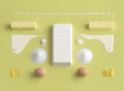
Ikea's Recipe Book


While wandering through all of the blogs and websites that I like to visit the past couple weeks, I've happened to stumble upon this new recipe book for Ikea several times. These photographs blow my miiiiind.


Photos by CARL KLEINER

Styling by EVELINA BRATELL


October 1, 2010

Narrative - Combined Channels Storyboard

Here's a sample of my beginnings of the combined channel project. The channels that I used previously were the text channel and the image channel, so now I am going to attempt to combine them in an animation. I'm also going to attempt to fix a couple of the smaller issues that were in my past project (although I don't really have enough time to correct some of the bigger issues).

Flash flash flash! Everything is all story-boarded out, now it's just time to sit and twiddle around with frustrating programs, whew!

Modes of Appeal Round 1 sketches


After working on all of these thumbnails, it's pretty clear that I've got some issues visually showing ethos and logo. Way to be boring, redundant, and predictable, Kelsey. Anyway, Moving forward with the Annie's Homegrown Bunny Grahams, as this is the product that I had the most success with.

Because the original packaging turned out to actually be a little ambiguous as to what appeal it was (dominantly), I'll be doing a page or two of ethos appeal, and going to the next step with all three appeals in for these little bunny snacks.

September 27, 2010

Modes of Appeal - Intended audience

Dove Milk Chocolate Promises - chocolate is a comfort food, but it's really a universal product. It's tough to think of what specific audience might be intended with these chocolates. BUT. Considering the way that the current packaging is handled:
-adult audience
-someone looking for higher-quality chocolate (as opposed to Hershey's)
-perhaps more geared toward women

Act Total Care Anticavity Fluoride Mouthwash - this is a hygiene product. Hopefully, everyone is concerned with hygiene.
-adult audience (taste is very strong. also, it's not alcohol-free, and most children's mouthwashes are.)
-someone who cares about more than just the average dental protection (unlike Listerine, this product rebuilds enamel instead of solely preventing cavities).

-parents looking for healthy food for their children
-people who like organic good