
- growth in ability to problem solve
- focusing on both the process and the final product
- articulation of concepts and ideas/ learning formal vocabulary
- attention to both fine details and the larger whole
Off-the-Top Questions:
- Is it ok to tile scaled-down versions rather than plot large things such as posters, to save space. Or just print on 12x18?
- Can evidence of progress (like one of our binders) be included? even if we just use one page or something as an example?
- can we show parts of projects instead of the whole thing (specifically, the experimental type). The experimental type is what I want to include, not the application of the images to the busses and billboards.
- Will we get stuff back that we turned in earlier this semester?
DOT BOOK
The dot book was a my first lesson in combining type and image together, and also a lesson in high-quality craftsmanship. It's also where the elements of design were initially introduced.

LINE BOOK

TAXONOMY
My taxonomy is pretty. But I know that's not a good enough reason to add it. It's also a good example of my high levels of craft, and is a good showing of documenting a process, and presenting it in a tasteful way. Of course, I would juxtapose this with my motion haiku project.

HAIKU
Another thing that I would like to try in do in my 35 minutes is bounce between my work so that it shows the ways that we explored the difference between TIME and STATIC images, and DIGITAL and PRINT work. So, combining this with the taxonomy would make sense. Now I just have to figure an order that makes the rest of them work.

 COLOR BOOK
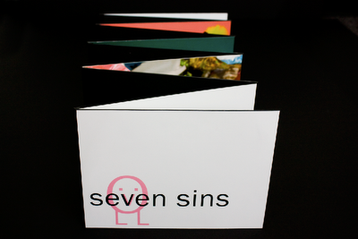
SEVEN SINS BOOK
LETTER TRANSFORMATION
Working with type, working with motion, working with sound.
 COLOR BOOK
This would be an example of how we learned about color, and applied all the termed we learned into a photographic assignment. This was also a really long project. I need to think a little harder on what I would want to say about this, but I am really proud of it so I really want to keep it in!
This was one of my favourite assignments, and I loved being humorous and ironic about a theme as serious as the seven deadly sins. This was a project where I took complete control of all the aspects of the scene, more so than the color book. This was an exercise in planning and constructing ideas, keeping it to a high standard of quality and executing everything. Of course, there were also lots of problems throughout this project, so this was a big problem solving piece too.
 SELF PORTRAIT or FAMOUR DEAD PERSON POSTER?
 SELF PORTRAIT or FAMOUR DEAD PERSON POSTER?
I know I don't need both of these, since they both deal with learning the semiotics, which I feel is one of the most important things that I learned this semester. It's interesting to see how things that are normally literary devices, like rhetoric and semiotics, translate into design work.

 CHANGE ONE THING

 CHANGE ONE THING
This poster was 100% all what I wanted to do! Because I got to choose the topic, and had to research all the information that led me to the final design. Also, this was the only illustrated thing that I did!
 SIX DEGREES
 SIX DEGREES
This was the only seriously group project that we did this year. It was intense, and learning to work with someone else so close was a good experience. Developing better communication skills was an important thing I learned from this project. Also, this is a good example of a series of work that is all cohesive and unified, but still separate enough to not be redundant. This would be what I use to represent all the series sort of works we have done this semester.
 MURIEL COOOOOOOPER
 MURIEL COOOOOOOPER
Important: I like it! Researching the designer, and then trying to reference them without blatantly just mimicking them, this was a fun project that require me to refine my ability to translate the feel, the idea of the designer into the poster.
 MAGAZINE (LAYOUT AND INFOGRAPH COMBOOO)
 MAGAZINE (LAYOUT AND INFOGRAPH COMBOOO)
I also really love my magazine, even though I need to do some more refinements to it before putting it out for someone to see! This is a great example of my ability to sort through a lot of information and facts and organize them into visually pleasing, organized, informative diagrams.

ICONS ICONS ICONS ICONS ICONS ICONS ICONS ICONS ICONS ICONS
ICONS ICONS ICONS ICONS ICONS ICONS ICONS ICONS ICONS ICONS ICONS ICONS ICONS ICONS ICONS ICONS ICONS ICONS ICONS ICONS
ICONS ICONS ICONS ICONS ICONS ICONS ICONS ICONS ICONS ICONS
Of course, everything icon related will be involved. But since there is SO much to it, I want to try and thread the icons in and out with all the other project, relating the back to older projects, and new project, and showing how this continuous project pulls from all areas to make the final work, the museum exhibit...which still needs work!


