February 23, 2011

Individual Health Concerns

These are the issues that Taylor and I concluded to be some of the most current and pertinent heath concerns for individuals.
  • Cancer
  • Weight
  1. nutrition
  2. ingredients/chemicals in food
  3. diabetes
  4. hearth disease
  5. fitness
  6. FDA
  • Affordable Healthcare
  • Sleep and related issues
  1. stress
  2. insomnia
  3. long work hours
  • Prescription Drugs

February 18, 2011

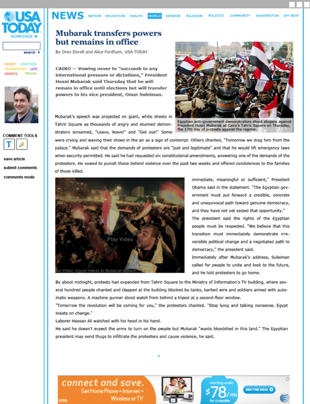
USA Today: Revised!


Lots of changes! Hopefully this page has more character than previously. Unfortunately, Cooper Black is bringing a little too much character to the pages, but that can be fixed with a Clarendon patch-up. Everything still needs a bit of work, but that's ok, it's made leaps and bounds since last class.

Some notes to cross through as a fix things:
Incorporate the persona back into the presentation to make it more personal/relate-able
make sure general craft is tidied up–line stuff up, even spacing, etc

February 16, 2011

USA Today Progress

Working out the kinks of the design that I am moving along with. It wasn't a super great crit, and I've got a lot to do to get this where it needs to be. Not going to lie, I feel like I'm in a bit of a rut with this project, and I'm not sure why. Anyway, things to work on:

  • typography is default, and could use some jazzing up
  • make the weather icons work!
  • customize the shapes some more
  • more photos
  • make sure all the boxes line up
  • fix a bunch of the pages!
  • tweak colors so they are readable
  • make it not boring
  • make it not flat


February 15, 2011

Subculture: Camera Journal


photos

So, the quality of most of the photos we got back from the camera journal were not the best quality. But this isn't really a surprise, and it's fine they came out like this. The real gem of this research collection method was the descriptions that our interviewee filled out for us.
Not only did she help describe some of the more difficult-to-see pictures, but she gave us some insight into her feelings towards the objects. She stressed her dependence on some of the things pictured, like the therapist and the nurse. She also took a lot of pictures of different part of her home. While she did this to show the different contraptions she had to use from day to day, to us, this painted a bigger picture to us, showing us that they sometimes have to modify or renovate their whole homes so it is compatible with the person they are caring for.
She also revealed some of the frustrations that she had within some of the pictures she took, which is something she didn't really discuss the first time we interviewed her. She talked about how the wheelchair was a lot more trouble that it might seem as first, from the most obvious inconveniences to the smallest things like the fact that she couldn't have rugs or carpet (otherwise the chair would snag).

February 12, 2011

Subculture: Initial Book Designs


Here are some of the pages I've been working on as part of the subculture book. I've already begun to mess around with these new colors (not partner-approved yet). What's most difficult so far is just creating copy to supplement the information we have gathered. One goal of making this book is to make sure we get as much of the juicy information we gathered on these pages.

It's still lacking it's "something special" though. We will be brainstorming on this tomorrow.

February 11, 2011

Webpage designs

The three directions that I brought to the table last (last, last) class (sorry, a bit behind) are these. I tried to refine the idea of my modular, customizable design. The direction that I ended up going along with was a combination of the first and third designs shown here. Color coding seems like a logical convention to use here, and it is something that was used on the original USA Today webpage.
Time to refine!


February 10, 2011

Subculture: Interviews

Dianne–wife and caregiver to her brain damaged husband
Sandra–wife and caregiver to her husband who had back surgery
Nancy–Currently a part time caregiver for and elderly women
Gwen–former caregiver for a variety of patients

There was a lot of great insight gained from these interviews. Each woman that we talked to (although our topic is not exclusive to female caregivers) had a lot of great answers for our questions and gave wonderful, entertaining stories and examples that we will be able to use in our subculture data collection.
As we asked about the pros and cons of being a caregiver, all of the ladies seemed to give us similar answers. To start off with, they all truly enjoyed what they did, and didn't consider it a hardship, even if it wasn't by choice that they were in their situation. They have big hearts and only have the best interests of their patients in mind. While it can sometimes be difficult to handle the mental and physical strain their responsibility puts on them, they would have it no other way. They all seemed to unanimously say that patience is the key to the work they do, since sometimes it is slow, or sometimes patients are not cooperative, or something goes wrong.
They have many concerns that come along with their job that might not be that obvious just from doing secondary research. For instance, their own age is a huge concern among them. Since they are baby boomers, 46-64, they are beginning to encounter health concerns that come with getting older. Along with the physical strain that they put on themselves while caregiving, this can add up to a decline in health. Also, money issues are another problem for caregivers and their families. Depending on the state of the person they are caring for, they might have to give up their job to take care of the person. And also, their patient might have been formally employed. Then, with the loss of one or two incomes coupled with medical bills, finances are a big concern.
Overall, this is a group that has a lot of love and a lot of problems. They also have great stories to tell.

For more on this, watch for Familial Baby Boomer Caregivers: An Insight by Kelsey Anderson and Joseph Shopen in your local bookstore. (tehehe)

February 9, 2011

C/ID Reading

Branding to think about:
  • Signage
  • advertisements
  • printed material
These can all have their own look at feel, but the overall brand of them must be cohesive. Consistency is key, of course. It seems like when creating a brand to put on these materials, in the case of several of the examples, the more simple, the better. With a large, clear, and simple design for a logo, the Frieze Art Fair could be applied everywhere. And the simple colors were enough to make the signage identifiable (as well as the categories the corresponded with, I'm guessing) but not so crazy that they were their own art piece.
Which also makes me think, there are certain times when it is best for the brand to NOT be overstated. Too much going on is overwhelming.

That's not to say, though, that the imagery can have its time to shine. My favorite assortment of brand applications is the Mori Art Museum. It has a simple but very bold design, with several elements that the designers can alternate across different media. Something to consider? Yes.

February 7, 2011

Subculture: Shadowing

Dianne:
1-30-10
6.00 pm

She begins sitting on the couch, she is watching the entertainment news programs. She switches to a country music channel. Her husband is wheelchair-bound. It is a very quite house. They are both very quiet. While we are talking to her, Steve makes sounds, Dianne tells her helper that he needs to go to the bathroom. But Dianne doesn’t help with this, she tells us she can’t do all the physical lifting, that’s what the helper is for. She feels kind of awkward with us here, she seems really stiff. We sit for a while, making small talk. He husband thumps his foot against the wheelchair, and mumbles something. He cannot form words very well. She gets up and goes straight to him. He talks to her again, not making any words again. She is talking to him in a quiet, soothing voice. Simple language. Not like talking to a child, but still very basic. She somehow understands what he’s saying–Joseph and I don’t understand anything he says. She wheels him over to the kitchen table, and sets his out place mat. His is very still, she says that she must have been right that he was hungry. There is a younger woman in the kitchen, she is one of the part-time helpers (she is younger, looks like her twenties?) Dianne joins her in the kitchen and works on preparing the meal. It’s something mushy. She sets the food in front of Steve, and she helps him put his special silverware in his hands, and then the helper takes over for her. We continue with the interview.
__________________________

From the shadowing, Joseph and I gleaned some key insights to the everyday life of Dianne, a woman who is on the "heavy care" end of our subculture spectrum. We did this shadowing when we initially came to interview her. Earlier, during the interview, she mentioned that she is very reliant on media sources such as the internet (she loves pandora), email, and her television with satellite. This seemed to prove true as she was always a bit distracted by the TV But when her husband needed help, she was quick to jump to his aid.
Sitting with her, we got a clear idea of what some of her values were. She values the time that she spends with her husband, in contrast to the idea that he could be in assisted living right now instead. She does all that she can to keep her husband with her. Her shortcomings include her physical limitations that keep her from being able to give him full care. Because of this, she relies on the 24/7 support of hired helpers. She says that it is hard to find helpers for certain hours and certain days (like no one wants to come in during church time).
Anyway, her simple language is something that seemed to show her speaking style, as well as her knack for patience (an essential skill, all care takers have noted). Even though it is unclear to other people, Dianne was able to understand what her husband said to her, and he seemed to understand what she was saying back to him.

February 2, 2011

Symposium Concepting

Typography: one of the basic elements of graphic design. But more than that, typography is something that you experience non-stop, all day. This (poster/postcard/whatever artifact they’re reading off of) is typography. The girl wearing sweatpants with the word “juicy” on the back? That’s typography. The alphabet cereal you had for breakfast? The book you’re reading for English? The little smilie face you put at the end of your last text? Of course, all are forms of typography. But what are some of the kinds of typography you don’t see everyday? Come to the (symposium name here) to learn about the broad spectrum of what is TYPE.

Abstract to Practical: A Typographic Exploration

Type: An Exploration Of The Written Laguage

Typographic Breakdown: The construction and deconstruction of all things type.

Letter Mania

Now You Read It, Now You Don’t

It’s not all Books and Posters: Type explanations and experiments of KCAI graphic design students.

Typographic Map: Covering all corners of what lies within its borders.

ty·pog·ra·phy - Defining and redefining type.
[tahy-pog-ruh-fee] - Defining and redefining type.

I shot the serif: wrangling the elusive typography.

Typography Trapeze: A circus of exhibits and activities revolving around the world of type.


Since we have another snowday, and therefor a while before we review this list, it is subject to change between now and then. :)

February 1, 2011

Baby Boomer Care Givers Analysis

To begin with, Baby Boomers are a group of people that span 20 years in age, from 46-64. This means that they are getting older, and might have parents that need caring or spouses that require help. The caregivers that we focused on were those that either fell into this because their family situation required it, or used caregiving as a part-time job now that they were wrapping up their careers. After interviewing a number of caregivers, we noted many traits that they seemed to share, as well as information such as their frustrations, worries, and concerns.
Caregivers of the Baby Boomer generation are genuinely concerned for the wellbeing of their patients, and are dedicated to whoever they are helping. During our research, it came up a lot that the baby boomer generation is an altruistic one, and this seemed to prove very true as all of our interviewees had past volunteer experience before becoming caregivers. A trusting personality is an essential quality of these caregivers, as they are asked to do a lot and they have to be careful not to offend or demean their patients throughout the day. This can sometimes be difficult, since sometimes patients can really give them a hard time. As one woman, Gwen, put it, “you’ve got to learn how to appease them, because you’re both set in your own ways.” But their patient, upbeat attitude keeps them going, in addition to being able to adapt to the person they’re caring for.
The caregivers we talked to were all very modest, downplaying their importance and happy with the gratitude they got. This surprised us, as we thought they might feel more burdened than they seemed to be. But they all seemed to love what they did and were content with the personal satisfaction they got from doing this.
Another thing that came as a surprise to us was that none of the women we interviewed had any professional experience that would have trained them to be care givers. Nancy said that all her experience came from being a mother, and another caregiver, Sandra, said that aside from some instructional packets (she is caring for her husband with a back injury), she relied learning quickly and being a good communicator to make things run smoothly. When shadowing Dianne, it seemed like she must have had some sort of training, the way she adjusted the wheelchair of her handicapped husband, or described all the equipment they used.
One worry that many baby boomer care givers seem to share though, is that they will soon need to start thinking about caring for themselves. As they age, they will be less and less able to take care of their patients, so they need to both find ways to continue aiding the patients, while accounting for any help they will begin to need. Financially, too, this is something that concerns our subculture quite a bit.

January 31, 2011

USA Today Wireframes

The Winnerrrrr:
The design that I'm going to move forward with is a modular design. This webpage is meant to be totally customizable. In the first page, the user (Stacy_007) has arranged her news categories in to how important they are to her. The same thing is happening on the next page, where she has click into the category "news" and she has also arranged the subcategories to her liking. Although, on this page, categories that she sees as unimportant are still present on the screen. They're just much smaller. From there, she can choose and article, which she can annotate as she reads. When she's done reading, she can choose to submit her annotations as comments, and see what other people had to say about it.

Other layouts:

I'll be working elements of these pages into the chosen layout.

Brainstorming:

USA Today Improvements

While navigating through the USA today website, I noticed a couple issues that I had with their navigation and layout. Although I will give them credit, it is a pretty easy-to-navigate site compared to some other new websites.

To begin with, there are multiple links on any given page that lead you to the same place. Since the pages seem like they go on and on forever, they could really clear up some space by removing all the duplicates.When then primary navigation is hierarchically distinguished by being in a bar at the top, being in buttons, and being color coded, there's really no reason to put them again further down the page...and again at the bottom.
When you visit the site, you do seem to have the option to create a member account. But the benefits of this account are limited, allowing you to comment and subscribe to get emails. That's...about it. Granted, I didn't spend a lot of time signing up and browsing. SO, if they DO have more features available, I should be able to see them better.
And as previously mentioned, the pages go on forever, and the articles within each category are not organized in any particular method. hierarchy of individual articles could be improved, if there is any. And if there isn't any that is more important that another, for goodness sake, take them out of those boxes that they're almost randomly places in.

Design research, Designing for Interaction

Designing for Interaction

  • qualitative - is a smaller range and asks why and how
  • quantitative- more general statistics, asks what. Really large groups surveyed.
  • Qualitative is the kind of research that we want to do because it is more personal and gives us an idea of aspects like the cultures behaviors, values, motivations.
  • It's essential to remain neutral toward the group you're researching, even though you need to be empathetic.
  • Being ethical is also essential with interacting with the audience.
  • Collect information long enough, and patterns will emerge. This is what you map.
  • When interviewing, note things besides their answers. Note the tone in their voice, body language, etc.
Design Research
  • we must both observe an interpret:
  • behaviors
  • cultures
  • belief systems
  • attitudes

Ethnography - the study pf people in their own environment
It's important that as designers we are familiar with ethnography, so that we can research and analysis the people we are trying to appeal to.

Symposium Concept Map

So for the concept map, I tried to make sentences that made sense as it traveled down the lines of though.

January 27, 2011

Preliminary Research: Baby Boomers

  • Defining a Baby Boomer

Generally.

Beginning with the secondary research, we thought it would be a good idea to see what makes this generation worth having its own name. Baby boomers are all of the Americans born between the years 1946 and 1964 beginning after World War II ended(this is also a generation in other countries like Canada, Australia, Great Britain, etc. But they have different names for this group in those countries) . Now, this group is about 29% of the population, about 75 million. But it's not just the time in which they were born. More definitely, it is the time during which they grew up that makes them so special.


BabyBoomerHeadQuarters is a great overview source for this. Fascinating stuff!


Economically:

  • Boomers represent the majority of the work force, although, this is beginning to shift.
  • The huge growth of the economy is because of boomers reaching their peak earning and spending years.
  • Biggest buying group, currently-dominating big-ticket spending in areas like travelling (vacations), car sales, etc.
  • Day care centers largely came to existence because boomers (so they also began the shift from staying home to take care of their kids)
  • largely, advertising has been following this generation since they were kids. The story goes like this:

30 million baby boomers are around by 1950. Who comes along? Gerber, now probably the best known baby food company. The kids start to grow, and so does the toy industry, at a ridiculously fast pace. TV is just becoming big. So is children's programming. Disneyland pops up in in the 1950s as well. Later, in the 70s (now that the kids are a little older) Disneyworld is build and filled with thrill rides. Flashy cars of the 60s and 70s are also a result of catering to the Boomers.

Other products that are getting big because of this subculture: "active retirement communities and vacation homes, skin creams, tooth whitening goo, cosmetic surgery, lasik surgery, Depends, and, of course, the Hair Club for Men."*


And because I don't want to type this all out, I'll copy this directly:


Social Impact:

"Aside from that, what impact on society are boomers having? Well, let's see now... the CEO of General Electric is a boomer; the CEO of IBM is a boomer; the CEO of Ford is a boomer; Bill Gates, Paul Allen and Steve Ballmer (Microsoft) are boomers; Steve Jobs is a boomer; Steven Spielberg is a boomer; Ron Howard is a boomer; Tom Hanks is a boomer; Denzel Washington is a boomer; Meg Ryan is a boomer; Michael Jordon is a boomer. The producers of most TV shows and movies are boomers. The editorial page editor of the Wall Street Journal (Paul Gigot) is a boomer. Rush Limbaugh is a boomer; Oprah is a boomer; Barack Obama is a boomer; Mitt Romney is a boomer. Madonna is a boomer; Bruce Springsteen is a boomer; Tom Cruise is a boomer; David Letterman is a boomer; Jay Leno is a boomer; Dr. Laura is a boomer. Clarence Thomas is a boomer; Sean Hannity is a boomer; Glenn Beck is a boomer; Al Gore is a boomer; Bill and Hillary Clinton are boomers; Ben Bernanke, the chairman of the Federal Reserve System, is a boomer; Sarah Palin is a boomer; Osama bin Laden is a boomer; George Bush is a boomer; Supreme Court Chief Justice John Roberts is a boomer; every potential candidate for the Supreme Court for the next 20 years will likely be a boomer."


25 Defining Images in Baby Boomer History - pretty self-explanatory

Wikipedia Information

"As a group, they were the healthiest, and wealthiest generation to that time, and amongst the first to grow up genuinely expecting the world to improve with time."

"In the 1960s, as the relatively large numbers of young people became teenagers and young adults, they, and those around them, created a very specific rhetoric around their cohort, and the change they were bringing about.[4] This rhetoric had an important impact in the self perceptions of the boomers, as well as their tendency to define the world in terms of generations, which was a relatively new phenomenon."


Terms:

"Jones Generation" - the second half of the baby boomers generation. The name comes from the phrase "keeping up with the Joneses." Supposedly, the Jonesers were given huge expectations as children in the 60s, and then were confronted with a different reality in the 70s and 80s. Also, it seems they are "less optimistic, distrust of government, and general cynicism."

"Golden Boomers" - Boomers who are retired or will retire from an occupation or profession.

In the 1985 study of US generational cohorts by Schuman and Scott, a broad sample of adults was asked, "What world events over the past 50 years were especially important to them?" For the baby boomers the results were:

  • Baby Boomer cohort #1 (born from circa 1946 to 1955), the young cohort who epitomized the cultural change of the sixties
  • Baby Boomer cohort #2 or Generation Jones (born from circa 1956–1964)
    • Memorable events: Watergate, Nixon resigns, the Cold War, lowered drinking age in many states 1970-1976 (followed by raising), the oil embargo, raging inflation, gasoline shortages, Jimmy Carter's imposition of registration for the draft, disco music from Donna Summer and The Bee Gee's, punk or new wave from The Clash and Deborah Harry and techno pop to Annie Lennox and MTV.
    • Key characteristics: less optimistic, distrust of government, general cynicism
    • Key members: Douglas Coupland who initially was called a Gen Xer but now rejects it and President Barack Obama who many national observers have recently called a post-Boomer, and more specifically part of Generation Jones


CURRENT CONCERNS (pre interview assumptions)

"Baby Boomers control over 80% of personal financial assets and more than 50% of discretionary spending power. They are responsible for more than half of all consumer spending, buy 77% of all prescription drugs, 61% of OTC medication and 80% of all leisure travel."*

boomers start retiring during 2007–2009.

With a grain of salt, since this is from a 1993 article:

42% of baby boomers were dropouts from formal religion, a third had never strayed from church, and one-fourth of boomers were returning to religious practice. The boomers returning to religion were "usually less tied to tradition and less dependable as church members than the loyalists. They are also more liberal, which deepens rifts over issues like abortion and homosexuality."

As of 1998, it was reported that, as a generation, boomers had tended to avoid discussions and planning for their demise and avoided much long-term planning.

Baby Boomers are in a state of denial regarding their own aging and death and are leaving an undue economic burden on their children for their retirement and care.


Alzheimer's Defining Disease of the Baby Boomers

Retirements Swallowed by Debt

II

Continuing work after retirement

New Issues as Boomers continue to Age

Social Security Insecurity


too-young-to-retire-and-too-old-to-rehire - an article dispelling myths about Boomer's

Information Architecture Readings

First, a note. It seems that I missed the part about only reading Wurman. So I read them all.

Wurman

Designers need to be involved in more aspects of the creations they are designing for. In the commercial word examples he uses, it seems like the big issue is that there is no interaction between the different people involved in the creation of a product, who brings it to the user, and the user themselves. There is potential for a gap in the interest of the user and in the understanding of the user. There needs to be more clarity.

Organize by:
  • Location
  • Alphabet
  • Time
  • Category
  • Hierarchy
This article talks about the importance of readability in typography, and that we perhaps put too much emphasis on designers past accomplishments. Unreadable text isn't something that should be glorified and should not be considered the end-all of typography. How can someone understand a language that has been made to be illegible?

Don't Make Me Think

Chapter 3

-with users browsing content quickly, it's important to make sure they see as much as possible, by using several tactics:

1. Create a clear visual hierarchy
  • make sure the appearance portrays the relationships between things on the page.
  • larger, bolder, in a distinctive color, more white space, nearer to the top, etc.
  • things that are related logically are also related visually, via grouping below a heading, similar style, or putting them in one area.
  • nest things that are part of other things.
2. Take advantage of conventions
  • conventions are what allow us to scan through information faster, because we know the significance of each portion of the page (ie. a headline, a caption, an image)
  • conventions seem pretty universal, with only slight variations
  • they're conventions because they work well, saves effort on the designer and the user side of things.
  • suck it up and utilize them, don't be pretentious. OR
  • make something that is clear and self-explanatory, or so incredibly useful that it is worth adding a bit of a learning curve (and hopefully eventually making it into a new convention)
3. Break up into clearly defined areas
  • divide the page into areas so that users can quickly choose what to focus on, and which to ignore.
  • once a section is ignored though, people almost never use it.
4. Make it obvious what's clickable
  • let this be mindless, it's not something users want to waste time looking around for
  • distinguish buttons as buttons, links as links
  • look to conventions again, to help clarify this
5. Minimize noise
  • everything is visual noise, so try to get rid of what you can
  • busy-ness is when everything is competing for attention
  • and background noise is all the small things that add up

Chapter 4
  • number of clicks that a user has to make to get to any given page can be costly to their attention/patience
  • there are obvious clicks and ones you have to search for. people will click more, if the clicks are very obvious.
  • mindless is good, don't confuse the poor people

Chapter 6
  • give all levels of the site the same amount of thought and planning, don't just assume that the user will understand then navigation after 2 clicks
  • have all levels worked out before even thinking about the finer details

On Web Typography


A new CSS function has allowed us to use any font we want (technically speaking, not legally) on webpages. This brings up an issue, however, because many fonts were not made to be used on the web at all, and do not function well as such. So legibility is still key to designing on the web.
It might be a good method to start with the body text, as that is what the audience will be spending the most time looking at. Fonts that are readable at a small level is best. Personality is ok, but not a lot of it. Consider bumping up the x-height and the space between characters, this is something common in the web-based fonts.
One sans and one serif font is an easy way to pair. And fonts by the same designer tend to go well too. Play around with the weights and variations of the text too.

Web Design is 95% Typography and Reactions Articles

Text is a user interface
sometimes unornamental text on websites function very well
avoid overloading users, an consider shaping the text as a whole for the users convenience.

Things to think about:
  • The text lines (measure) are too long
  • 100% scalable is not a reader friendly solution: Don’t make me think, ok, but don’t make me resize my window either
  • Lack of whitespace
  • Lack of active whitespace
  • Linespacing is too narrow
  • The text blocks are not well aligned
  • Too many font sizes
  • Pictures are badly placed and disrupt the reading ease

  • Text-background color contrast
  • Lazy handling of titles and subtitles
  • Text sizes
  • Text blocks that are not split up into enough small, scannable, digestible parts
  • Indiscernible links. Visited and non visited links are not discerned
  • Text is not treated as an interface but as decoration
  • It’s not clear if the text is a navigational element, a link or plain text
  • Fancy navigations marking the center of attention (content is the center of attention, content deserves the most love from the designer)
Sites don't need to look the same on all platforms. There can be some variety, but emphasis in this world is that we try to make it functional on lots of different technological media.

December 5, 2010

Helping Hands Final Process and Comments

With a project with so many elements, it was essential from the beginning that Karen and I create a rigid schedule and checklist to stick to, so we didn't lose track of time or lose pieces of our system.
First, we developed and refined the icon system and colors while playing around with the size and content of the booklets.

We wanted to create a size that was portable, considering that the people who would use these books might not have a lot of space to carry it around with. We first tried to create something that was "wallet sized," but then just changed it to small, hand sized booklet.
Each booklet features a back page that both folds out and tears away. These pages are either forms you can fill out or another resource like a map. This is another part of the project where we paid careful attention to the lack of time and space the users of these books suffer from. These books don't need to be kept on the person all the time. You can read the information, tear out the page, and then utilize it (fill it out or navigate with) while keeping the information from the book in mind, instead of physically with you.

One thing that we had some trouble with during this project was coming up with a suitable name for the whole system. A highlight from the mindmapping of it all:
The first name that be came up with was Patch up. Sort of like a patch on a tire or clothing, or a bandaid patch, this kit was meant to fix you up so you could get control of yourself. That name didn't work, and after that we tried the "Open Hand Books." This was a step in the right direction but needed to hint more at the whole system, not just the books. Plus, not everyone understood the pun in it. So we instead went with the name Helping Hand Guides. This name is more all-encompassing.

Above: Some of the earlier mock up of the booklets.

Working on the copy in the books, we crafted it simply and concisely, making sure they remained helpful tools and not intimidating, text-heavy, encyclopedias of information. Each book has a general "What is this about?" section, a "Tips" section, and a Contacts page. This information is mean to inform and save you time by telling you the basics. For example, show below is the page listing what you will need to bring with you when you apply for the food stamp program. This addresses a problem we saw a lot in the simulation. People seemed to be waiting in long lines, only to realize they were in the wrong place or did not have everything they needed with them.


Then we worked on figuring out some of the other details. This is the custom box that all of the booklets ( and the mission statement card) come packaged in. The flaps of the box were a fun hint at the name, Helping Hand Guides.
Too big. Too small. Just right! The hand were supposed to link together, and lay flat(so they could stack).

Then it was just a matter of putting everything together, and working out tiny kinks. Like making all the books the same size! Here, you can tell which one is actually full of content.


We made stickers that go into the windows of affiliated organizations. They are 5x5 and are simple, dawning an icon and the "Helping Hands Affiliate" text.


And the final presentation!:


Andersonvillalba Presentation

December 3, 2010

Portfolio

Anderson Portfolio
Here's my shot at making a portfolio, the project that never ends. Since taking these snapshots, I've already edited it. Several times.

I've gotten rid of most of the illustrated images. In fact, I'm rethinking the whole idea of using hand-rendered elements at all.