
Showing posts with label Typography 4. Show all posts
Showing posts with label Typography 4. Show all posts
May 4, 2011
Type Experiments: Thinking
Throughout the process of executing these experiments, there are a lot of things that I have learned. One thing that ended up shaping the hole project was the unpredictably of what I was working with. At times, it was difficult to reign in the materials and get them to work in my favor, and even then, the outcome of each experiment was, to a certain extent (some more than others), out of my hands. That's not so say though, that I did not have any successes.
Since it was sort of impossible to predict what a going to happen, I was often open to ANYTHING that would happen, as long as there was a change. For instance, in some of my water experiments, the water ran down because it was on an incline. This was unexpected, but not unwelcomed. It was this sort of discovery that drove most of the experiments (and I imagine it was the same with other people too).

April 18, 2011
Experimental Typography Test
This weekend I spent an extended amount of time recording type over time. I played around with flowers again, like in the previous class, and I also did a lot of type with water. I feel like I started to get something with the water, because of some variables that happened to be in the area I was filming. While this is a technical detail, it's still significant, considering the fact that that is the nature of the question I am asking.
In the flower piece, I waiting for either the flowers to wither or the wind to blow them away. Either element was fine, or a combination of the two, since that's just what happens. The wind was very mild yesterday, but after a few suprise gusts, the flowers were in a pretty good state of disarray, making it nearly impossible to read the word that it originally was.
In the first and second water test, I was trying to play with the nature of the water spreads. To be honest, I was a little disappointed in the degree that it did NOT spread. When I did initial tests—on a smaller scale—to the letters, there was a lot of spread of the water, which resulted in almost losing the letter's legibility altogether. Now that I've changed the scale of the letters though, it's not nearly as obvious.
After the first two tests with water, I realized that something more interesting than what I was trying to test was happening. I was filming on a slight incline, and the water was beginning to drip. This was a new factor that I had not thought about before, and for the third water test, I changed locations and tried to capitalize on this running water effect.
In the flower piece, I waiting for either the flowers to wither or the wind to blow them away. Either element was fine, or a combination of the two, since that's just what happens. The wind was very mild yesterday, but after a few suprise gusts, the flowers were in a pretty good state of disarray, making it nearly impossible to read the word that it originally was.
In the first and second water test, I was trying to play with the nature of the water spreads. To be honest, I was a little disappointed in the degree that it did NOT spread. When I did initial tests—on a smaller scale—to the letters, there was a lot of spread of the water, which resulted in almost losing the letter's legibility altogether. Now that I've changed the scale of the letters though, it's not nearly as obvious.
After the first two tests with water, I realized that something more interesting than what I was trying to test was happening. I was filming on a slight incline, and the water was beginning to drip. This was a new factor that I had not thought about before, and for the third water test, I changed locations and tried to capitalize on this running water effect.
Type Experiments
Moving along with the nature theme, I tried to execute an experiment in which I set up flowers in their natural environment. This was not a time-lapse experiment, since I was just trying to make it believable that these flowers were in their natural environment. Since technical problems that we run into don't matter, I will try to focus on other areas. Right now, these letters are very simple, and also do not show any change. Continuing on, I would like to try and work on making the letters a little more detail, and get back to the original questions of the evolution or devolution of type that is reflecting its environment.


April 17, 2011


April 15, 2011
April 12, 2011
It is Beautiful, Then Gone
While the processes for both of the projects were interesting, I felt that the Sundance project was a more useful read. Venezky talks about the project being split into several pieces that work individually, and were created independently and then brought together. While the Reebok work was very different from what is normally done for Sports design, the unpredictability of the Sundance work really appeals to me and relates more to the experimental type that I'm doing.
While what we are doing are technically experiments, it really frustrates me and makes me nervous when I think about the prospect of them not going anywhere or failing completely. I've been working on several different works at once, trying to answer the questions that I posed at the beginning of the project.
As I continue to work on more experiments, I will also work on refining their quality, keeping them in a managable time frame, and trouble shooting to resolve and prevent problems found in the past experiments.
While what we are doing are technically experiments, it really frustrates me and makes me nervous when I think about the prospect of them not going anywhere or failing completely. I've been working on several different works at once, trying to answer the questions that I posed at the beginning of the project.
- How can human interaction change the form or legibility of type placed in nature?
- How can time effect the state of type placed in nature?
- How can type be presented in nature to make people more aware of their environment?
- What kind of type can be placed in an environment without it effecting the well-being of the nature in it?
- How can nature be manipulated to form legible type?
- How can a font be made that expresses the environment it was created in?
- How can typography reflect the patterns found in nature?
- How can the unpredictability of nature be translated into typographic form?
- How can type emulate the symbiosis of natural and manmade elements?
- How can the passage of time evolve or devolve typography in nature?
As I continue to work on more experiments, I will also work on refining their quality, keeping them in a managable time frame, and trouble shooting to resolve and prevent problems found in the past experiments.
March 21, 2011
Experimental Typography Readings
Experimental typography. Whatever that means.
This article really spoke to the unclear lines between what is considered "experimental" and what is not. In many instances, people toss the word experiment around when there's no clear reason to their work. If we were to speak scientifically, then we would be making questions/hypothesis's that we would be using type to prove. But this doesn't really mean the result will be groundbreaking or "novel."
With the limitation of communication on us, our experiments must already conform to some sort of convention. But out of all of this what I got was that the definition of experimentation is extremely subjective, and no matter what opinion or view you tend to lean towards, it seems that most importantly, like design overall, the experiments are all about process.
"It is experimental only in the process of its creation."
This reading really gave me some insight into the variety of standards regarding what people consider to be experimental typography. It's so subjective, I'm not sure why people want to analyze it. But it was interesting when the author pointed out that even if it is something that does not have a practical use when it was made, often times the discoveries made in the process of the experimenting lent itself to some better purpose.
RADICAL TYPE DESIGN
function and aesthetic
I thought this was a much more interesting reading the perspective that it has as much to do with the experimenter as the experiment. This reading made me really excited to approach the risks involved in the process of creating these experiments. Again, it's all about process process process of it all! This project seems like it's going to be a sort of embodiment of the design process, explored through the element of typography.
This article really spoke to the unclear lines between what is considered "experimental" and what is not. In many instances, people toss the word experiment around when there's no clear reason to their work. If we were to speak scientifically, then we would be making questions/hypothesis's that we would be using type to prove. But this doesn't really mean the result will be groundbreaking or "novel."
With the limitation of communication on us, our experiments must already conform to some sort of convention. But out of all of this what I got was that the definition of experimentation is extremely subjective, and no matter what opinion or view you tend to lean towards, it seems that most importantly, like design overall, the experiments are all about process.
"It is experimental only in the process of its creation."
This reading really gave me some insight into the variety of standards regarding what people consider to be experimental typography. It's so subjective, I'm not sure why people want to analyze it. But it was interesting when the author pointed out that even if it is something that does not have a practical use when it was made, often times the discoveries made in the process of the experimenting lent itself to some better purpose.
RADICAL TYPE DESIGN
function and aesthetic
I thought this was a much more interesting reading the perspective that it has as much to do with the experimenter as the experiment. This reading made me really excited to approach the risks involved in the process of creating these experiments. Again, it's all about process process process of it all! This project seems like it's going to be a sort of embodiment of the design process, explored through the element of typography.
March 2, 2011
Atypeical: Freshman Pep Squad
For my portion of the freshman information/presentation I produced the circular information leave behind and the small remind card. One thing that we wanted to emphasise was the importance of the time factor in the production and presentation of all the elements of information. Altogether, we wanted to create:


Instead of bombarding the freshmen with a ton of information and then leaving them to forget about it, we decided it would be best to do it in this sort of order:
- Simple to print and post flyer
- 1 or 2 very large, colored posters for IMPACT
- Circular flyer
- Email New Letter
- Business card-sized reminder (to be left on their desk)


Instead of bombarding the freshmen with a ton of information and then leaving them to forget about it, we decided it would be best to do it in this sort of order:
- sneak peak sort of thing
- information
- information with examples of work (presentation)
- reminded a couple days beforehand
Atypeical: Image Selection and Copy Refinement
For this round of work done, I was on the copy-refinement team and on the team that narrowed down the images that we are going to use on all the materials.
For the type, we didn't want to do a lot of BIG changes. After all, we spent a whole class period earlier back synthesizing the tagline and description we wanted to use. So, Bethany and I created a sort of web of options, with some slight word variations, so that a vote could be easy. As for the copy, we just tweeked a phrased here and there, and made some variations on that for good measure and to make sure we covered everything!
 For the image selection, we wanted to focus on having a variety of images, both digital and analog. These images needed to have a certain degree of abstractness to them, so that they did not conflict with and copy that went on top of them and did not compete with the logo.

For the type, we didn't want to do a lot of BIG changes. After all, we spent a whole class period earlier back synthesizing the tagline and description we wanted to use. So, Bethany and I created a sort of web of options, with some slight word variations, so that a vote could be easy. As for the copy, we just tweeked a phrased here and there, and made some variations on that for good measure and to make sure we covered everything!
 For the image selection, we wanted to focus on having a variety of images, both digital and analog. These images needed to have a certain degree of abstractness to them, so that they did not conflict with and copy that went on top of them and did not compete with the logo.
Atypeical: Starting to Finesse
Before class:
I spent time playing with many different type lockups and typefaces choices for the combination of the symposium name and the tagline. Then I selected an image from some of the ones that Karen produced, and placed the type on top of it. I wanted to try and keep the idea that I had from last class, where I made bars that reflected the nature of the image behind it. This round was...not so successful.

 During class though, I was part of the team that was working on a logo shape! Here were my brainstormings that I pumped out during the hour we worked:
 I wanted to use the circle idea we had going, in correlation with the idea of the exchange of ideas or "round table" feeling our symposium will have. The idea that I liked the best was the overlapping, rotated ovals. They were originally circles, but I felt that a more flat shape would help lend itself to the shape of the text that would go inside.


I spent time playing with many different type lockups and typefaces choices for the combination of the symposium name and the tagline. Then I selected an image from some of the ones that Karen produced, and placed the type on top of it. I wanted to try and keep the idea that I had from last class, where I made bars that reflected the nature of the image behind it. This round was...not so successful.

 During class though, I was part of the team that was working on a logo shape! Here were my brainstormings that I pumped out during the hour we worked:
 I wanted to use the circle idea we had going, in correlation with the idea of the exchange of ideas or "round table" feeling our symposium will have. The idea that I liked the best was the overlapping, rotated ovals. They were originally circles, but I felt that a more flat shape would help lend itself to the shape of the text that would go inside.

Atypeical: Continueing with the Direction
Now that we were starting to tighten up the visual elements of the symposium, I created this mock postcard and webpage as an example of the branding I was thinking of. I wanted to create elements that could be subbed out, like the background image, and matched with bars or other visual elements to make a variety of artifacts with an underlying unity.

 I used my own images as the example. Since the images were made using folded paper, the banner and bar on the webpage and postcard, respectively, were treated in a manner that gave them an abstract 'folded' feeling.

 I used my own images as the example. Since the images were made using folded paper, the banner and bar on the webpage and postcard, respectively, were treated in a manner that gave them an abstract 'folded' feeling.
Atypeical: A Direction
In this exploration, I set out to make some sort of theme based off of a hastily-whipped-up experimental type. This was a lot of fun to play around with, but ultimately I ran into a couple road blocks, and regardless, this got scrapped.
 I arranged the paper shapes into the different letters of the name "Atypeical" and photographed them at varying angles. My initial idea was to make the whole symposium name out of these shapes, and maybe make it into a workable logo. The concept behind it all was again the idea of the many parts or players that came together to make this symposium, including the class and the people who come to the symposium. But after laying them out all together, I was unsatisfied with how it all came out. It looked like a cross between a beehive and an icecube tray! Luckily I did glean some stuff from the individual photos.


While the letters together seemed like a mistake, the individual letters very really interesting! It created a nice texture, nice dimension, and were visually interesting. It was after making these and laying them all out that I thought that traditional text would best suit these.
 I arranged the paper shapes into the different letters of the name "Atypeical" and photographed them at varying angles. My initial idea was to make the whole symposium name out of these shapes, and maybe make it into a workable logo. The concept behind it all was again the idea of the many parts or players that came together to make this symposium, including the class and the people who come to the symposium. But after laying them out all together, I was unsatisfied with how it all came out. It looked like a cross between a beehive and an icecube tray! Luckily I did glean some stuff from the individual photos.

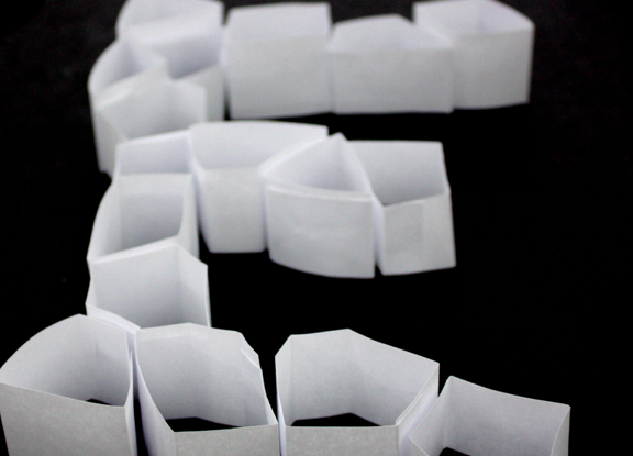
While the letters together seemed like a mistake, the individual letters very really interesting! It created a nice texture, nice dimension, and were visually interesting. It was after making these and laying them all out that I thought that traditional text would best suit these.
Atypeical: Initial theming ideas
So here are some of the brainstormings of the earliest stages of the Atypeical branding. I had messed around with some different ideas, mostly staying in black in white for the sake of keeping it simple and allowing it to be put on any media.
At first I though an idea that involved the sort of "pieced together" nature of the symposium, because it was made from 12 people collaborating. I had some weird idea of playing with negative space, and pushing the legitiblity. This looked very silly. Execution was not spot on.
 Then after this, and after looking at the brainstorming wall of images that people put up, I thought of trying to appeal to the high school audience and play to the nature of the work "atypical." Barcodes seem like the ultimate symbol for conformity (I feel like I'm in high school when I say that word) and that making a theme of altered or broken barcodes might look nice. Again, I messed with the negative space, putting the symposium name inside. Then I played around with different ways to alter the shape, and then played around with the idea of making so sort of wayfinding/signage system.

At first I though an idea that involved the sort of "pieced together" nature of the symposium, because it was made from 12 people collaborating. I had some weird idea of playing with negative space, and pushing the legitiblity. This looked very silly. Execution was not spot on.
 Then after this, and after looking at the brainstorming wall of images that people put up, I thought of trying to appeal to the high school audience and play to the nature of the work "atypical." Barcodes seem like the ultimate symbol for conformity (I feel like I'm in high school when I say that word) and that making a theme of altered or broken barcodes might look nice. Again, I messed with the negative space, putting the symposium name inside. Then I played around with different ways to alter the shape, and then played around with the idea of making so sort of wayfinding/signage system.
February 9, 2011
C/ID Reading
Branding to think about:
Which also makes me think, there are certain times when it is best for the brand to NOT be overstated. Too much going on is overwhelming.
That's not to say, though, that the imagery can have its time to shine. My favorite assortment of brand applications is the Mori Art Museum. It has a simple but very bold design, with several elements that the designers can alternate across different media. Something to consider? Yes.
- Signage
- advertisements
- printed material
Which also makes me think, there are certain times when it is best for the brand to NOT be overstated. Too much going on is overwhelming.
That's not to say, though, that the imagery can have its time to shine. My favorite assortment of brand applications is the Mori Art Museum. It has a simple but very bold design, with several elements that the designers can alternate across different media. Something to consider? Yes.
February 2, 2011
Symposium Concepting
Typography: one of the basic elements of graphic design. But more than that, typography is something that you experience non-stop, all day. This (poster/postcard/whatever artifact they’re reading off of) is typography. The girl wearing sweatpants with the word “juicy” on the back? That’s typography. The alphabet cereal you had for breakfast? The book you’re reading for English? The little smilie face you put at the end of your last text? Of course, all are forms of typography. But what are some of the kinds of typography you don’t see everyday? Come to the (symposium name here) to learn about the broad spectrum of what is TYPE.
Abstract to Practical: A Typographic Exploration
Type: An Exploration Of The Written Laguage
Typographic Breakdown: The construction and deconstruction of all things type.
Letter Mania
Now You Read It, Now You Don’t
It’s not all Books and Posters: Type explanations and experiments of KCAI graphic design students.
Typographic Map: Covering all corners of what lies within its borders.
ty·pog·ra·phy - Defining and redefining type.
[tahy-pog-ruh-fee] - Defining and redefining type.
I shot the serif: wrangling the elusive typography.
Typography Trapeze: A circus of exhibits and activities revolving around the world of type.
Since we have another snowday, and therefor a while before we review this list, it is subject to change between now and then. :)
Abstract to Practical: A Typographic Exploration
Type: An Exploration Of The Written Laguage
Typographic Breakdown: The construction and deconstruction of all things type.
Letter Mania
Now You Read It, Now You Don’t
It’s not all Books and Posters: Type explanations and experiments of KCAI graphic design students.
Typographic Map: Covering all corners of what lies within its borders.
ty·pog·ra·phy - Defining and redefining type.
[tahy-pog-ruh-fee] - Defining and redefining type.
I shot the serif: wrangling the elusive typography.
Typography Trapeze: A circus of exhibits and activities revolving around the world of type.
Since we have another snowday, and therefor a while before we review this list, it is subject to change between now and then. :)
January 31, 2011
Symposium Concept Map
 So for the concept map, I tried to make sentences that made sense as it traveled down the lines of though.
Subscribe to:
Posts (Atom)