Showing posts with label Atypeical Symposium. Show all posts

March 2, 2011

Atypeical: Freshman Pep Squad

For my portion of the freshman information/presentation I produced the circular information leave behind and the small remind card. One thing that we wanted to emphasise was the importance of the time factor in the production and presentation of all the elements of information. Altogether, we wanted to create:
  • Simple to print and post flyer
  • 1 or 2 very large, colored posters for IMPACT
  • Circular flyer
  • Email New Letter
  • Business card-sized reminder (to be left on their desk)


Instead of bombarding the freshmen with a ton of information and then leaving them to forget about it, we decided it would be best to do it in this sort of order:
  • sneak peak sort of thing
  • information
  • information with examples of work (presentation)
  • reminded a couple days beforehand
Since talking in class, the purpose of the circle has changed (to a more guerrilla graphic) and the poster might have the possibility of being in strange/atypical (heh) locations, with strange dimensions. I am excited about all this.

Atypeical: Image Selection and Copy Refinement

For this round of work done, I was on the copy-refinement team and on the team that narrowed down the images that we are going to use on all the materials.
For the type, we didn't want to do a lot of BIG changes. After all, we spent a whole class period earlier back synthesizing the tagline and description we wanted to use. So, Bethany and I created a sort of web of options, with some slight word variations, so that a vote could be easy. As for the copy, we just tweeked a phrased here and there, and made some variations on that for good measure and to make sure we covered everything!

For the image selection, we wanted to focus on having a variety of images, both digital and analog. These images needed to have a certain degree of abstractness to them, so that they did not conflict with and copy that went on top of them and did not compete with the logo.

Atypeical: Starting to Finesse

Before class:

I spent time playing with many different type lockups and typefaces choices for the combination of the symposium name and the tagline. Then I selected an image from some of the ones that Karen produced, and placed the type on top of it. I wanted to try and keep the idea that I had from last class, where I made bars that reflected the nature of the image behind it. This round was...not so successful.

During class though, I was part of the team that was working on a logo shape! Here were my brainstormings that I pumped out during the hour we worked:
I wanted to use the circle idea we had going, in correlation with the idea of the exchange of ideas or "round table" feeling our symposium will have. The idea that I liked the best was the overlapping, rotated ovals. They were originally circles, but I felt that a more flat shape would help lend itself to the shape of the text that would go inside.

Atypeical: Continueing with the Direction

Now that we were starting to tighten up the visual elements of the symposium, I created this mock postcard and webpage as an example of the branding I was thinking of. I wanted to create elements that could be subbed out, like the background image, and matched with bars or other visual elements to make a variety of artifacts with an underlying unity.

I used my own images as the example. Since the images were made using folded paper, the banner and bar on the webpage and postcard, respectively, were treated in a manner that gave them an abstract 'folded' feeling.

Atypeical: A Direction

In this exploration, I set out to make some sort of theme based off of a hastily-whipped-up experimental type. This was a lot of fun to play around with, but ultimately I ran into a couple road blocks, and regardless, this got scrapped.

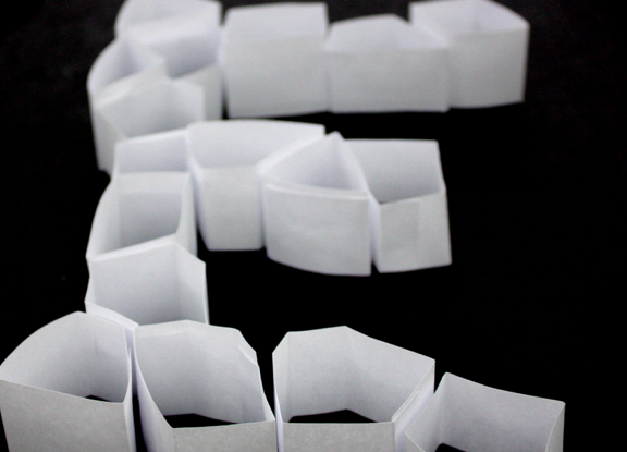
I arranged the paper shapes into the different letters of the name "Atypeical" and photographed them at varying angles. My initial idea was to make the whole symposium name out of these shapes, and maybe make it into a workable logo. The concept behind it all was again the idea of the many parts or players that came together to make this symposium, including the class and the people who come to the symposium. But after laying them out all together, I was unsatisfied with how it all came out. It looked like a cross between a beehive and an icecube tray! Luckily I did glean some stuff from the individual photos.


While the letters together seemed like a mistake, the individual letters very really interesting! It created a nice texture, nice dimension, and were visually interesting. It was after making these and laying them all out that I thought that traditional text would best suit these.

Atypeical: Initial theming ideas

So here are some of the brainstormings of the earliest stages of the Atypeical branding. I had messed around with some different ideas, mostly staying in black in white for the sake of keeping it simple and allowing it to be put on any media.

At first I though an idea that involved the sort of "pieced together" nature of the symposium, because it was made from 12 people collaborating. I had some weird idea of playing with negative space, and pushing the legitiblity. This looked very silly. Execution was not spot on.
Then after this, and after looking at the brainstorming wall of images that people put up, I thought of trying to appeal to the high school audience and play to the nature of the work "atypical." Barcodes seem like the ultimate symbol for conformity (I feel like I'm in high school when I say that word) and that making a theme of altered or broken barcodes might look nice. Again, I messed with the negative space, putting the symposium name inside. Then I played around with different ways to alter the shape, and then played around with the idea of making so sort of wayfinding/signage system.