Anderson iPhone App
Here's my final version of my iphone app, Pocket Sweep (PS)!

Showing posts with label Information Architecture. Show all posts
Showing posts with label Information Architecture. Show all posts
May 9, 2011

April 24, 2011
iPhone App - Exploring Visual Directions
Out of the three directions that I tried to play around with, I have ended up moving forward with a hybrid of the first two. The photo-overlay of the first style is nice, but the navigation of of it is pretty yucky. I enjoy the type and pattern elements of the version #2, as well as some of the more refined elements of the interface.


April 21, 2011
Tailored iPhone App: Brainstorming and Wireframes
The three initial concepts that I came up with for the iPhone apps were for the Hiking subculture, which was technically specifically for older hikers. There was a trail index, with an option to "image map" trails through users photos of the trail, and a lot of stuff that would help you choose trails in your local area, as well as ones that you might like when you are traveling elsewhere. The second idea was an app that would allow you to scan tags of new equipment that you got or want to get, and it will give you user opinions and ratings, and some other information about the product.
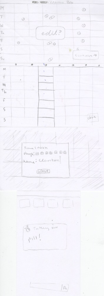
 The final idea, and the one that I moved forward with was the health related app. As older hikers, while they might be fit, they still need to be more aware of themselves and maybe younger hikers might be. For this, they can imput any health concerns they have (meds and vitamins they take, physical issues or other problems that could be affected by the environment, ect) and the app will remind them when they need to drink water, take their rest breaks, maybe take their pills, and then also guide them toward trails that suit them best. This app also sends an email to a friend in their address book with their plans, so that if something were to happen to them, someone would know!
 So, these are the wireframes that I tossed around. I got a lot of good feedback and a lot of help and advice, which I needed. Changes to come!


 The final idea, and the one that I moved forward with was the health related app. As older hikers, while they might be fit, they still need to be more aware of themselves and maybe younger hikers might be. For this, they can imput any health concerns they have (meds and vitamins they take, physical issues or other problems that could be affected by the environment, ect) and the app will remind them when they need to drink water, take their rest breaks, maybe take their pills, and then also guide them toward trails that suit them best. This app also sends an email to a friend in their address book with their plans, so that if something were to happen to them, someone would know!
 So, these are the wireframes that I tossed around. I got a lot of good feedback and a lot of help and advice, which I needed. Changes to come!

April 18, 2011
iPhone App Problem and Readings
For the final project of information architecture, I decided to go with the Jones Generation Hikers. They are baby boomers, which means they are concerned with their health. This of course, could contribute to the reason that they are hiking. But at this age, they are beginning to be concerned with many health issues.
For my app, I would like to create a program that will help the hikers remember other health issues that they need to be aware of before, during, and after their hike. This includes problems such as allergies, air quality, blood pressure, arthritis, and remembering to take meds at certain hours. While hiking is a wonderful exercise, it is good at distracting people too. So this will hopefully help.
The Readings:
For my app, I would like to create a program that will help the hikers remember other health issues that they need to be aware of before, during, and after their hike. This includes problems such as allergies, air quality, blood pressure, arthritis, and remembering to take meds at certain hours. While hiking is a wonderful exercise, it is good at distracting people too. So this will hopefully help.
The Readings:
- Buttons should look like buttons, and not be hard to find or hard to understand as buttons. Too many visual elements can make it hard to read, but you do want it to have a degree of abstractness to it.
- There are a set of standard tab icons. Use them. Certain icons have certain meanings, and if you stray from them then it is confusing for the user.
- There are a lot of standards that are required for an iPhone app to pass inspection. If you're not within these guidelines, doesn't expect it to pass.
- Along the same lines, it is probably a good idea to just stick with the gestures that the user will already know, instead of creating a whole new one just for your app.
- It needs to be taken into account, to some degree, that a lot of the screen is covered up by the user's finger as they do a gesture.
March 27, 2011
March 7, 2011


February 18, 2011
USA Today: Revised!
Lots of changes! Hopefully this page has more character than previously. Unfortunately, Cooper Black is bringing a little too much character to the pages, but that can be fixed with a Clarendon patch-up. Everything still needs a bit of work, but that's ok, it's made leaps and bounds since last class.
Some notes to cross through as a fix things:
Incorporate the persona back into the presentation to make it more personal/relate-able
make sure general craft is tidied up–line stuff up, even spacing, etc
February 16, 2011
USA Today Progress
Working out the kinks of the design that I am moving along with. It wasn't a super great crit, and I've got a lot to do to get this where it needs to be. Not going to lie, I feel like I'm in a bit of a rut with this project, and I'm not sure why. Anyway, things to work on:


- typography is default, and could use some jazzing up
- make the weather icons work!
- customize the shapes some more
- more photos
- make sure all the boxes line up
- fix a bunch of the pages!
- tweak colors so they are readable
- make it not boring
- make it not flat


February 11, 2011
Webpage designs
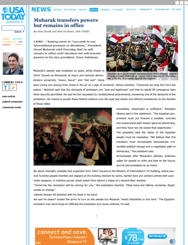
The three directions that I brought to the table last (last, last) class (sorry, a bit behind) are these. I tried to refine the idea of my modular, customizable design. The direction that I ended up going along with was a combination of the first and third designs shown here. Color coding seems like a logical convention to use here, and it is something that was used on the original USA Today webpage.
Time to refine!


Time to refine!


January 31, 2011
USA Today Wireframes
The Winnerrrrr:
 The design that I'm going to move forward with is a modular design. This webpage is meant to be totally customizable. In the first page, the user (Stacy_007) has arranged her news categories in to how important they are to her. The same thing is happening on the next page, where she has click into the category "news" and she has also arranged the subcategories to her liking. Although, on this page, categories that she sees as unimportant are still present on the screen. They're just much smaller. From there, she can choose and article, which she can annotate as she reads. When she's done reading, she can choose to submit her annotations as comments, and see what other people had to say about it.
Other layouts:

 I'll be working elements of these pages into the chosen layout.
Brainstorming:

 The design that I'm going to move forward with is a modular design. This webpage is meant to be totally customizable. In the first page, the user (Stacy_007) has arranged her news categories in to how important they are to her. The same thing is happening on the next page, where she has click into the category "news" and she has also arranged the subcategories to her liking. Although, on this page, categories that she sees as unimportant are still present on the screen. They're just much smaller. From there, she can choose and article, which she can annotate as she reads. When she's done reading, she can choose to submit her annotations as comments, and see what other people had to say about it.
Other layouts:

 I'll be working elements of these pages into the chosen layout.
Brainstorming:

USA Today Improvements
While navigating through the USA today website, I noticed a couple issues that I had with their navigation and layout. Although I will give them credit, it is a pretty easy-to-navigate site compared to some other new websites.
To begin with, there are multiple links on any given page that lead you to the same place. Since the pages seem like they go on and on forever, they could really clear up some space by removing all the duplicates.When then primary navigation is hierarchically distinguished by being in a bar at the top, being in buttons, and being color coded, there's really no reason to put them again further down the page...and again at the bottom.
When you visit the site, you do seem to have the option to create a member account. But the benefits of this account are limited, allowing you to comment and subscribe to get emails. That's...about it. Granted, I didn't spend a lot of time signing up and browsing. SO, if they DO have more features available, I should be able to see them better.
And as previously mentioned, the pages go on forever, and the articles within each category are not organized in any particular method. hierarchy of individual articles could be improved, if there is any. And if there isn't any that is more important that another, for goodness sake, take them out of those boxes that they're almost randomly places in.
To begin with, there are multiple links on any given page that lead you to the same place. Since the pages seem like they go on and on forever, they could really clear up some space by removing all the duplicates.When then primary navigation is hierarchically distinguished by being in a bar at the top, being in buttons, and being color coded, there's really no reason to put them again further down the page...and again at the bottom.
When you visit the site, you do seem to have the option to create a member account. But the benefits of this account are limited, allowing you to comment and subscribe to get emails. That's...about it. Granted, I didn't spend a lot of time signing up and browsing. SO, if they DO have more features available, I should be able to see them better.
And as previously mentioned, the pages go on forever, and the articles within each category are not organized in any particular method. hierarchy of individual articles could be improved, if there is any. And if there isn't any that is more important that another, for goodness sake, take them out of those boxes that they're almost randomly places in.
January 27, 2011
Information Architecture Readings
First, a note. It seems that I missed the part about only reading Wurman. So I read them all.
Wurman
Designers need to be involved in more aspects of the creations they are designing for. In the commercial word examples he uses, it seems like the big issue is that there is no interaction between the different people involved in the creation of a product, who brings it to the user, and the user themselves. There is potential for a gap in the interest of the user and in the understanding of the user. There needs to be more clarity.
Organize by:
- Location
- Alphabet
- Time
- Category
- Hierarchy
This article talks about the importance of readability in typography, and that we perhaps put too much emphasis on designers past accomplishments. Unreadable text isn't something that should be glorified and should not be considered the end-all of typography. How can someone understand a language that has been made to be illegible?
Chapter 3
-with users browsing content quickly, it's important to make sure they see as much as possible, by using several tactics:
1. Create a clear visual hierarchy
- make sure the appearance portrays the relationships between things on the page.
- larger, bolder, in a distinctive color, more white space, nearer to the top, etc.
- things that are related logically are also related visually, via grouping below a heading, similar style, or putting them in one area.
- nest things that are part of other things.
2. Take advantage of conventions
- conventions are what allow us to scan through information faster, because we know the significance of each portion of the page (ie. a headline, a caption, an image)
- conventions seem pretty universal, with only slight variations
- they're conventions because they work well, saves effort on the designer and the user side of things.
- suck it up and utilize them, don't be pretentious. OR
- make something that is clear and self-explanatory, or so incredibly useful that it is worth adding a bit of a learning curve (and hopefully eventually making it into a new convention)
3. Break up into clearly defined areas
- divide the page into areas so that users can quickly choose what to focus on, and which to ignore.
- once a section is ignored though, people almost never use it.
4. Make it obvious what's clickable
- let this be mindless, it's not something users want to waste time looking around for
- distinguish buttons as buttons, links as links
- look to conventions again, to help clarify this
5. Minimize noise
- everything is visual noise, so try to get rid of what you can
- busy-ness is when everything is competing for attention
- and background noise is all the small things that add up
Chapter 4
- number of clicks that a user has to make to get to any given page can be costly to their attention/patience
- there are obvious clicks and ones you have to search for. people will click more, if the clicks are very obvious.
- mindless is good, don't confuse the poor people
Chapter 6
- give all levels of the site the same amount of thought and planning, don't just assume that the user will understand then navigation after 2 clicks
- have all levels worked out before even thinking about the finer details
On Web Typography
A new CSS function has allowed us to use any font we want (technically speaking, not legally) on webpages. This brings up an issue, however, because many fonts were not made to be used on the web at all, and do not function well as such. So legibility is still key to designing on the web.
It might be a good method to start with the body text, as that is what the audience will be spending the most time looking at. Fonts that are readable at a small level is best. Personality is ok, but not a lot of it. Consider bumping up the x-height and the space between characters, this is something common in the web-based fonts.
One sans and one serif font is an easy way to pair. And fonts by the same designer tend to go well too. Play around with the weights and variations of the text too.
Web Design is 95% Typography and Reactions Articles
Text is a user interface
sometimes unornamental text on websites function very well
avoid overloading users, an consider shaping the text as a whole for the users convenience.
Things to think about:
- The text lines (measure) are too long
- 100% scalable is not a reader friendly solution: Don’t make me think, ok, but don’t make me resize my window either
- Lack of whitespace
- Lack of active whitespace
- Linespacing is too narrow
- The text blocks are not well aligned
- Too many font sizes
- Pictures are badly placed and disrupt the reading ease
- Text-background color contrast
- Lazy handling of titles and subtitles
- Text sizes
- Text blocks that are not split up into enough small, scannable, digestible parts
- Indiscernible links. Visited and non visited links are not discerned
- Text is not treated as an interface but as decoration
- It’s not clear if the text is a navigational element, a link or plain text
- Fancy navigations marking the center of attention (content is the center of attention, content deserves the most love from the designer)
Sites don't need to look the same on all platforms. There can be some variety, but emphasis in this world is that we try to make it functional on lots of different technological media.
Subscribe to:
Posts (Atom)