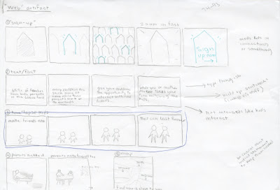
To begin, here are the three animations that I put in the the webpage mock-up. The first one is a type-only piece, second is a mostly image animation with houses, and the third is an illustrated animation also with a bit of text. I tried to give them all three different kinds of imagery, but kept them all in the same style.
Text Fact from Kelsey Anderson on Vimeo.
House from Kelsey Anderson on Vimeo.
Growing Up from Kelsey Anderson on Vimeo.
And here is the videos placed into a fake webpage. I didn't go ahead and make a full-out webpage, since that wasn't really the focus of my project, but I did add some shapes and the organization logo to try and simulate some of the noise that would be on a real webpage. The animations would rotate through, and loops and continue to play until the viewer moved to a new page. The best way I can think of describing it is like a web reel.
Web Mock-up from Kelsey Anderson on Vimeo.
During the production, I had a lot of trouble with timing. I worked this out by asking other people in studio "Is this slow enough now?" over and over and over. I seem to have a problem with making everything too fast.
Storyboarding really helped me on this project (with the exception of text being too fast) because since a lot of my stuff was originally hand-drawn, it let me know every piece that I needed to get ready before I even opened up affect effects. It also helped with the digital rendering, and getting all of the layers in the correct order before animating.
From a technical aspect, I'm still working one learning After Effects. I had some troubles getting started, and all of my issues were just from lack of understanding how the program works. In comparison to working in Flash though, this is light years better.
Edited Logo Build from Kelsey Anderson on Vimeo.
And my logo build. I've got the visual aspect down but could add a few things. I need to add the actual name, "PlayDates" to the logo build somewhere, since you don't know what PD stands for otherwise. Also, some sort of sound could help.


No comments:
Post a Comment