The final set of book covers are finished now, complete with their own little books to wrap around. From the last round of revisions, I changed may things, but most of them were tiny details meant to help unify them as a set of books.
 Don't Try This at Home
 is a collection of short stories told by chefs about their mistakes made before they became successful. It relates to my icons and my story because of a the disaster aspect of the short stories. To convey the theme of the stories on the cover, I combined a stop sign with a rather unappetizing piece of food. This combination of normally unrelated objects makes a message of warning.
 Good Housekeeping's Family First Aid
 is an instructional book focusing on first aid you should know for accidents that might happen around the home. Because of it's family-oriented theme, it seemed appropriate to show a children's toy patched up with a band-aid, an easily recognizable object related with the medical theme.
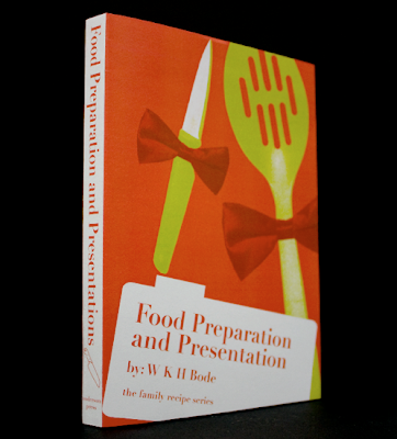
 Food Preparation and Presentation
 is another instructional book, this time about the art of food presentation. Even though it's a pretty formal topic, I decided to go with a lighter kind of image, adding bow-ties to cooking utensils. I tried to keep away from actually showing food on this book cover, since it would have been redundant, both because of the title and also because of the food images in 2 of the other book covers in the set.
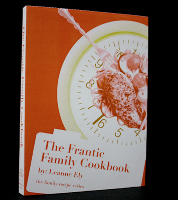
 The Frantic Family Cookbook
 is a recipe book containing fast, healthy meals for busy families. Again, I wanted to avoid being too redundant with the title, so I avoided showing a family, or children, or recipes from inside. Instead, I used a clock to indicate the fast-paced theme of this book, but used it as a plate on which one of the meals is placed.

By juxtaposing seemingly unrelated images using a simple plain background, bold complementary colors, and clear imagery, these book covers are meant to represent their contents by hinting at their overall theme.
 The final set of book covers are finished now, complete with their own little books to wrap around. From the last round of revisions, I changed may things, but most of them were tiny details meant to help unify them as a set of books.
 Don't Try This at Home is a collection of short stories told by chefs about their mistakes made before they became successful. It relates to my icons and my story because of a the disaster aspect of the short stories. To convey the theme of the stories on the cover, I combined a stop sign with a rather unappetizing piece of food. This combination of normally unrelated objects makes a message of warning.
 Good Housekeeping's Family First Aid is an instructional book focusing on first aid you should know for accidents that might happen around the home. Because of it's family-oriented theme, it seemed appropriate to show a children's toy patched up with a band-aid, an easily recognizable object related with the medical theme.
 Food Preparation and Presentation is another instructional book, this time about the art of food presentation. Even though it's a pretty formal topic, I decided to go with a lighter kind of image, adding bow-ties to cooking utensils. I tried to keep away from actually showing food on this book cover, since it would have been redundant, both because of the title and also because of the food images in 2 of the other book covers in the set.
 The Frantic Family Cookbook is a recipe book containing fast, healthy meals for busy families. Again, I wanted to avoid being too redundant with the title, so I avoided showing a family, or children, or recipes from inside. Instead, I used a clock to indicate the fast-paced theme of this book, but used it as a plate on which one of the meals is placed.
 By juxtaposing seemingly unrelated images using a simple plain background, bold complementary colors, and clear imagery, these book covers are meant to represent their contents by hinting at their overall theme.
No comments:
Post a Comment