Showing posts with label Visual Communication 2. Show all posts

May 7, 2010

Final Review Proposal

Aspects of design that I would like to focus on specifically:
  • growth in ability to problem solve
  • focusing on both the process and the final product
  • articulation of concepts and ideas/ learning formal vocabulary
  • attention to both fine details and the larger whole
This is almost definitely too many; I'm aware! I would rather MINDMAP my work, and then REFINE it, and start knocking out too many from the get-go.


Off-the-Top Questions:
  • Is it ok to tile scaled-down versions rather than plot large things such as posters, to save space. Or just print on 12x18?
  • Can evidence of progress (like one of our binders) be included? even if we just use one page or something as an example?
  • can we show parts of projects instead of the whole thing (specifically, the experimental type). The experimental type is what I want to include, not the application of the images to the busses and billboards.
  • Will we get stuff back that we turned in earlier this semester?


DOT BOOK
The dot book was a my first lesson in combining type and image together, and also a lesson in high-quality craftsmanship. It's also where the elements of design were initially introduced.

LINE BOOK
This was a good exercise in working with a variety of different tools, and combining all the different methods of image making into a cohesive whole. It was also an exercise in communicating visually between two, where extra meaning is added between the juxtaposition of two images.
TAXONOMY
My taxonomy is pretty. But I know that's not a good enough reason to add it. It's also a good example of my high levels of craft, and is a good showing of documenting a process, and presenting it in a tasteful way. Of course, I would juxtapose this with my motion haiku project.

HAIKU
Another thing that I would like to try in do in my 35 minutes is bounce between my work so that it shows the ways that we explored the difference between TIME and STATIC images, and DIGITAL and PRINT work. So, combining this with the taxonomy would make sense. Now I just have to figure an order that makes the rest of them work.
LETTER TRANSFORMATION
Working with type, working with motion, working with sound.


COLOR BOOK
This would be an example of how we learned about color, and applied all the termed we learned into a photographic assignment. This was also a really long project. I need to think a little harder on what I would want to say about this, but I am really proud of it so I really want to keep it in!


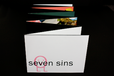
SEVEN SINS BOOK
This was one of my favourite assignments, and I loved being humorous and ironic about a theme as serious as the seven deadly sins. This was a project where I took complete control of all the aspects of the scene, more so than the color book. This was an exercise in planning and constructing ideas, keeping it to a high standard of quality and executing everything. Of course, there were also lots of problems throughout this project, so this was a big problem solving piece too.


SELF PORTRAIT or FAMOUR DEAD PERSON POSTER?
I know I don't need both of these, since they both deal with learning the semiotics, which I feel is one of the most important things that I learned this semester. It's interesting to see how things that are normally literary devices, like rhetoric and semiotics, translate into design work.

CHANGE ONE THING
This poster was 100% all what I wanted to do! Because I got to choose the topic, and had to research all the information that led me to the final design. Also, this was the only illustrated thing that I did!
SIX DEGREES
This was the only seriously group project that we did this year. It was intense, and learning to work with someone else so close was a good experience. Developing better communication skills was an important thing I learned from this project. Also, this is a good example of a series of work that is all cohesive and unified, but still separate enough to not be redundant. This would be what I use to represent all the series sort of works we have done this semester.
MURIEL COOOOOOOPER
Important: I like it! Researching the designer, and then trying to reference them without blatantly just mimicking them, this was a fun project that require me to refine my ability to translate the feel, the idea of the designer into the poster.
MAGAZINE (LAYOUT AND INFOGRAPH COMBOOO)
I also really love my magazine, even though I need to do some more refinements to it before putting it out for someone to see! This is a great example of my ability to sort through a lot of information and facts and organize them into visually pleasing, organized, informative diagrams.
ICONS ICONS ICONS ICONS ICONS ICONS ICONS ICONS ICONS ICONS
ICONS ICONS ICONS ICONS ICONS ICONS ICONS ICONS ICONS ICONS ICONS ICONS ICONS ICONS ICONS ICONS ICONS ICONS ICONS ICONS
ICONS ICONS ICONS ICONS ICONS ICONS ICONS ICONS ICONS ICONS

Of course, everything icon related will be involved. But since there is SO much to it, I want to try and thread the icons in and out with all the other project, relating the back to older projects, and new project, and showing how this continuous project pulls from all areas to make the final work, the museum exhibit...which still needs work!

April 29, 2010

Three Directions

This is from wednesday! These are the three directions that I had for class.

PATTERN


The patterns are one of the directions that I am continuing with, although the need a lot of work. I need to work on all the the text, and on unifying the colors, keeping things ucluttered, etc etc.

PHOTO/QUOTE


These photo are something that I plan on working into the pattern series, making a hybrid of them!

JUST PHOTO
This is the direction that is getting left behind. Poor thing. That picture of Julia on the bus booth is terrifying! love it!

April 26, 2010

Julia Child Quotes

Just throwing some of the quotes I collected out there, keeping them in one spot!


“Find something you're passionate about and keep tremendously interested in it.”

“I was 32 when I started cooking; up until then, I just ate.”

"I think every woman should have a blowtorch."

"Always start out with a larger pot than what you think you need."

"A cookbook is only as good as its worst recipe."

"Always remember: If you're alone in the kitchen and you drop the lamb, you can always just pick it up. Who's going to know?"

"You don't have to cook fancy or complicated masterpieces - just good food from fresh ingredients."

"On what her longevity is attributed to, “Red meat and gin.”

"Once you have mastered a technique, you barely have to look at a recipe again."

“It's so beautifully arranged on the plate - you know someone's fingers have been all over it.”

April 21, 2010

Museum Exhibition Title Ideaaas!

  1. The Dinner Ritual
  2. Recipes for Disaster
  3. Instruments of the Trade
  4. Aspiring Amateur
  5. Yearly Tradition
  6. Family Traditions
  7. Playing with Fire: Cooking Mishaps
  8. Cozy Cuisine
  9. Recipe Relations
  10. Producing the Final Product
EDIT :

I've been working on thumbnails this evening, and working through it, I've been thinking about the suggestion to make the exhibition theme about a particular chef. This seems like a fun idea, and Julia Childs is the chef I wanted to choose, so I've started brainstorming ideas that a relative to her career/life. I'm still keeping it in the mix with some other ideas, and I'll see how they shape up. I'll continue to think through the other directs, but might need to think of some new, more appropriate titles if this ends up being about Childs..

April 15, 2010

First Round of Patterns

To be honest, I'm not really sure where I'm going with these, I'm a bit confused on what's working and what's not. One thing I am proud of is that every single one of these are legit tiles, and could go onnn and onnnn forever. Learning how to make them seamless was a lot of fun, and it's something that I would like to try on my own, without having to use icons, if I ever have time.

Lupton: Pattern

This was a really informative article to look to while I was working on my first round of icons, since it was clear clear on how dots and line form grids. Dots can also form lines, that then go into a grid system. The pages with the many ways to implement the same shape in many different ways way cool too, although some of those relied on overlaying, which when I tried to do with my icons, looked TERRIBLE. :( BUT STILL, it was good to see how a simple shape can make so many patterns, both simple and more complex. Seeing the patterns with random repeats were interesting too, and it would be a cool challenge to try and create my own pattern with difficult-to-find- edges.

April 9, 2010

Infographics Linear Progression

The Research
For this infograph, I took the information from a magazine article. It was a very useful article, with lots of factoids about food, and then a timeline of food that a person ate over the period of two days. On one day she snacked all day, and on the other she planned out her meals. The purpose of the information is to convey the importance of forethought when it comes to eating.

Round 1
For the first step of the graph, I needed to just get the information down on paper, and give it some organization. The idea of meals around the clock is formed, but at this point there's no hierarchy or real system to it.

Round 2
These two versions play with a more refined version of the clock (although that clock is not a good clock to use). The icons are used as a coding system instead of just standing with random blurbs of information. The pizza box is used for poor choices, and the carrots are used for good choices. There is color coding in this stage, as well.

Round 3


In the first round of digital translations, it was a challenge fitting all the information into the space a page-sized document, and the infographs became rather cluttered and confusing. I removed the icons next to each food item, and just used them at the top as a key. This cleared up some of the mess, but not much. I also tried to clarify the clock, and the beginning point of the information listed in it. Everything is these are very messy, and the type is all different and hard to read. From this point, I needed to cut down my information, de-clutter everything, and try to unify the elements of my infographs with the magazine article they're to be inserted in.

Round 4

Lots of cleaning up! This is a BIG change from what I had before, but it's a lot more clear than it previously was. In this version, I changed the type and the font sizes so that all matched with the article. I also set it up in a 3-line grid, just like the article. In this though, there are some informations (like the ket at the top and the information at the bottom of the clock) that needed to be presented differently, since they are not the same information as the other boxed elements.

Final

Ta-da! This is the final that was added to the magazine. It is a gate-fold that flips out from the second spread. In this version, I attempted to resolve the issue of the information divide by added bars to the top and bottom, that echo the shape of a recipe card. The bottom portion still needs some resolution, but it's gotten a lot better!

April 6, 2010

More Butcher Paper Mock-ups

More Process work for the infographs!

KITCHEN MAP
This one is a map of a kitchen with clean-up and safety tips. It is color coded, with the icons being used as the key. I'm not going to be using a drawing though! I was also playing around with using a montage of photos all placed together, buuuuut that's not looking to good. Here's the digital translations:
V1
From this version, I like the organization of the information at the top of the image, although I need to put the information in a 3-column grid like it is in my article.
V2
From this version, I am going to take the placement of the icons. Instead of being under the text, which just makes both elements difficult to read, they'll be chillin next to the information that they are categorizing. Also, the line weights in the infographs need to match the lines that I have in my article. There needs to be lot more cohesion between the images and the article they're in!

TIMELINES


Here are the butcher-paper iterations that I made for my Food Trends timeline. From these, I found that the cookie one was too specific, and that it was too busy with other information too. I chose to continue to go with the recipe box version, as it was one of my icons, and it seemed more appropriate.

V1

This was the first iteration of the timeline that I did. In this I finally got the linear nature of a timeline pinned down, but that's about it. The next one is much more successful!
V2
In this version of the recipe-box timeline, I inserted the information into the actual icons. I've also started editing out information, to make the facts more concise and fit into the cards. Everything I've done digitally is messy, so I'm trying to clean things up! Everything needs more space in this, and I need to make the type in the tab portion of the card look like part of the card rather than the text.

Clock Time-Based/Comparative
From these butcher-paper explorations, I decided that I wanted to have only one clock, instead of two. This chart is showing a day of bad eating (or snacking) versus a day of planned meals. The time base is, of course, the time of the day, and then the comparative is the calories in the food that the people ate. Pulled out from the these bits of information are addition facts about healthy eating choices (suggestions, nutritional info, etc.).

V1
Once again, I need to pay more attention to the infographs and article as ONE unit instead of separate projects. This information is SO MESSY! I will be cutting down the information in this graph, changing the colors to match the icon colors, and changing the text so that it is unified with the text in the article. Also, the text needs to be in grids that will match the article. This particular infograph might become a gate-fold page, or a fourth spread. I'm not sure which at this very moment, we'll see how the day treats us, but I'm hoping for the gate-fold. This graph has enough information in it that it could be an article of its own.

V2
From this iteration of the clock, I will be taking the title/key (so that there are not any paragraphs of information like in the first version). I'll also be taking the arrow from this version and altering the clock so that the beginning and ending of the graph will be more apparent!

Altogether, I need to work on making the infographs and article work together, and I've got a lot of work to get to that spot! Gonna unify text, unify color, and unify the layouts.