 (click to enlarge)
This project was a great learning experience, not just because of the material we covered, but because of the process and evolution involved. In my opinion at least, having accumulative parts of the project made the final artifact more impressive than if we had been aware of what we were doing from the beginning. Plus, we gained experience with so many different mediums, which was greeeeaaat!
At the beginning it seemed like a straightforward "visual communications" practice, making simple lines reflect the given words. But as the days progressed, simple lines evolved into juxtaposed pairs quicker than I could realize.
Focusing on just the line studies, and then just the manipulations was a really intense and required us to pay attention to the fine detail of each. It was a little frustrating to create x amount of line studies that defined "balance" or "progression," and quite frankly, after a while all my mine started to look the same.
Tracings ➘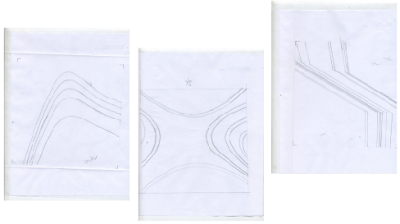
The tracing experience was something that I had a lot of trouble with, even though it seemed simple at first. It was like a paper version of photoshop layering, but without the undo action. I won't lie, I got terribly frustrated with all the problems I had with the tracings. Wobbly lines, uneven strokes, and dull pencils made doing the curve drawings really difficult. But I've gotten the hang of it now, and I'll do my best to maintain good line quality in my tracings in the future.
Vectoring ➘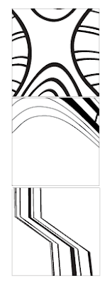 This is the only part of this project were I felt I might have an edge up, so it was almost therapeutic working on these. There's just something about zooming to max magnification and scooting anchor points that is so relaxing. It was also a good example of how detail-oriented this project was. One wrong angle or one misplaced anchor, and it was totally visible once it printed.
Photography ➘
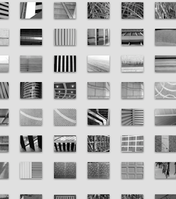 You never have enough photos. Never ever. Exploring the city and taking pictures is really fun, and now at the end of the project I look at my environment as nothing but potential line studies. It's crazy to think that one school assignment changed the way I see things.
Another big part of this assignment was learning how to be really selective. Make more than you need of everything, and then work down from there, refining every tiny step so only the best make it to the end.
Having a project with so many elements seemed over whelming, but it all came together in a tidy little book, which is a pretty awesome way to present all our work. The book was definitely labour intensive, and cutting squares turned out to be a lot more difficult than I thought it would be. But the final piece is only the best of everything - clearest photos, smoothest line studies, most interesting manips, and squarest squares.
At the beginning it seemed like a straightforward "visual communications" practice, making simple lines reflect the given words. But as the days progressed, simple lines evolved into juxtaposed pairs quicker than I could realize.
Focusing on just the line studies, and then just the manipulations was a really intense and required us to pay attention to the fine detail of each. It was a little frustrating to create x amount of line studies that defined "balance" or "progression," and quite frankly, after a while all my mine started to look the same.
Tracings ➘

The tracing experience was something that I had a lot of trouble with, even though it seemed simple at first. It was like a paper version of photoshop layering, but without the undo action. I won't lie, I got terribly frustrated with all the problems I had with the tracings. Wobbly lines, uneven strokes, and dull pencils made doing the curve drawings really difficult. But I've gotten the hang of it now, and I'll do my best to maintain good line quality in my tracings in the future.
Vectoring ➘
 This is the only part of this project were I felt I might have an edge up, so it was almost therapeutic working on these. There's just something about zooming to max magnification and scooting anchor points that is so relaxing. It was also a good example of how detail-oriented this project was. One wrong angle or one misplaced anchor, and it was totally visible once it printed.
Photography ➘
 You never have enough photos. Never ever. Exploring the city and taking pictures is really fun, and now at the end of the project I look at my environment as nothing but potential line studies. It's crazy to think that one school assignment changed the way I see things.
Another big part of this assignment was learning how to be really selective. Make more than you need of everything, and then work down from there, refining every tiny step so only the best make it to the end.
Having a project with so many elements seemed over whelming, but it all came together in a tidy little book, which is a pretty awesome way to present all our work. The book was definitely labour intensive, and cutting squares turned out to be a lot more difficult than I thought it would be. But the final piece is only the best of everything - clearest photos, smoothest line studies, most interesting manips, and squarest squares.

this post really articulates everything you learned. you did get a lot out of the process and sound very aware of how you are "learning how to see" from this studio.
ReplyDeleteContinue to foster this openness to learn, because the processes you learn here will have more longevity and adaptability than any end product.